
Espartaco

“Is that to say we are against Free Trade? No, we are for Free Trade, because by Free Trade all economical laws, with their most astounding contradictions, will act upon a larger scale, upon the territory of the whole earth; and because from the uniting of all these contradictions in a single group, where they will stand face to face, will result the struggle which will itself eventuate in the emancipation of the proletariat.”

Karl Heinrich Marx · Marx-Engels Collected Works, Vol. VI, p. 290

EnglishEspañol

Tag: computación estadística

  • Extracting Signals from Noise: How SignalY Tackles Three Hard Problems in Panel Data Analysis

    Extracting Signals from Noise: How SignalY Tackles Three Hard Problems in Panel Data Analysis

    You can also find this library at CRAN and download it directly from R and RStudio.

    The Problem Every Quantitative Researcher Knows

    Imagine you are staring at a spreadsheet with 50 columns and a few hundred rows of macroeconomic indicators. Somewhere inside this matrix, a handful of variables carry the signal you care about. The rest is noise — or worse, confounding variation that masquerades as signal. You need to answer three questions: Which variables actually matter? What is the latent structure driving them? And how persistent are the components you extract?

    If you have worked with panel data for any length of time, you know that these questions are rarely addressed by a single tool. You run a LASSO in one environment, a PCA in another, an ADF test in a third. Each method lives in a different package with different input formats, different assumptions, and different output structures. Stitching the results together is left to you.

    SignalY is an R package that was built to solve exactly this fragmentation problem. Developed by José Mauricio Gómez Julián and released under the MIT license, it provides a unified framework for signal extraction from panel data through multivariate time series analysis. Its design rests on three analytical pillars — column selection, series decomposition, and persistence analysis — that can be used independently or chained together through a single orchestrating function.

    This post walks through the problem SignalY solves, the methods it implements, and why the combination matters for applied econometrics and data science.


    Pillar 1: Which Variables Matter?

    The first challenge in any high-dimensional analysis is selection. When you have dozens of potential predictors, you need a principled way to determine which ones carry structural information and which ones are along for the ride.

    The Horseshoe Prior

    SignalY approaches this problem through Bayesian sparse regression with the Horseshoe prior. The Horseshoe, introduced by Carvalho, Polson, and Scott (2010) and refined for practical variable selection by Piironen and Vehtari (2017), is a global-local shrinkage prior with a distinctive property: it is aggressive around zero (shrinking noise variables strongly toward zero) while maintaining heavy tails (allowing true signals to escape shrinkage). This dual behavior makes it particularly well-suited for sparse problems where you expect only a few variables to matter, but you do not know which ones.

    The math behind this is elegant. Each coefficient βⱼ is given a prior with two layers of shrinkage:

    • A local parameter λⱼ that controls how much each individual coefficient is shrunk.
    • A global parameter τ that governs overall sparsity.

    The result is a shrinkage profile where most coefficients collapse toward zero — the global pull — while a small number of coefficients stand apart, barely affected — the local escape. This is what gives the Horseshoe its name: the prior density looks like the shape of a horseshoe, with a sharp spike at zero and long, flat arms extending outward.

    SignalY’s fit_horseshoe() function estimates this model and provides built-in shrinkage profile diagnostics, so you can visually inspect which variables survived shrinkage and by how much.

    Four Ways to Select Variables

    Fitting a model is one thing; converting the posterior into a concrete variable selection is another. SignalY offers four distinct selection strategies, each with different strengths:

    1. Projection predictive selection (select_by_projection()): This is the most theoretically robust approach. It works by projecting the full posterior onto candidate submodels and selecting the smallest submodel whose predictive distribution is close enough to the full model. The reference is Piironen and Vehtari (2017), and the implementation respects the posterior geometry rather than relying on ad-hoc thresholds.
    2. Credible interval exclusion (select_by_credible_interval()): Selects variables whose posterior credible intervals do not include zero. Intuitive and easy to interpret, though it can be conservative in high-dimensional settings.
    3. Shrinkage-based selection (select_by_shrinkage()): Uses the kappa (shrinkage fraction) parameters to identify variables that escaped shrinkage. This is useful when you want to understand the degree of shrinkage, not just the binary in-or-out question.
    4. Magnitude-based screening (select_by_magnitude()): A straightforward effect-size filter. Useful as a first pass or when you need to combine Bayesian inference with a frequentist-style screening step.

    The fact that SignalY provides all four in a coherent pipeline — not as separate, unrelated functions — is the key design decision. You can run all four and cross-validate the results, or choose the one that best matches your inferential philosophy.

    Beyond Regression: Factor Discovery

    Sometimes the question is not “which of my 50 variables matter?” but rather “what are the few latent factors driving all 50?” SignalY addresses this through two complementary methods:

    • PCA with block bootstrap (pca_bootstrap()): Standard principal component analysis, but with block bootstrap confidence intervals that account for temporal dependence in time series data. It also includes entropy-based topology analysis, which measures the informational content of each component.
    • Dynamic Factor Models (estimate_dfm()): Implements the Bai and Ng (2002) information criteria for automatic determination of the number of static factors, then fits a VAR (Vector Autoregression) on the factor dynamics. This captures not just what the latent factors are, but how they evolve over time.

    Pillar 2: What Is the Underlying Structure?

    Once you know which variables matter (or have constructed a composite signal), the next question is decomposition: what are the trend, cycle, and residual components of your series?

    This is where signal processing meets econometrics, and SignalY implements three methodologically distinct approaches, each with its own strengths.

    Wavelet Decomposition

    filter_wavelet() implements the Maximal Overlap Discrete Wavelet Transform (MODWT) using Daubechies wavelets, following the framework of Percival and Walden (2000).

    Unlike a Fourier transform, which decomposes a signal into infinite sinusoids (losing all time information), a wavelet decomposes a signal into localized, finite-length oscillations at different scales. The MODWT variant is particularly useful for time series because it does not decimate the data (no downsampling), meaning the output length matches the input length at every scale.

    In practice, the wavelet decomposition separates a series into:

    • Detail coefficients (D1, D2, D3, …): capturing oscillations at progressively coarser time scales — high-frequency noise in D1-D2, business-cycle frequencies in D3-D4, and longer cycles in higher levels.
    • Smooth coefficients (S): the low-frequency approximation that captures the trend.

    SignalY includes multi-resolution variance analysis, which tells you how much of the total variance is explained at each scale. This is invaluable for understanding whether your series is dominated by high-frequency noise, medium-term fluctuations, or long-run trends.

    Empirical Mode Decomposition

    filter_emd() implements Empirical Mode Decomposition (Huang et al., 1998), a fundamentally different approach. Where wavelets impose a predetermined basis (Daubechies, Haar, Symmlet, etc.), EMD is fully data-adaptive. It works by iteratively sifting the signal — identifying local extrema, fitting envelopes, and subtracting the mean — until it extracts Intrinsic Mode Functions (IMFs) that satisfy specific oscillatory conditions.

    The key advantage of EMD is that it makes no assumptions about stationarity or linearity. The IMFs are defined by the data itself, not by a mathematical basis. This makes EMD particularly powerful for:

    • Non-stationary signals whose frequency content changes over time.
    • Non-linear oscillations that cannot be captured by fixed-basis decompositions.
    • Signals where the “natural” decomposition is not known a priori.

    The trade-off is that EMD can be sensitive to end effects and mode mixing, though SignalY’s implementation includes standard mitigations.

    HP-GC Bayesian Filter

    filter_hpgc() implements the Grant and Chan (2017) unobserved-components Hodrick-Prescott filter, estimated via MCMC. This is a significant upgrade over the traditional HP filter, which requires you to manually set the smoothing parameter λ (the famous λ = 1600 for quarterly data, or λ = 6.25 for annual data, or any of the other arbitrary rules of thumb floating around the literature).

    The HP-GC approach formulates the decomposition as a Bayesian unobserved-components model:

    • A trend component whose second differences are penalized (this is the smoothness prior, equivalent to the HP penalty).
    • A cycle component modeled as an AR(2) process.
    • The smoothing parameter λ is estimated from the data via MCMC, not fixed by the user.

    This removes one of the most criticized aspects of the classical HP filter — its sensitivity to the arbitrary choice of λ — while preserving its interpretability. The output includes the estimated trend, cycle, and residual, each with full posterior distributions.

    filter_all(): Compare All Three

    A particularly useful design choice is the filter_all() function, which runs all three decomposition methods on the same series and returns the results in a comparable format. This is not just a convenience function; it is an epistemological statement. No single decomposition method is universally correct. By running all three and comparing, you can identify components that are robust across methods (strong signal) versus components that depend on the specific decomposition assumptions (potentially method artifact).


    Pillar 3: How Persistent Is the Signal?

    The third question — what is the persistence regime of your series or its components — is critical for downstream modeling. If your extracted trend is a random walk, that has very different implications than if it is a stationary AR process. If your cycle is near-unit-root, standard mean-reversion models will fail.

    A Comprehensive Unit Root Battery

    test_unit_root() runs four classical tests with complementary null hypotheses:

    TestNull HypothesisKey Feature
    Augmented Dickey-Fuller (ADF)Unit root existsMost widely used; sensitive to lag selection
    Phillips-Perron (PP)Unit root existsNon-parametric correction for serial correlation
    KPSSSeries is stationaryReversed null; useful as cross-check against ADF
    Elliott-Rothenberg-Stock (ERS)Unit root existsPoint optimal test with higher power near unity

    The critical insight is that no single test is definitive. The ADF and PP tests can fail to reject a false unit root (low power near unity). The KPSS test has the opposite null hypothesis, so it can detect stationarity that ADF misses. By running all four and synthesizing the results, SignalY provides a more robust classification than any individual test.

    The automated synthesis follows a standard decision logic:

    • If ADF/PP/ERS reject unit root and KPSS fails to reject stationarity → stationary.
    • If ADF/PP/ERS fail to reject and KPSS rejects → unit root.
    • Mixed results → borderline / near-unit-root, flagged for careful interpretation.

    This automated synthesis is not a black box; the individual test statistics and p-values are all available for inspection. But the synthesis gives you a quick, defensible classification without manually cross-referencing four separate test outputs.


    The Orchestrator: One Call, Full Pipeline

    The signal_analysis() function is the centerpiece of SignalY’s design philosophy. A single call can run the complete analysis pipeline:

    result <- signal_analysis(
    data = data,
    y_formula = Y ~ X1 + X2 + X3,
    methods = c("wavelet", "emd", "pca", "dfm", "unitroot"),
    verbose = TRUE
    )

    This executes:

    1. Column selection (PCA, DFM, optionally Horseshoe).
    2. Series decomposition (Wavelet, EMD).
    3. Persistence analysis (Unit Root Battery).

    …and returns a unified result object with print(), summary(), and plot() methods. The plot() method generates interactive plotly dashboards with filter trends, coefficient profiles, PCA loadings, and DFM factor panels.

    The formula interface (Y ~ X1 + X2 + X3) makes it feel like a standard R regression call, while the methods argument lets you mix and match analytical layers as needed.


    How Well Does It Work?

    The Wiki includes recovery benchmarks on synthetic data with known ground truth. These are worth highlighting because they address the most important question: does this actually work?

    TaskMethodRecovery Metric
    Factor structure (3 latent factors)PCA / DFMr > 0.95, exact factor count
    Sparse variable selection (5 of 50)HorseshoeF1 > 0.85, Precision > 0.90
    Logarithmic trend recoveryEMDr > 0.95 with true trend
    Multi-scale cycle extractionWavelet (D3+D4)r > 0.70 with true cycle
    Stochastic trend + AR(2) cycleHP-GC BayesianTrend r > 0.90, cycle r > 0.50
    Stationarity classificationUnit Root Battery4/4 correct on synthetic data

    A few things stand out:

    • The Horseshoe achieves over 90% precision in a 5-of-50 sparse selection problem. This means that when it says a variable matters, it is almost always right. The F1 score above 0.85 indicates a good balance between precision and recall.
    • Factor recovery is near-perfect (r > 0.95), and the DFM correctly identifies the exact number of latent factors.
    • Wavelet cycle extraction at r > 0.70 and HP-GC cycle extraction at r > 0.50 reflect the inherent difficulty of extracting cyclical components from noisy data. These are realistic numbers, not inflated claims.
    • Unit root classification achieves 100% accuracy on synthetic data with clear-cut cases. Real-world data is messier, but this validates the synthesis logic.

    Who Should Use SignalY?

    SignalY is built for three overlapping communities:

    Economists and econometricians working with panel or multivariate time series data who need to move from raw data to structural inference — identifying relevant variables, extracting latent factors, decomposing signals, and characterizing persistence — without stitching together five different packages.

    Quantitative researchers in finance, macro, or political economy who face high-dimensional predictor sets and need principled Bayesian variable selection rather than stepwise regression or arbitrary LASSO tuning.

    Data scientists working on signal processing problems where the signals are non-stationary, non-linear, or embedded in high-dimensional panels, and where the standard Python signal processing toolkit does not provide the statistical rigor needed for publication-quality inference.


    Getting Started

    Installation is straightforward:

    # From GitHub
    remotes::install_github("IsadoreNabi/SignalY")
    library(SignalY)
    # Minimal workflow
    data <- data.frame(Y = as.vector(Y), X)
    result <- signal_analysis(data = data, y_formula = "Y",
    methods = c("pca", "wavelet", "unitroot"))
    plot(result)

    The package is MIT-licensed, actively maintained (current version 1.1.2), and designed to work with standard R data frames.


    The Bigger Picture

    What makes SignalY interesting is not any single method — the Horseshoe prior, MODWT, EMD, and unit root tests all exist in other packages. The value is in the integration. By placing Bayesian sparse regression, spectral decomposition, and persistence analysis inside a single coherent framework with a unified interface, SignalY enables workflows that are difficult to replicate otherwise:

    • Run a Horseshoe regression to select variables, then decompose the fitted signal with wavelets, then test the stationarity of the extracted components — all without changing packages, data formats, or mental models.
    • Compare wavelet, EMD, and HP-GC decompositions of the same series to identify robust components versus method-dependent artifacts.
    • Use the DFM to discover latent factors, then test each factor’s persistence regime to inform your downstream modeling choices.

    In applied econometrics, the quality of your inference depends on the coherence of your pipeline. SignalY makes that coherence a feature rather than a chore.


    SignalY is developed by José Mauricio Gómez Julián. The source code, documentation, and wiki are available at github.com/IsadoreNabi/SignalY under the MIT License.

  • When the Textbook Test Fails: How HTDV Brings Rigor to Dependent, Unbalanced Data

    When the Textbook Test Fails: How HTDV Brings Rigor to Dependent, Unbalanced Data

    You can also find this library at CRAN and download it directly from R and RStudio.

    The problem hiding in your data

    Picture a straightforward question: Is the average inflation rate in the United States meaningfully different from zero? You have monthly data going back decades. A classical t-test would seem like the natural tool — and it would be quietly, systematically wrong.

    The reason is that inflation figures do not bounce around independently. January’s number carries information about February’s. This autocorrelation corrupts the standard error that the t-test relies on, inflating the false-positive rate well beyond the nominal 5% you think you are signing up for. The same problem afflicts yield spreads, stock returns, sectoral profitability, regional employment — virtually any real-world time series you might want to compare.

    Now make it harder. The two groups you are comparing have different sample sizes — one sector has twenty years of data, another only five. The data may have heavy tails you cannot rule out. And your sample is finite, which means the asymptotic guarantees printed in your econometrics textbook are promises that may not have been kept yet.

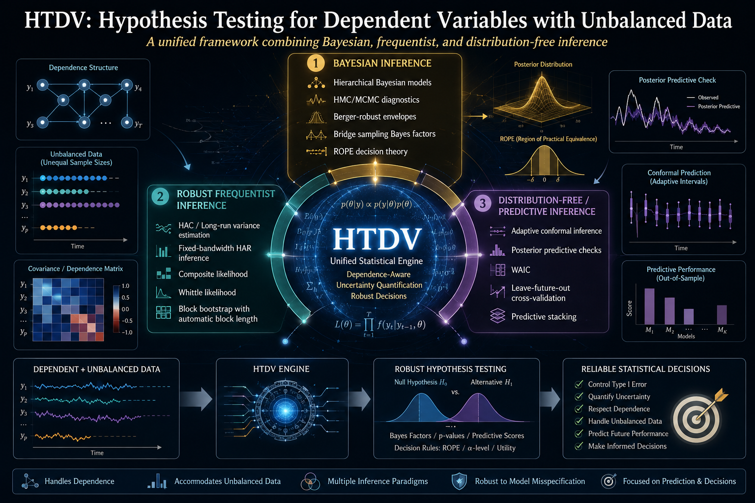
    This is the terrain HTDV was built for. Short for Hypothesis Testing for Dependent Variables with Unbalanced Data, HTDV is an R package that answers a deceptively simple question — do these dependent, possibly unequally-sized samples come from the same population? — under the worst combination of conditions an applied statistician is likely to encounter.

    The central idea: triangulation, not trust

    The most common approach to dependent data is to reach for a single robust method — a heteroskedasticity-and-autocorrelation-consistent (HAC) standard error, say, or a block bootstrap — and hope it is calibrated. HTDV takes a structurally different stance: run three independent inferential methods in parallel and expose the disagreement between them as a signal.

    The three layers are:

    1. A hierarchical Bayesian fit via Hamiltonian Monte Carlo (HMC), implemented in Stan. This layer builds a full probability model of the data-generating process, places weakly informative priors on the dependence parameters, and produces a posterior distribution for the quantity of interest.
    2. A fixed-bandwidth HAR Wald test in the frequentist tradition of Kiefer and Vogelsang (2005). Rather than letting the bandwidth grow with the sample in the usual way, it holds the bandwidth at a fixed fraction of the sample size. This produces a non-standard asymptotic distribution that is better calibrated in finite samples than the conventional chi-square approximation.
    3. A stationary block bootstrap (Politis and Romano, 1994) with automatic block-length selection (Patton, Politis, and White, 2009). This resamples the data in blocks long enough to preserve the dependence structure, then constructs confidence intervals from the resampled distribution.

    A fourth, distribution-free layer — adaptive conformal inference (Gibbs and Candès, 2021) — is available for online prediction settings where no parametric assumption is palatable.

    The logic is forensic. Where all three layers agree, your conclusion is robust. Where they disagree, the pattern of disagreement tells you something specific about your data. If the Bayesian interval is dramatically wider than the HAR or bootstrap interval, your series likely has strong temporal persistence, and the asymptotic critical values that HAR and bootstrap rely on are losing their reliability. That gap is not a bug — it is the most informative thing the framework can show you.

    Why a single method is not enough

    It is fair to ask: if the Bayesian layer is the most reliable, why not just use it and discard the others? The answer is that each layer has a regime where it is the appropriate tool, and the framework’s job is to make the regime visible.

    HAR inference is computationally cheap — sub-second on typical data — and well-calibrated when persistence is low to moderate and sample sizes are large enough for asymptotics to bite. The block bootstrap shares those advantages while making fewer distributional assumptions. The Bayesian layer is the most computationally expensive (each fit can take tens of seconds) but is the only one that maintains nominal calibration under strong persistence at finite sample sizes, because it models the dependence explicitly rather than relying on asymptotic corrections.

    The package ships with a pre-registered factorial Monte Carlo study — 1,024 cells crossing sample size, autocorrelation, tail heaviness, imbalance ratio, and location shift, with 500 replications per cell across all three inferential layers — and the results are unambiguous. The Bayesian layer holds nominal size (mean 0.056 against a target of 0.05) and nominal coverage (mean 0.944 against a target of 0.95) across the entire grid. HAR and bootstrap, by contrast, inflate dramatically in the worst corners: under strong persistence and small samples, HAR’s empirical rejection rate under the null reaches 0.60, and its coverage drops to 0.29.

    The narrowness of the HAR and bootstrap intervals in those corners is not a sign of precision. It is a sign of miscalibration — the intervals are confidently wrong.

    The theory that holds it together

    Running three different methods on the same data and comparing the answers is sound practice, but it raises a mathematical question: under what conditions are the three methods even addressing the same inferential target? A Bayesian posterior on a triangular-array likelihood and a HAR-Wald statistic on a mixingale process are, on their face, different objects.

    HTDV’s theoretical backbone is a metric equivalence theorem that resolves this concern. The framework identifies three structurally distinct ways real-world data can violate the independence assumption — each corresponding to a different law-of-large-numbers regime:

    • Triangular Arrays Convergence (TAC): information accumulates through hierarchical aggregation. Think of input-output tables disaggregated into ever-finer sectors, where each “row” of the array adds more observations.
    • Weighted Sums with Correlation (WSC): the observations share a cross-sectional covariance structure. Regional markets that move together, trade flows between linked economies.
    • Mixingale Process Convergence (MPC): temporal memory that decays smoothly over time. Forecast errors, model residuals, prediction intervals that gradually lose contact with the past.

    The theorem proves that, under α-mixing with polynomial decay rate γ > 1 and finite moment conditions, these three regimes induce strictly equivalent metrics on the space of hypothesis-testing problems. The equivalence comes with explicit, computable finite-sample constants — exposed by the function htdv_equivalence_constants() — that tell you the maximum slack when translating a conclusion from one regime to another. For typical parameter values (γ = 2, q = 6, n = 500), the conversion slack is about 18%, a margin that is usually irrelevant for a hypothesis-testing decision.

    This is what makes the three-layer architecture mathematically well-defined rather than merely pragmatic. Without the equivalence theorem, comparing a Bayesian result on a TAC dataset with a HAR result on a WSC dataset would be comparing apples and oranges. The theorem certifies that the metrics are coercible to one another with computable error.

    The dependence assumption, plainly

    The framework assumes that the data are α-mixing with polynomial decay — meaning that the statistical dependence between observations dies off as they get farther apart in time, and it does so fast enough (at a rate faster than 1/k) that the long-range correlations are summable. This is a mild condition satisfied by most stationary time series in econometrics and finance, including ARMA processes, GARCH models, and a broad class of Markov chains.

    It is not satisfied by long-memory processes (where dependence decays more slowly than 1/k) or by unit-root processes (where dependence does not decay at all). The framework is honest about these limitations: it will fit near-unit-root data, but the posterior will widen correspondingly — which is the correct answer. For explicit unit-root testing, the standard ADF or Phillips-Perron tools remain the right choice.

    The Bayesian engine

    The hierarchical Bayesian core fits Stan models via the No-U-Turn Sampler (NUTS), the state-of-the-art Hamiltonian Monte Carlo variant. The models are parameterized around an AR(1) structure — the mean θ, the autocorrelation φ, and the innovation scale σ — with hierarchical priors on the dependence nuisance parameters that are weakly informative enough to respect admissible ranges without overwhelming the data.

    Five likelihood backends are available, corresponding to the three convergence regimes plus two parametric likelihood families: the Whittle likelihood (which works in the frequency domain, comparing the observed periodogram to a theoretical spectral density) and the composite likelihood (which works in the time domain, combining conditional densities over short blocks). Both are well-established in the time-series literature; the choice between them depends on whether you have more confidence in your spectral model or your conditional density model.

    A distinctive feature is the Berger-robust envelope — a method for combining posteriors across multiple fitted models into a single, wider posterior that hedges against the worst-likelihood-specification scenario. If you are unsure whether the Whittle or composite likelihood better describes your data, the envelope gives you an inferential answer that is honest about that uncertainty rather than forcing an arbitrary choice.

    After sampling, every fit must pass a five-gate diagnostic check before its posterior is admissible: split-R̂ below 1.01, bulk and tail effective sample sizes above 400, zero post-warmup divergences, and energy Bayesian fraction of missing information (E-BFMI) above 0.3. These are the standard HMC convergence diagnostics from the Stan ecosystem, enforced as a gate rather than offered as a suggestion.

    The validation: visible in the data

    The most compelling aspect of HTDV is that it does not merely claim to be well-calibrated — it ships the evidence. Two validation datasets are bundled with the package.

    The first is the factorial simulation described above, with its 3,069-row summary table accessible as a package dataset. The headline finding — that the Bayesian layer is the only one maintaining nominal calibration across the full design — is not an assertion but a reproducible fact. The full study took 31 hours on a 16-core workstation; the scripts to regenerate it from scratch are shipped in the package repository.

    The second is a set of three external benchmarks against published references on public-source data:

    • Post-1984 US CPI inflation, compared against Stock and Watson (2007).
    • Shiller’s log-CAPE ratio, compared against Campbell and Shiller (1998).
    • The US–Canada 10-year yield differential, compared against the naive iid Welch baseline.

    All three layers reproduce all three references with agreement in every case. But the width of the agreement tells the real story. The interval widths scale monotonically with the persistence of the underlying series. At moderate persistence (φ ≈ 0.45, the inflation series), the Bayesian interval is actually narrower than HAR — 0.81 times its width. At high persistence (φ ≈ 0.97, the CAPE series), the Bayesian interval is 2.8 times wider. At near-unit-root persistence (φ ≈ 0.99, the yield differential), it is 15 times wider.

    This gradient is the framework’s central empirical finding. Both layers are technically asymptotically valid. Only the Bayesian layer accounts honestly for the finite-sample uncertainty inflation that occurs as φ approaches 1. The HAR and bootstrap intervals do not widen because they know more — they fail to widen because their asymptotic critical values have not yet caught up with the data.

    When to use it — and when not to

    HTDV is the right tool when your data are time-dependent or spatially dependent, when your samples are of unequal size, when you suspect heavy tails but cannot rule them out, and when you need an inferential answer (a test or an interval) rather than a prediction. It is particularly valuable when the stakes are high enough that you want your conclusion to survive methodological scrutiny — the framework ships its own validation evidence precisely so that a reviewer can interrogate the calibration claims rather than taking them on faith.

    It is the wrong tool when your data are genuinely independent with finite variance — classical methods are simpler, equivalent, and faster. It is also not designed for long-memory processes, explicit unit-root testing, structural breaks (unless you segment the sample first), or forecasting. The framework is built for hypothesis testing and parameter estimation under uncertainty, not for predictive accuracy.

    An open architecture

    The package exposes its full infrastructure: the simulation engine (htdv_simstudy()), the equivalence constants calculator, the diagnostic suite, the posterior-predictive checks on dependence statistics, and the decision tools — ROPE-based decisions (Kruschke, 2018), bridge-sampling Bayes factors, WAIC and leave-future-out cross-validation, and predictive stacking (Yao, Vehtari, Simpson, and Gelman, 2018). Every function is documented with its underlying reference, so the user can trace any method back to its source.

    The complete function reference, mathematical foundations, tutorial walkthroughs (oriented toward novices, applied statisticians, and mathematicians respectively), and the full validation narrative are in the HTDV Wiki on GitHub. The package is installed with a single command — remotes::install_github("IsadoreNabi/HTDV") — and requires rstan as its only hard dependency.

    The larger point

    HTDV embodies a methodological philosophy worth stating explicitly: when no single inferential method is universally valid in the finite-sample regime, the honest response is not to pick the best one and hide its limitations, but to run several and make the disagreement visible. The framework’s value is not that it always gives you a narrower interval or a more powerful test. Its value is that it shows you — concretely, quantitatively — where your inference is on solid ground and where it is standing on asymptotic ice.

    The validation evidence makes this concrete. In 98% of the simulation cells, the Bayesian layer alone passes the calibration benchmarks. The HAR and bootstrap layers pass in the regime where asymptotics have bitten — low persistence, large samples — and fail predictably outside it. The framework does not hide that failure. It turns it into a signal.

    That signal is the product.


    HTDV is released under the MIT license. The companion paper, full validation vignette, and reproducibility scripts are available at github.com/IsadoreNabi/HTDV. For the complete mathematical foundations, function reference, and tutorials, see the project wiki.

  • topologyR: Turning Time Series into Shapes to Test What Your Models Quietly Assume

    topologyR: Turning Time Series into Shapes to Test What Your Models Quietly Assume

    You can also find this library at CRAN and download it directly from R and RStudio.

    There is a habit so embedded in quantitative work that most practitioners never think to question it. You have a time series — quarterly GDP, an EEG channel, a temperature record — and at some point you fit a smooth curve through it, interpolate a missing value, or estimate a “long-run trend.” All of these moves rest on a single, seldom-checked assumption: that the data form one continuous whole, that a single smooth function can legitimately pass through every point.

    But what if they don’t? What if your series is, structurally, two or three disjoint pieces glued together by the calendar — pieces between which no continuous function can travel? In that case, the spline you just fitted is not an approximation of reality; it is a mathematical fiction painted over a fracture.

    topologyR is an R package that lets you check this before you model. It takes a numeric time series, converts it into a graph, converts that graph into a topological space, and then asks the one question that determines whether global continuous methods are even valid: is this space one connected piece, or several?

    It sounds abstract. It is abstract — but the consequence is concrete. The package is the work of José Mauricio Gómez Julián, and it is open-source, with a GitHub repository, a detailed Wiki, and a companion research paper archived on Zenodo. What follows is a tour of what the package does, why it matters, and where it fits in the broader landscape of topological data analysis.


    The Hidden Assumption

    Think about what happens when you impute a missing value in a time series using a cubic spline. The spline assumes that the points on either side of the gap belong to the same continuous process — that the missing value lies somewhere along a smooth bridge between them. If the series has actually undergone a structural break, a regime change, or a discontinuity between those points, the spline will happily produce a number, and that number will be wrong in a way no confidence interval can capture.

    This is not a niche problem. It appears in econometrics (trend estimation across business cycles), in neuroscience (coherence across brain-state transitions), in climatology (warming trends across regime shifts). The methodological error is always the same: assuming continuity without first verifying that continuity is mathematically possible.

    topologyR’s contribution is to make that verification explicit, parameter-free, and exact.


    From Numbers to Shapes: The Pipeline in Three Steps

    The package’s workflow has an elegant, almost architectural logic. You feed it a series of numbers; it returns a topological verdict. Between input and output, three transformations occur.

    Step 1: The Series Becomes a Graph

    The first move is borrowed from network science: the visibility graph. Imagine your time series plotted as a mountain range — each observation is a peak or a valley at a given time. Two points are connected by an edge if you could stand on one and see the other, with no taller peak blocking the line of sight.

    topologyR implements two flavours. The Horizontal Visibility Graph (HVG) connects two points if every point between them is strictly lower than the shorter of the two — a horizontal line of sight. It runs in linear time and captures the skeleton of the series’ ups and downs. The Natural Visibility Graph (NVG) is more generous: it connects two points if every intermediate point lies below the straight line joining them, regardless of the heights of the endpoints. It is denser, richer, and runs in O(n log n) expected time. The NVG always contains the HVG as a subgraph.

    Both are parameter-free. There is no threshold to tune, no bandwidth to select, no ε to agonise over. The graph is determined entirely by the data’s own geometry. This matters enormously: it eliminates the single largest source of arbitrariness in the entire pipeline.

    Step 2: The Graph Becomes a Topology

    Here is where topologyR departs from ordinary network analysis. A graph tells you who is adjacent to whom. A topology tells you something deeper: what the neighbourhood structure of the entire space looks like — which collections of points form coherent open regions, and how those regions combine.

    The construction follows a method introduced by Nada, El Atik, and Atef in 2018. For each vertex v in the graph, you form its closed neighbourhood — the vertex itself plus all its direct neighbours. This family of closed neighbourhoods serves as a subbase. You then close it under finite intersections to obtain a base, and close the base under arbitrary unions to obtain the full topology.

    If those words feel heavy, think of it this way: the subbase is a rough draft of “who belongs with whom.” Intersecting neighbourhoods refines the draft — “the points that both neighbourhoods agree on.” Taking unions completes the picture — “every region that can be assembled from these building blocks.” The result is a genuine topological space, complete with open sets satisfying the standard axioms, sitting on top of your time series like a scaffolding you didn’t know was there.

    Step 3: The Topology Reveals Its Connectivity

    Now comes the decisive question. A topological space is connected if it cannot be split into two non-empty open pieces — if there is no clean fracture running through it. For finite spaces, there is a beautiful theorem, due to McCord (1966) and Stong (1966), that makes this check exact and tractable. The specialization preorder orders the points by how their neighbourhoods nest inside one another, and the connected components of the resulting structure are precisely the topological connected components.

    The crucial practical point: this computation works directly on the base — the refined building blocks — without ever needing to enumerate the full topology (which can be exponentially large). It runs in polynomial time, and the components it returns are exact, not approximate.


    The Decision Rule

    Everything so far converges on a single, actionable verdict. topologyR hands you a connectedness decision, and that decision has a direct methodological consequence:

    • If the induced topology is connected, then your data are consistent with a single continuous process. Global continuous methods — splines, kriging, polynomial interpolation, moving-average imputation, kernel methods — are mathematically supported. You may proceed.
    • If the induced topology is disconnected, then no single continuous function can cover the entire series. Global continuous methods are invalid by construction. You must segment the series along the connected components the package identifies, and model each piece independently — with regime-switching models, component-wise imputation, or finite mixtures.

    This is the package’s value proposition: a reproducible, topology-first workflow that decides, before you touch a model, whether global continuity is a justified assumption or a silent error.

    Global versus Local

    A subtlety worth flagging: the rule depends on what you are trying to learn. Global properties — a secular trend, a Hurst exponent, total neural synchronisation, a centennial warming signal — depend on relationships among all points and require topological connectivity to be valid. Local properties — instantaneous volatility in a small window, point-to-point rates of change, low-order autocorrelation — are defined on restricted neighbourhoods and remain valid within each connected component, regardless of whether the whole series is one piece or several. The package gives you the component structure to make that distinction operational.


    Time Has an Arrow: Directed Topologies and Irreversibility

    So far, the construction has treated the visibility graph as undirected — time flows, but the edges don’t care which way. That discards information. Time series are inherently directional: time runs from past to future, and many real systems are irreversible — they behave differently forwards and backwards. Economic expansions creep upward over years; recessions collapse in quarters. Neurons fire and recover on different timescales. The undirected graph cannot see this asymmetry.

    topologyR’s directed mode fixes this. With directed = TRUE, each visibility edge is oriented from the earlier time point to the later one, producing a directed acyclic graph (a DAG) in which the time index is a natural topological order. From this directed graph, the package extracts two neighbourhood structures: the forward neighbourhood (who can I see ahead of me?) and the backward neighbourhood (who behind me can see me?).

    Applying the Nada construction to each yields two topologies: a forward topology τ⁺ and a backward topology τ⁻. The pair (X, τ⁺, τ⁻) forms what Kelly (1963) called a bitopological space — a set equipped with two topologies rather than one. The divergence between them is a direct, topological measurement of temporal irreversibility.

    Irreversibility Indices

    In a perfectly reversible process — symmetric dynamics, no privileged direction — the two topologies coincide: τ⁺ ≅ τ⁻. They have the same number of connected components, the same base size, the same connectivity. In an irreversible process, they pull apart.

    topologyR quantifies this with several indices. The component irreversibility measures the normalised difference in the number of connected components between the forward and backward topologies: zero means symmetric, one means maximally asymmetric. The base irreversibility does the same for the sizes of the topological bases. The asymmetry direction — the signed difference in component counts — tells you which way the arrow points: a positive value means the forward topology is more connected (fewer components) than the backward one.

    That last point has a concrete physical interpretation. Consider a time series with gradual expansions and abrupt contractions — the classic shape of a business cycle, where GDP creeps up over years and drops in a quarter. During a gradual rise, forward visibility is relatively unobstructed: looking ahead from a point on the upslope, you can see far. After an abrupt drop, backward visibility is blocked: looking back from the trough, the cliff face hides earlier points. This asymmetry means the forward topology should be more connected than the backward topology — fewer forward components, more backward fragmentation. The package predicts, and the data confirm, a positive asymmetry direction for such series.


    The Alexandrov Layer and the Resolution Hierarchy

    There is a third topology lurking in the directed graph, and it is older than the Nada construction by several decades. The Alexandrov topology τ_A, introduced by Alexandrov in 1937, is the topology whose open sets are the upsets of the reachability relation — the sets that, once you enter them, contain everything reachable downstream. For each vertex, its minimal open set is the collection of all vertices reachable from it via directed paths.

    topologyR computes this efficiently: a reverse-order bitset propagation that processes vertices from last to first, OR-ing reachability sets together in O(nm/64) time, reusing the same high-performance bitset infrastructure as the Nada engine.

    The relationship between the Alexandrov and Nada topologies is precise and informative: τ_A is always a subset of the forward Nada topology. The Alexandrov base captures pure order structure — “who can reach whom” — while the Nada intersection closure generates additional sets that are not upsets, catching finer-grained structure. The difference in base sizes, |B_Nada| − |B_A|, tells you exactly how much extra topological information the Nada pipeline extracts beyond the raw ordering. A large gap means the closure operations are doing real work; a small gap means the order structure already tells most of the story.


    Under the Hood: Performance Without Compromise

    Topological enumeration is, in the worst case, exponential — the number of open sets can in principle double with every additional element. This is an inherent mathematical fact, not a software limitation. But topologyR is engineered so that the decision you actually need — connectedness — never requires that enumeration.

    The connectivity computation works on the base alone, via the specialization preorder, in O(n² · ⌈B/64⌉) time. The C++ backend (via Rcpp) represents every subset as a packed array of 64-bit words, so set operations reduce to machine-level bitwise instructions. A compile-time template dispatch selects single-word operations for series up to 64 points, two-word for up to 128, three-word for up to 192 — zero loop overhead, branch-free. Beyond that, a runtime fallback handles arbitrary sample sizes, and OpenMP parallelisation is available where the build supports it.

    The practical upshot: you can run the connectivity decision on series with thousands of points without ever touching the exponential regime. Safety limits (max_base_sets, max_open_sets) cap the intersection and union closures with informative termination flags, so if a computation does hit resource limits, you know exactly where and why — and the connectivity result remains valid as long as the base closure completes.


    A Real-World Test: Reading the Business Cycle

    The paper accompanying the package applies the framework to quarterly U.S. real GDP growth from 1992 to 2024 — 129 observations spanning over three decades. The bitopological analysis recovers a positive asymmetry direction: the forward topology is more connected than the backward one, exactly as predicted for a series with gradual expansions and abrupt contractions.

    The undirected topology partitions the series into six connected components, each corresponding to a distinct macroeconomic regime. Strikingly, the COVID-19 contraction and its rebound — the deepest and fastest swing in the sample — are classified as a single topological episode: one connected component spanning the collapse and recovery, reflecting the fact that the visibility structure treats the V-shaped episode as one structural unit rather than two separate events.

    This is the kind of insight the package is designed to produce: not a forecast, not a parameter estimate, but a structural classification that tells you where the legitimate boundaries in your data lie — and, critically, whether a global model is appropriate at all.


    Where It Sits: Complementary, Not Competing

    It is important to be clear about what topologyR is not. It is not a general-purpose topological data analysis (TDA) engine. Packages like GUDHI, Ripser, TDAstats, and scikit-TDA compute persistent homology — multi-scale features across all dimensions, capturing higher-order structures (loops, voids) via Betti numbers β₁, β₂ and their persistence across scales. That is a richer and harder enterprise.

    topologyR has a narrower and more focused aim: it zeroes in on β₀ — connectedness — for one-dimensional series, using graph-induced topologies, and it turns that single invariant into an actionable decision rule for method selection. Think of it as a pre-model governance tool: a rigorous gatekeeper that runs before you choose your modelling strategy, telling you whether the continuity assumptions your favourite methods require are actually justified by the data’s structure.

    The two approaches are complementary. For early-warning detection, precursor signals, or multi-channel structure, persistent homology is the right tool. For the binary question “can I legitimately fit a global continuous model to this series?”, topologyR gives a direct, interpretable, and mathematically exact answer. A natural hybrid workflow uses topologyR as a pre-test and persistent homology for deeper multi-scale analysis.


    Honest Limitations

    No tool is universal, and topologyR is transparent about its boundaries:

    1. Graph choice matters. HVG and NVG produce different graphs, and therefore potentially different topologies. The NVG, being denser, tends to produce fewer connected components. The package encourages comparing both and interpreting the difference — the gap itself is diagnostic.
    2. Sampling and noise. Sparse sampling can mimic disconnection; minor overlaps can mimic connection. The connectedness verdict should be treated as prima facie evidence, not absolute truth — especially near the boundary.
    3. β₀ only. The approach focuses on connectedness. It will not capture loops, voids, or higher-order patterns that persistent homology can detect. If your question is about cycles or multi-scale structure rather than fragmentation, you need the heavier machinery.
    4. Enumeration is exponential; connectivity is not. This is handled honestly: the connectivity decision is polynomial and scalable; full topology enumeration (needed for pairwise connectedness in the bitopological sense) is capped by safety limits with transparent reporting.

    The Bigger Picture

    What makes topologyR more than a clever technical exercise is its epistemological stance. It transforms a step that is normally a tacit habit — assuming continuity — into an explicit, testable, mathematical procedure. In doing so, it removes arbitrariness from one of the most consequential decisions in applied quantitative work: the choice between global and segmented methods.

    The package’s central theorem — that the Nada construction extends to directed graphs and yields a bitopological space whose asymmetry quantifies irreversibility — is formalised in Lean 4 against Mathlib, so the mathematical foundation is not merely asserted but machine-checked. The implementation is CRAN-compliant, passes R CMD check --as-cran cleanly, and ships with 68 unit tests covering visibility graphs, topology generation, connectivity, directed topology, Alexandrov topology, and bitopological analysis.

    For anyone who works with time series and has ever fitted a spline, run a kriging model, or estimated a trend — which is to say, for most of applied quantitative science — topologyR offers something rare: a way to check, before you model, whether the smoothness you are about to assume is a property of your data or a story you are telling yourself.


    Links and Credits

    The package is authored by José Mauricio Gómez Julián and released under the MIT licence. It requires R ≥ 4.0.0 with Rcpp and ggplot2. The companion paper, “Bitopological Spaces from Directed Graphs: Extending the Nada Construction to Capture Temporal Irreversibility,” develops the full mathematical theory, including the central theorem, the Alexandrov sublayer, specialization preorder, pairwise connectedness, polynomial-time algorithms, and the Lean 4 formalisation.

    If you use topologyR in your research, please cite the repository release.