
Espartaco

“Is that to say we are against Free Trade? No, we are for Free Trade, because by Free Trade all economical laws, with their most astounding contradictions, will act upon a larger scale, upon the territory of the whole earth; and because from the uniting of all these contradictions in a single group, where they will stand face to face, will result the struggle which will itself eventuate in the emancipation of the proletariat.”

Karl Heinrich Marx · Marx-Engels Collected Works, Vol. VI, p. 290

25,885 views since December 2020

25,885 visitas desde diciembre de 2020

EnglishEspañol

Category: GitHub

  • BAYES ESTIMATORS, CLUSTER ANALYSIS, AND GAUSSIAN MIXTURES

    BAYES ESTIMATORS, CLUSTER ANALYSIS, AND GAUSSIAN MIXTURES

    Probability · Statistical Theory · Unsupervised Learning

    From Bayes Estimators to Gaussian Mixtures

    A guided reading of José Mauricio Gómez Julián’s 2020 study on Bayesian decision theory, cluster analysis, density estimation, the EM algorithm, and model-based clustering in R.

    Research conducted in 2020 José Mauricio Gómez Julián Approx. 15-minute read

    Statistics often becomes difficult not because any single idea is impossible to understand, but because several ideas must suddenly be held together at once. A probability distribution leads to an estimator; an estimator leads to a loss function; a loss function leads to an optimization problem; an optimization problem leads to an algorithm; and the algorithm finally produces something that looks deceptively simple on the screen: a handful of clusters. Gómez Julián’s 2020 study, On Bayes Estimators, Cluster Analysis and Gaussian Mixtures, is essentially an attempt to reconstruct that entire chain of reasoning before asking R to perform the calculation.

    Its destination is model-based cluster analysis with finite Gaussian mixture models. But the paper deliberately takes the long road. Before arriving at Gaussian mixtures and the Mclust() routine, it moves through posterior probability, Bayesian estimators, loss functions, mean squared error, information criteria, data mining, machine learning, supervised and unsupervised learning, density estimation, k-means, the expectation-maximization algorithm, categorical and Dirichlet distributions, optimization, parameters and hyperparameters. The point is not simply to list definitions. It is to show why these concepts meet inside the same statistical machine.

    Reading note · what this article will do

    The original 2020 study is much broader than a conventional software tutorial. This guided reading therefore concentrates on its main statistical architecture: how Bayesian reasoning, cluster analysis, Gaussian mixture models, the EM algorithm, and BIC-based model selection fit together, and what happens when that framework is applied in R.

    · · ·

    01 · Context Why this 2020 study was written

    The immediate motivation is educational research. Gómez Julián begins from a doctoral study by Villegas Barahona concerned with academic performance, latent dimensions, directly observed student variables, CUR matrix decomposition, and the construction of a statistical model capable of supporting academic and administrative decision-making. That earlier project provides the practical problem; the 2020 study asks what statistical theory one must understand in order to follow the machinery being used.

    This matters because a statistical package can make a difficult procedure look trivial. A researcher can type a command, obtain a classification, inspect a graph, and move on. Yet the command silently presupposes answers to difficult questions. What is being estimated? What does it mean for observations to belong to different groups? What happens when those memberships are not observed? How should the number and geometry of the groups be chosen? What quantity is the algorithm maximizing? And how much uncertainty remains after a point has been assigned to a cluster?

    These are not merely programming questions. They are questions about probability, inference, geometry and decision-making. The paper’s distinctive strategy is therefore foundational: instead of treating Gaussian mixture models as a black box, it reconstructs the conceptual staircase leading to them.

    A cluster on a computer screen is the final visible result of a much longer argument about probability, hidden structure, estimation and optimization.

    Conceptual summary of Gómez Julián’s 2020 framework

    There is another reason this approach is useful outside statistics. Political scientists, economists, sociologists and public-policy researchers frequently work with populations that are heterogeneous. Countries, households, firms, voters or students may appear in one dataset while actually belonging to several statistically distinct subpopulations. If those subpopulations are not directly labelled, the analytical task is no longer simply to estimate an average. It is to infer the hidden structure that may have generated the observations.

    That is where cluster analysis and Gaussian mixture models eventually enter. But Gómez Julián begins one layer deeper: with Bayes and the logic of updating knowledge when new evidence arrives.

    · · ·

    02 · Bayesian foundations Bayes as a rule for learning from evidence

    At its simplest, Bayes’ theorem tells us how a probability should change when we acquire relevant information. Suppose we have a hypothesis \(H\) and observe some data \(D\). Bayesian updating connects four quantities:

    \( P(H\mid D)=\dfrac{P(D\mid H)\,P(H)}{P(D)} \) posterior = likelihood × prior / marginal probability of the data

    The prior, \(P(H)\), represents the state of information before the new evidence is incorporated. The likelihood, \(P(D\mid H)\), tells us how compatible the observed evidence is with the hypothesis. The denominator \(P(D)\) normalizes the calculation. The result, \(P(H\mid D)\), is the posterior: the probability conditional on having observed the new evidence.

    For readers coming from economics, there is a useful analogy. Imagine beginning with a set of beliefs about the likely position of an economy, then receiving new information about employment, inflation or production. The point of Bayesian updating is not that the old information disappears. Rather, prior information and new evidence are combined according to a precise probabilistic rule. The posterior then becomes the informational starting point for whatever decision comes next.

    The key intuition

    Bayes’ theorem is not yet a clustering algorithm. Its importance here is more fundamental: Gaussian mixture models repeatedly ask conditional-probability questions. Given an observed data point, how probable is it that the point came from component 1, component 2, component 3, and so on? Once group membership is hidden rather than directly observed, posterior probabilities become a natural language for reasoning about that uncertainty.

    This is one of the conceptual bridges that makes the paper coherent. What begins as an abstract discussion of conditional probability will later reappear in a very concrete form: each observation can carry a probability of membership in each possible Gaussian component. That is already a major difference between a Gaussian mixture model and the familiar hard assignment produced by ordinary k-means.

    03 · Statistical decision-making From posterior probability to a Bayes estimator

    Updating probabilities is only part of the story. Eventually, an analyst has to do something with the posterior distribution. A parameter must be estimated, a prediction must be produced, a model must be selected, or an observation must be assigned—perhaps provisionally—to a group.

    This is why Gómez Julián’s 2020 study moves from Bayes’ theorem into decision theory. Once several possible estimates or actions are available, the statistical problem can be expressed as a question of consequences: if the unknown quantity is really \(\theta\), what is the cost of reporting some estimate \(\hat{\theta}\)?

    That cost is represented by a loss function. The exact form of the function depends on what kinds of errors matter in the problem under study. One particularly important case, and the one emphasized in the paper, is squared-error loss:

    \( L(\theta,\hat{\theta})=(\hat{\theta}-\theta)^2 \) a larger distance between the estimate and the unknown parameter produces a disproportionately larger loss

    Squaring the error has two immediate consequences. First, positive and negative deviations no longer cancel each other. Second, large errors are penalized more heavily than small ones. The associated expected loss is therefore closely connected with the familiar mean squared error.

    \( \mathrm{MSE}(\hat{\theta}) = E_{\theta}\!\left[(\hat{\theta}-\theta)^2\right] \) mean squared error as an expected measure of estimation error

    Bayesian decision theory adds one decisive ingredient: rather than evaluating loss while treating the parameter as an unknown fixed object outside the probability calculation, the posterior distribution is used to average the possible consequences of a decision. The relevant quantity becomes the posterior expected loss.

    \( \rho(a\mid x) = \int_{\Theta} L(\theta,a)\, p(\theta\mid x)\,d\theta \) posterior expected loss: consequences averaged over current uncertainty about the parameter

    A Bayesian decision rule selects the action that minimizes this quantity. Under squared-error loss, something especially elegant happens: the optimal estimate is the posterior mean.

    \( \hat{\theta}(x) = E(\theta\mid x) = \int_{\Theta} \theta\,p(\theta\mid x)\,d\theta \) Bayes estimator under quadratic loss

    The intuition is straightforward. The posterior distribution describes what values of \(\theta\) remain plausible after observing the data. If squared distance is what we wish to minimize, then the posterior mean is the point that minimizes the average squared distance to all those possible values.

    A useful distinction

    Bayesian updating tells us how uncertainty changes after observing evidence. Bayesian decision theory tells us how to convert that updated uncertainty into an action. The first produces a posterior distribution; the second combines that posterior with a loss function.

    This distinction becomes important later. A Gaussian mixture model does not merely compute probabilities. It uses probabilities as part of an iterative estimation problem in which unknown component memberships and unknown component parameters have to be inferred together.

    The study also discusses the broader statistical idea of Bayes risk: the expected loss associated with a decision rule when uncertainty about the parameter is itself represented probabilistically. Within the decision-theoretic framework adopted in the paper, a Bayes estimator is the estimator chosen because it minimizes the relevant expected loss.

    Probability describes uncertainty; a loss function gives that uncertainty consequences.

    The bridge from inference to decision theory
    · · ·

    04 · Unsupervised learning Why clustering is different from classification

    The paper then changes scale. It moves from the estimation of an unknown parameter toward a broader machine-learning question: how can structure be discovered in a dataset when the observations do not already come with known class labels?

    This is the defining setting of unsupervised learning. In supervised learning, the training data contain an outcome or label that the algorithm is asked to reproduce or predict. A model may learn, for example, whether a loan applicant defaulted, which party a respondent voted for, or what numerical value a dependent variable took.

    In unsupervised learning there is no such answer key. The algorithm receives observations and their measured characteristics, but not a pre-existing declaration that observation 17 belongs to type A while observation 18 belongs to type B. The structure itself must be inferred from patterns in the data.

    Classification versus clustering

    In classification, classes are known during training and the model learns how to assign new observations to them. In clustering, the groups are not given in advance. The method attempts to discover a useful grouping from similarities, differences and distributional structure within the observed data.

    Gómez Julián places cluster analysis at the center of this unsupervised-learning problem. In its most general form, clustering means partitioning observations according to shared characteristics so that observations within a cluster are relatively similar and observations belonging to different clusters are relatively dissimilar.

    That formulation sounds simple, but it conceals one of the deepest difficulties in clustering: there is not always one uniquely obvious way to divide a dataset. The same cloud of points may plausibly be described as containing two broad groups, several narrower subgroups, or a hierarchy in which larger groups contain smaller ones.

    The study uses this ambiguity to distinguish two broad families. Partitional clustering divides observations into non-overlapping groups at a selected level. Hierarchical clustering, by contrast, organizes groups within groups, producing a nested structure that can often be represented as a tree.

    This is more than a technical distinction. It reminds us that a cluster is not simply an object waiting in the data to be photographed. A clustering procedure embodies a definition of what similarity means, how distance is measured, what geometry is permitted, and at what scale differences are considered important.

    To ask how many groups are in a dataset is already to ask what counts as a group.

    Why clustering is fundamentally a modelling problem

    This is particularly important for economists and political scientists. Suppose countries are represented by unemployment, literacy, poverty and public education expenditure. A clustering algorithm may detect statistically distinct configurations of those variables. But the resulting groups should not automatically be treated as substantive political or economic “types.” Statistical grouping is evidence about structure; interpretation still requires theory and knowledge of the phenomenon being studied.

    Before clustering, the paper also emphasizes the importance of data preprocessing. Outliers, different measurement scales, irrelevant variables and missing values can alter the apparent geometry of the dataset. Normalization may therefore matter when distance is central to the algorithm, while variable reduction can be useful when irrelevant dimensions obscure rather than clarify structure.

    · · ·

    05 · A first clustering model What k-means actually assumes

    To understand why Gaussian mixtures are useful, Gómez Julián first introduces one of the best-known clustering algorithms: k-means.

    The basic idea is geometric. Choose a number of groups, \(K\). Associate each group with a center, or centroid. Then assign every observation to the group whose centroid is closest. The centroids are updated from the observations assigned to them, and the process is repeated until the configuration stabilizes.

    \( \displaystyle \min_{C_1,\ldots,C_K} \sum_{k=1}^{K} \sum_{x_i\in C_k} \lVert x_i-\mu_k\rVert^2 \) the familiar k-means objective: minimize within-cluster squared distance from each observation to its centroid

    Even readers who have never implemented the algorithm can visualize its logic. Imagine placing \(K\) pins on a map. Each observation is sent to the closest pin. The pins are then moved to the centers of the observations assigned to them, and the assignment is repeated. Eventually the pins and memberships stop changing substantially.

    This procedure is powerful and computationally convenient, but its simplicity imposes a geometric structure. The distance-to-centroid logic works most naturally when clusters are compact and roughly spherical—or circular when visualized in two dimensions.

    Real datasets need not cooperate. A cluster may be long and narrow, tilted diagonally through the feature space, tightly concentrated in one direction and widely dispersed in another. Two groups can also overlap. Once these possibilities appear, distance to a single center may no longer describe the structure adequately.

    There is another limitation that becomes central to the paper. Ordinary k-means makes what is known as a hard assignment. An observation is placed in cluster 1 or cluster 2 or cluster 3. The algorithm does not naturally say: “there is a 72% probability that this observation belongs to cluster 1 and a 28% probability that it belongs to cluster 2.”

    Two limitations to remember

    The transition from k-means to Gaussian mixtures in the study is motivated by two especially important ideas: cluster geometry and uncertain membership. Gaussian mixtures can model clusters with covariance structure and can assign probabilistic, rather than purely deterministic, membership.

    This prepares the central conceptual turn of the study. Instead of thinking of a cluster merely as a collection of points around a centroid, we can think of it as a probability distribution.

    · · ·

    06 · Latent structure The central idea: a population can be a mixture

    Suppose we observe the distribution of some variable across an entire population. At first glance we see only one dataset. But what if that population is actually composed of several subpopulations generated by different statistical processes?

    This is the fundamental intuition behind a mixture model. The overall probability distribution is represented as a weighted combination of several component distributions.

    \( \displaystyle f(x_i;\Psi) = \sum_{k=1}^{G} \pi_k f_k(x_i;\theta_k) \) finite mixture model · each component has its own parameters and contributes according to its mixture weight

    Here \(G\) is the number of components. \(f_k(x_i;\theta_k)\) is the density of component \(k\), determined by its own parameters \(\theta_k\). The quantity \(\pi_k\) is the component’s mixture weight, satisfying \(\pi_k>0\) and \(\sum_{k=1}^{G}\pi_k=1\).

    The weights are important. If 70 percent of the population appears to have been generated by one component and 30 percent by another, the two component densities should not contribute equally to the overall population density. The mixture weights encode their relative prevalence.

    But the deepest feature of the model is something we do not directly observe: the component identity of each observation. The dataset contains \(x_i\), but it does not ordinarily contain an additional column supplied by nature saying: “this point was generated by Gaussian component 3.”

    Component membership is therefore a latent variable. It is hidden structure inferred from the observed data.

    Observed and latent quantities

    The observations \(x_1,\ldots,x_n\) are visible. The component labels that generated them are not. A finite mixture model therefore links observable data to unobservable group membership, while estimating the parameters and relative weight of each component.

    This is why the paper treats mixture models as naturally connected to hierarchical and latent-variable modelling. There is one level at which an observation belongs to some unobserved component, and another level at which the observed value is generated according to the probability distribution associated with that component.

    If the component distributions are Gaussian, the model becomes a Gaussian mixture model, or GMM:

    \( \displaystyle f(x) = \sum_{k=1}^{G} \pi_k\, \mathcal{N}(x\mid\mu_k,\Sigma_k) \) Gaussian mixture model · each latent group is represented by a Normal density with its own mean and covariance structure

    In one dimension, each component has a mean and a variance. In several dimensions, the mean becomes a vector \(\mu_k\), while dispersion and dependence among variables are represented by the covariance matrix \(\Sigma_k\).

    The covariance matrix is precisely what gives Gaussian mixture models their geometric flexibility. It allows one cluster to be narrow, another broad, another elongated, and another oriented along a diagonal direction in multivariate space.

    The paper therefore presents Gaussian mixtures as a probabilistic generalization of the more rigid centroid-based intuition associated with k-means. Instead of asking only which center is closest, the model asks a richer question: given the estimated distributions, how probable is it that this observation came from each component?

    \( \displaystyle P(Z_i=k\mid x_i) = \frac{ \pi_k\, \mathcal{N}(x_i\mid\mu_k,\Sigma_k) }{ \sum_{j=1}^{G} \pi_j\, \mathcal{N}(x_i\mid\mu_j,\Sigma_j) } \) posterior probability that observation i belongs to component k

    Now the earlier discussion of Bayes becomes visibly relevant. The model begins with component weights and component densities and, conditional on an observed point, calculates updated probabilities of component membership.

    An observation near the center of one component and far from all others may receive an assignment probability close to one. An observation lying in an overlapping region may receive substantial probability under two or more components. This is soft classification: the uncertainty surrounding membership is retained instead of being immediately discarded.

    A Gaussian mixture does not merely divide the data. It proposes a probabilistic account of how several hidden subpopulations could have generated the observed population.

    The core modelling idea of the 2020 study

    But we have now reached an apparent circularity. To estimate the mean, covariance and weight of each component, we would like to know which observations belong to which component. Yet determining which observations belong to which component is precisely what requires knowing those means, covariances and weights.

    Solving that circular problem is the task of one of the most important algorithms in latent-variable statistics: expectation-maximization.

    07 · Hidden information EM: learning when group membership is unknown

    The difficulty facing a Gaussian mixture model can now be stated precisely. We observe the data points, but we do not observe the component from which each point was generated. If those memberships were known, estimating the parameters of each Gaussian component would be relatively straightforward. But the memberships themselves depend on parameters that are still unknown.

    Gómez Julián’s 2020 study approaches this problem through the classical expectation-maximization algorithm, or EM, developed by Dempster, Laird and Rubin. The broader setting is estimation from incomplete data: there is information that would make the estimation problem easier, but that information is not directly observed.

    In mixture modelling, the missing piece is especially intuitive. Imagine that each row of the dataset secretly carries an additional variable saying which Gaussian component generated it. If that hidden variable were visible, we would have what can be thought of as the complete data. In reality, only the measured variables are observed.

    The missing-data interpretation

    In a Gaussian mixture model, the data point itself is observed, but its generating component is latent. EM treats this hidden information as the missing part of an otherwise more convenient statistical problem.

    The ingenious feature of EM is that it does not demand that this missing information somehow become directly observable. Instead, it alternates between two calculations. Each calculation makes the other possible.

    The E-step: estimate the hidden memberships

    Begin with some current values for the component parameters: the means, covariance matrices and mixture weights. Given those values, calculate how probable it is that each observation belongs to each component.

    These probabilities are often called responsibilities. Component \(k\) takes responsibility for observation \(i\) in proportion to how plausible that observation is under the component’s Gaussian density and how prevalent that component is in the mixture.

    \( \displaystyle \gamma_{ik} = P(Z_i=k\mid x_i,\Psi) = \frac{ \pi_k\, \mathcal{N}(x_i\mid\mu_k,\Sigma_k) }{ \sum_{j=1}^{G} \pi_j\, \mathcal{N}(x_i\mid\mu_j,\Sigma_j) } \) E-step intuition · estimate the probability that each observation belongs to each Gaussian component

    Notice what has happened. The hard, unknown statement “observation \(i\) belongs to cluster \(k\)” has been replaced with a set of probabilities. An observation may be overwhelmingly associated with one component, or it may sit in an overlapping region and divide its probability between several components.

    The M-step: update the model

    Once those expected memberships have been calculated, the algorithm turns the problem around. It now treats the probabilistic memberships produced by the E-step as information for re-estimating the parameters.

    The means, covariance matrices and mixture weights are updated so that the likelihood of the observed data increases under the newly estimated mixture.

    One EM cycle

    E-step: using the current model parameters, estimate the hidden component memberships.

    M-step: using those estimated memberships, re-estimate the model parameters by maximizing the relevant likelihood criterion.

    Then the algorithm goes back to the E-step. The new parameters imply new membership probabilities; those new probabilities imply new parameter estimates; and the process continues iteratively.

    \( \Psi^{(0)} \rightarrow \text{E-step} \rightarrow \text{M-step} \rightarrow \Psi^{(1)} \rightarrow \text{E-step} \rightarrow \text{M-step} \rightarrow \cdots \) expectation and maximization alternate until the fitted solution stabilizes

    The process stops when the parameter estimates—or equivalently the likelihood improvements—change so little that the algorithm is considered to have reached convergence.

    This makes EM a particularly elegant response to the apparent circularity encountered at the end of the previous section. We needed cluster membership to estimate the distributions, but we needed the distributions to estimate cluster membership. EM solves the problem by alternating between the two conditional tasks.

    Estimate what is hidden using the current model; then improve the model using what you have just estimated.

    The iterative logic of expectation-maximization

    There is an important qualification. EM is an optimization algorithm, not a magical guarantee that every possible starting point will lead to the globally best solution. Mixture-model likelihoods can contain multiple local optima. Initialization and model specification can therefore matter. What EM guarantees at the operational level is an iterative procedure for improving the likelihood until a stationary solution is reached.

    · · ·

    08 · Statistical geometry Why Gaussian mixtures can see ellipses

    The next step in Gómez Julián’s argument is geometric. In one dimension a Gaussian distribution is described by a mean and a variance. Move into two or more dimensions, however, and variance is no longer sufficient. The relationships among variables must also be represented.

    This is the role of the covariance matrix, \(\Sigma_k\). For component \(k\), the mean vector \(\mu_k\) determines its center, while \(\Sigma_k\) determines how the probability mass spreads through multivariate space.

    \( X\mid Z=k \sim \mathcal{N}(\mu_k,\Sigma_k) \) each Gaussian component possesses its own center and covariance geometry

    In two dimensions, contours of equal Gaussian density form ellipses. This provides an intuitive way to read covariance. A nearly circular ellipse indicates similar dispersion in different directions. An elongated ellipse indicates much greater variation along one direction than another. A tilted ellipse signals covariance between the variables.

    This is precisely where Gaussian mixture clustering becomes more flexible than the elementary geometric picture supplied by k-means. A centroid alone tells us where a cluster is centered. A covariance matrix also tells us its volume, shape and orientation.

    Think geometrically

    Two clusters may have centers that are equally far apart while still being statistically very different. One may be compact and almost circular; another may be broad and strongly elongated. Gaussian mixture models can represent this difference because the covariance matrix is part of the model.

    The mclust framework studied in the paper exploits this fact systematically. Instead of fitting only one possible covariance structure, it considers a family of Gaussian models obtained by placing different restrictions on the volume, shape and orientation of the component ellipsoids.

    Gómez Julián discusses the 14 multivariate Gaussian models available in the version of mclust studied in the 2020 research. Their compact names—such as EEE, VEV, VVI or EEV—encode restrictions on those geometric properties.

    Example Geometric idea
    EEE Equal volume, equal shape and equal orientation across components
    VEV Variable volume, equal shape and variable orientation
    VVI Diagonal covariance structure with variable volume and shape
    EEV Equal volume and shape, with orientation allowed to vary

    These codes are not decorative software jargon. They describe competing statistical hypotheses about the geometry of the hidden groups. Should all clusters have the same spread? May one be larger than another? Must their ellipses point in the same direction? Is a diagonal covariance matrix enough, or does the data require rotated ellipsoids?

    Seen this way, model-based clustering is doing more than deciding where to draw boundaries. It is comparing alternative generative descriptions of the data.

    In model-based clustering, the shape of a cluster is not an afterthought. It is part of the hypothesis being estimated.

    Covariance as statistical geometry
    · · ·

    09 · Model selection BIC and the problem of choosing a model

    Gaussian mixtures create a new problem precisely because they are flexible. We may fit different numbers of components, and for each number of components we may consider different covariance structures. Which model should be preferred?

    Maximized likelihood alone is not enough. Adding parameters usually gives a model more freedom to accommodate the observed data, so raw fit can improve simply because the model has become more complicated. If complexity is never penalized, the procedure is pushed toward increasingly elaborate specifications.

    This motivates the Bayesian Information Criterion, introduced by Gideon Schwarz and discussed at length in the 2020 study. In one common notation,

    \( \mathrm{BIC} = -2\log \hat{L} + k\log n \) conventional minimization form · fit is balanced against a penalty that increases with model complexity

    Here \(\hat{L}\) is the maximized likelihood, \(k\) is the number of estimated parameters and \(n\) is the sample size. The first term rewards fit; the second penalizes additional parameters.

    An equivalent sign convention is often written so that larger values are preferred:

    \( \displaystyle \log \hat{L} – \frac{k}{2}\log n \) Schwarz’s maximization form · the same fit-versus-complexity logic expressed with the opposite orientation
    A practical warning about signs

    Readers sometimes see “choose the smallest BIC” in textbooks and then encounter mclust output where the preferred model has the largest BIC value. This is a matter of convention. The criterion can be written with opposite signs. What matters is using the convention adopted by the software or source consistently.

    In mclust, BIC therefore becomes the mechanism for comparing combinations of component number and covariance parametrization. The software can fit a collection of candidate Gaussian mixture models and compare them rather than forcing the researcher to stipulate one geometry in advance.

    Conceptually, this is a competition among explanations. A one-component model says that a single Gaussian population is sufficient. A two-component model says that two latent subpopulations provide a better account after accounting for the additional parameters. A five-component model makes an even more elaborate claim. BIC asks whether the gain in likelihood is large enough to justify that extra complexity.

    What BIC is doing in this paper

    BIC acts as a bridge between estimation and model selection. EM estimates the parameters of a candidate Gaussian mixture. BIC helps decide which candidate structure—among different numbers and geometries of components—is comparatively preferable.

    This distinction is essential. EM does not, by itself, answer every modelling question. Given a specified mixture structure, it provides a way to estimate its parameters. Model selection operates at another level: it compares alternative structures.

    The result is a layered procedure. First define candidate probability models. Then estimate them. Then compare them. Finally inspect the resulting classification and ask whether the statistical structure is substantively meaningful.

    \( \text{candidate models} \rightarrow \text{EM estimation} \rightarrow \text{BIC comparison} \rightarrow \text{selected clustering structure} \) the model-based clustering workflow developed toward the applied section of the study

    We are now ready for the final step of the 2020 investigation: seeing what this machinery actually produces in R. Gómez Julián closes the substantive analysis with two types of application. The first uses the canonical Iris dataset; the second moves into social and economic data from the World Bank, combining indicators of education expenditure, literacy, unemployment and poverty.

    10 · Applied examples in R From Iris flowers to World Bank indicators

    After more than one hundred pages of theoretical preparation, Gómez Julián’s 2020 study finally lets the statistical machinery run. This last substantive section is useful precisely because the preceding discussion changes the meaning of what would otherwise look like a few lines of R code. By this point, a call to Mclust() is no longer merely a software command. It invokes finite Gaussian mixtures, latent membership, maximum-likelihood estimation through EM, alternative covariance geometries and BIC-based model comparison.

    The paper provides two kinds of illustration. First comes the canonical Iris dataset distributed with R. Then the analysis moves to a dataset assembled from World Bank indicators, bringing the method into a setting much closer to economics, political science and public-policy research.

    How to read the output

    When Mclust() reports a model such as VEV, EEE or VVI, it is describing the covariance structure selected for the Gaussian components. When it reports a number of components, it is describing the number of mixture components preferred by the model-selection procedure among the candidates fitted.

    The Iris example

    The first application uses the four familiar quantitative variables in the Iris dataset. Gómez Julián runs:

    mod1 <- Mclust(iris[,1:4])
    summary(mod1)
    Gaussian model-based clustering of the four measured Iris variables

    The reported solution is a VEV Gaussian finite mixture with two components. The 150 observations are partitioned into clusters containing 50 and 100 observations, respectively. The reported log-likelihood is \(-215.726\), while the output gives a BIC of \(-561.7285\) and an ICL of \(-561.7289\).

    Dataset Selected structure Clustering
    Iris VEV · 2 Gaussian components 50 / 100 observations

    The accompanying plots make visible the two layers of the procedure. One panel compares BIC values across candidate covariance models and different numbers of components. Another displays the resulting classification across pairs of the measured variables. The graph is therefore not merely showing clusters after the fact: it also gives the reader a view of the model-selection problem that produced them.

    This example is deliberately straightforward. Its role is to show that the theoretical discussion of mixture densities, EM, covariance structure and BIC can be condensed operationally into a remarkably short piece of R code.

    · · ·

    A social-science example using World Bank data

    The second application is more directly connected to the concerns of economists and policy researchers. Gómez Julián constructs an example using World Bank data and four variables for 2018:

    Variables used in the 2020 application

    Public expenditure on education as a percentage of GDP; unemployment as a percentage of the total labour force; poverty incidence according to the national poverty line; and the adult literacy rate for persons aged 15 and above.

    The R workflow imports the separate datasets, selects the 2018 observations, joins them by country, removes rows for which the required combination contains missing values, and then applies Mclust() to the resulting numerical variables.

    When all four indicators are considered together, only 13 complete observations remain in the dataset used by the code. The reported model is EEE with nine components: ellipsoidal Gaussian clusters with equal volume, equal shape and equal orientation.

    \( n=13,\qquad G=9,\qquad \text{model}=\mathrm{EEE} \) four-variable World Bank example reported in the study

    The output reports a log-likelihood of \(-77.62892\), 54 degrees of freedom, BIC \(-293.7651\) and ICL \(-293.7727\). The component counts are extremely small: the nine clusters contain respectively 1, 2, 2, 1, 1, 1, 2, 2 and 1 observations.

    Gómez Julián then repeats the model-based clustering exercise using smaller combinations of variables. This is particularly revealing because the available sample size changes sharply depending on which World Bank indicators must be simultaneously observed.

    Variables n Model Components BIC
    Education expenditure + literacy 39 XXI 1 −475.3468
    Education expenditure + unemployment 71 VVI 2 −679.1997
    Education expenditure + poverty 17 EEV 5 −193.6785

    The contrast is striking. For public education expenditure and adult literacy, the fitted solution contains only one component among 39 complete observations. For education expenditure and unemployment, the selected model is VVI with two components, containing 49 and 22 observations. For education expenditure and poverty, the result is an EEV specification with five components, whose sizes are 3, 3, 4, 4 and 3.

    These examples demonstrate something that can easily disappear when one speaks abstractly about “the number of clusters.” The number of components is not an intrinsic number attached forever to a set of countries. It depends on the variables being modelled, the available observations, the candidate covariance structures and the statistical criterion used to compare those models.

    An important inferential boundary

    The output reported in this section is cluster analysis. It describes statistical structure found by the fitted Gaussian mixture models. By itself, such an exercise does not establish that education expenditure causes unemployment, literacy or poverty, nor does it estimate the magnitude of a causal effect. Those would be different inferential questions requiring a different research design.

    This distinction is especially valuable for policy analysis. A cluster can reveal that some countries occupy similar regions of a multivariate statistical space. That may motivate substantive investigation. It does not, by itself, explain historically or causally why those countries occupy that region.

    The four-variable result deserves similar care. Nine components from only thirteen complete observations is exactly the kind of output that should be read together with the sample size and model complexity rather than reduced to the phrase “nine types of countries.” The study reports the statistical fit; substantive interpretation requires returning from the model to the empirical object being studied.

    · · ·

    11 · The larger lesson What the 2020 study is really teaching

    The most important feature of Gómez Julián’s investigation may be its refusal to begin with the software. The paper could have been a short tutorial showing how to call Mclust(), inspect BIC and plot a classification. Instead, it constructs a long conceptual route from probability and estimation to the final clustering output.

    That route matters because the elements are genuinely connected. Bayesian reasoning introduces conditional probability and updating. Decision theory explains how probability distributions can be connected to estimators and loss. Unsupervised learning introduces the problem of discovering structure without known labels. Cluster analysis gives that problem a statistical form. Mixture models reinterpret an apparently homogeneous population as the superposition of latent subpopulations. Gaussian mixtures give those subpopulations flexible probabilistic geometry. EM estimates models whose membership information is hidden. And BIC provides a way to compare competing specifications.

    \( \text{Bayes} \rightarrow \text{estimation} \rightarrow \text{latent variables} \rightarrow \text{mixtures} \rightarrow \text{EM} \rightarrow \text{BIC} \rightarrow \text{clustering} \) a compressed map of the conceptual route reconstructed in the 2020 study

    One can also read the paper as an argument for understanding statistical methods structurally. A model is not simply an equation. It includes assumptions about what is observable, what is latent, which probability family describes the data, how parameters are estimated, what geometries are permitted and how competing specifications are compared.

    Gaussian mixture models make that point unusually visible. The observable cloud of data is only the surface. Beneath it lies a proposed generative structure: component distributions, latent memberships, mixture weights, means and covariance matrices. The analyst does not observe this machinery directly. It is inferred.

    The visible dataset is the starting point. The statistical model is a hypothesis about the hidden structure capable of producing it.

    A central intuition running through the study

    This is also why the difference between hard and soft classification is so significant. Saying that a country, person or flower belongs to “cluster 2” suppresses information. A Gaussian mixture can instead preserve the fact that an observation may lie near the frontier between several plausible components. Probability makes ambiguity measurable.

    Likewise, covariance transforms clustering from the simple idea of distance from a center into a richer account of statistical geometry. Groups may differ not only in location but also in dispersion, shape and orientation. And BIC reminds us that greater flexibility comes at a cost: a model must earn its additional complexity through improved fit.

    For economists, econometricians and political scientists, perhaps the most transferable lesson is therefore methodological. If a population may contain qualitatively different statistical regimes, forcing every observation into a single homogeneous distribution can conceal structure. Mixture models offer one formal way of asking whether the aggregate pattern may instead be generated by several latent components.

    But the converse warning is equally important. Discovering a statistically preferred partition does not relieve the researcher of the obligation to understand the real phenomenon. A component is a component of a statistical model. Whether it corresponds to a meaningful social class, institutional regime, developmental configuration, biological population or merely a feature of the available sample must be established with substantive knowledge and further evidence.

    In one sentence

    Gómez Julián’s 2020 investigation is a theoretical guided tour of the ideas required to understand how Gaussian finite mixture models can discover latent structure in unlabeled data, how EM estimates that structure, and how model-selection criteria such as BIC help decide which probabilistic representation to retain.

    · · ·

    12 · Closing perspective Statistics before software

    There is a useful reversal at the heart of this study. Modern statistical computing encourages us to begin with a function and discover afterward what it does. Gómez Julián’s 2020 text proceeds in the opposite direction: first reconstruct the mathematical and statistical concepts, then approach the function.

    That choice makes the paper unusually broad. Posterior probability, Bayes estimators, loss functions, BIC, data mining, machine learning, clustering, density estimation, vector quantization, k-means, EM, categorical and Dirichlet distributions, optimization, parameters, hyperparameters and Gaussian finite mixtures all appear because the final procedure stands at the intersection of those ideas.

    For a technically trained reader, the value of this route is that it exposes the architecture hidden beneath a familiar R command. For a reader from political science, economics or another applied field, it offers something equally useful: an intuitive path into a method that otherwise arrives wrapped in matrix algebra and probability notation.

    And the practical lesson is simple. When an algorithm reports that the data contain one group, two groups or five, the interesting question is not merely what did the software return? It is: what statistical model made that answer possible, what assumptions gave the groups their shape, and what kind of statement about reality is the result actually capable of supporting?

    Good statistical practice begins where the automatic output ends: with an attempt to understand what the model has actually measured.

    Final reflection on Gómez Julián’s 2020 study
    José Mauricio Gómez Julián · 2020
    On Bayes Estimators, Cluster Analysis and Gaussian Mixtures: A General Theoretical Analysis of densityMclust in R and Statistical Theory
  • The Shape of a Crisis: A General Theory of Capitalist Cycles

    The Shape of a Crisis: A General Theory of Capitalist Cycles

    Thesis Release · Political Economy

    The Shape of a Crisis

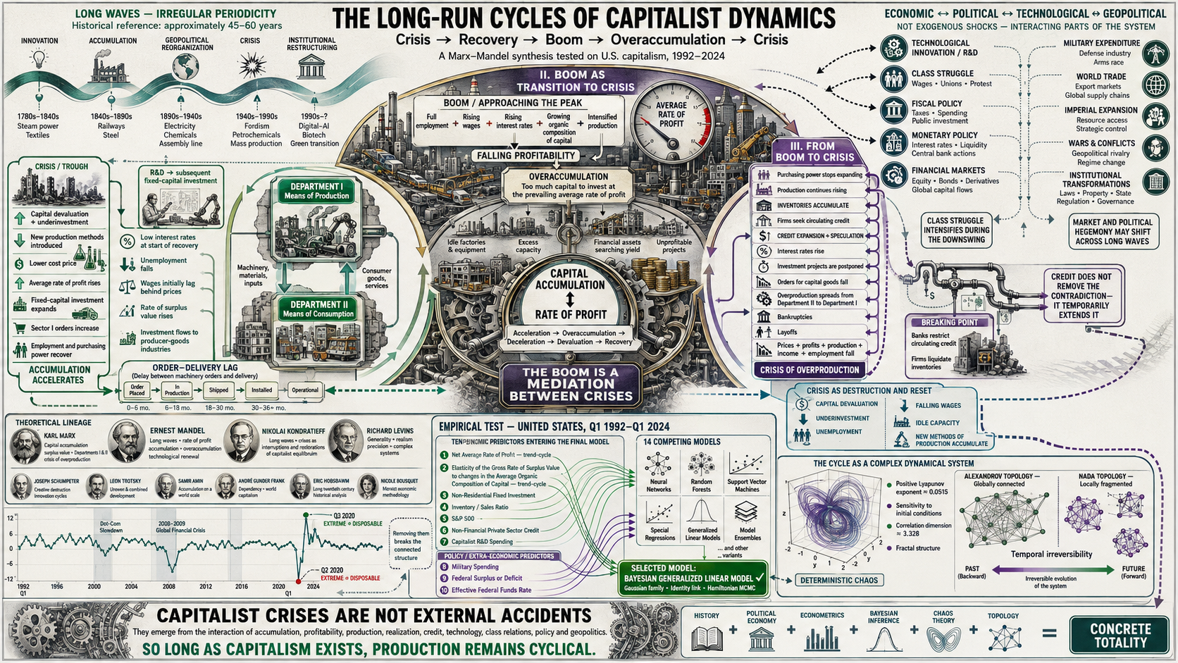
    A general theory of the cycles of the dynamics of the capitalist system in the long run — now available in English

    Every few years the same story is told twice. First, that the economy has entered a new era in which the old rules no longer apply. Then, some months later, that what happened was an accident: a shock, a bubble, a virus, a war. Both tellings share a premise so quiet that it is rarely examined — that the rise and the fall are separate events, and that a good theory of the good years need not be a theory of the bad ones.

    The thesis released today argues the opposite, and then goes to some length to measure it. The boom and the crisis are not two phenomena but two moments of one: the crisis of overproduction is the mechanism by which capitalism restores the conditions of an accumulation that its own success had eroded. Devaluation clears the field; new methods of production are introduced under duress; profitability recovers on the ruins. The recovery is not the negation of the crisis. It is its product.

    That claim is old. What is new here is the attempt to make it decidable — to state it in a form that quarterly data on the United States economy between 1992 and 2024 could have contradicted, and then to check whether they do.

    Three questions, and why the order matters

    The investigation is organised around one general objective — to analyse the long-run cyclical behaviour of U.S. capitalism in the light of the dominant economic theories — and three specific ones, asked strictly in this order:

    • Which theory explains and predicts best? Not which is most elegant, or most widely taught, but which survives being pointed at the data.
    • Which factors generate the cycle? Economic and extra-economic alike — the thesis refuses in advance to treat wars and monetary policy as noise sitting outside a clean economic mechanism.
    • By which rules do those factors interact? A list of causes is not a theory. The theory is in the grammar that binds them.

    The order is not decorative. A great deal of applied economics answers the third question with machinery borrowed from a theory it never subjected to the first. Here the selection of the framework is itself a result, defended before it is used.

    Five families of an old argument

    Before measuring anything, the thesis maps the terrain. Economic thought on the cycle is sorted into five groups: the pre-Kondratieff non-heterodox schools; the Kondratieff school; the post-Kondratieff marginalist and neoclassical schools; the heterodox schools; and the historiographic vision of long waves, which reads the cycle through the archives rather than through the equations.

    With that map in hand, three long-running disputes are adjudicated rather than summarised. Does the crisis originate in overproduction or in underconsumption? Is a sustained expansion of credit a symptom of recovery, or of the exhaustion of the conditions that made recovery possible? Is there really an inverse relation between inflation and unemployment, or is the appearance of one an artefact of the precariousness of the labour market? Each is answered, and each answer carries consequences later, when the model is specified.

    A framework that states its own conditions of failure

    A substantial part of the theoretical apparatus is devoted to a materialist characterization of the dialectical method: its fundamental categories, a Marxist ontology built from a metalogical gnoseology, and an explicit treatment of verification, falsification and decidability. The purpose is unglamorous and indispensable — to fix, in advance, which propositions of the theory are empirically decidable and which are interpretive. Without that boundary, no amount of subsequent statistics can tell you what has been tested.

    Ten dials, seven of them internal

    The empirical core is a Bayesian generalized linear model of the growth of U.S. real output, estimated with Hamiltonian Monte Carlo and cross-validated against machine-learning and deep-learning competitors. It retains thirteen coefficients across ten factors. Seven are economic:

    FactorWhat it registers
    Net Average Rate of Profit (ARoP)The central variable of the accumulation process, and the one whose long-run tendency the theory predicts.
    Elasticity of the gross rate of surplus value to the average organic composition of capitalHow the exploitation of labour power responds when the technical structure of capital changes.
    Non-residential fixed investmentThe pace of accumulation in the productive sector; the hinge between boom and crisis.
    Inventory-to-sales ratioThe gap between producing value and realising it on the market.
    S&P 500Financialization, entering through a natural cubic spline with three degrees of freedom.
    Non-financial private sector creditThe credit system as the accelerator and the brake, splined with two degrees of freedom.
    Capitalist R&D spendingThe innovative impulse; the second largest coefficient in the model.

    And three are extra-economic: military spending (splined with three degrees of freedom), the federal surplus or deficit, and the effective federal funds rate. Their presence is not a concession to realism. It follows from the argument that an imperial economy counteracts the tendency of its own profit rate to fall by means that are not internal to its national accounts.

    The Average Rate of Profit carries the fourth largest coefficient of the thirteen — behind only the intercept, R&D spending, and one basis function of the splined S&P 500. The conclusion the author draws from its behaviour is worth quoting in substance: what is favourable to the global process of capital accumulation is not thereby favourable to the dynamics of aggregate growth. The two are not the same quantity, and treating them as one is precisely the confusion the cycle punishes.

    Note, too, what the splines are doing. Three of the ten factors would not sit still in a straight line. That is not a technical footnote: it is the first quantitative sign that the interaction of these factors involves thresholds and turning points rather than a stable proportionality.

    Not random. Chaotic.

    “Unpredictable” and “random” are not synonyms, and the difference decides what kind of science economics can be. A random system has no internal structure to find. A chaotic one is rigidly determined and still unpredictable at long horizons, because arbitrarily small differences in initial conditions grow exponentially apart.

    Three measurements place the U.S. economy in the second category. The Lyapunov exponent is positive (approximately $0.0515$): small perturbations amplify rather than dissipate. The correlation dimension is not an integer ($3.32798$): the attractor reconstructed by Takens’ theorem has a fractal structure, patterns repeating across scales of time and magnitude — which is what “cyclical, but not periodic” means when it is stated precisely. And recurrence quantification finds high determinism alongside variability in laminarity and in the maximum diagonal line length: underlying deterministic structures that themselves evolve.

    $\lambda > 0 \quad\text{with}\quad D_2 = 3.32798 \notin \mathbb{Z}$

    Read together, these say something a forecaster should find sobering and a theorist should find encouraging. The long-horizon forecast is not merely hard; it is structurally bounded. But the structure that bounds it is real, stable and measurable — which is exactly what a theory of the cycle needs to have something to explain.

    The shape of time

    The most unusual instrument in the thesis is topological. The idea is to stop asking how big the numbers are and start asking which observations can see which. Convert the series into a directed visibility graph — a link from one quarter to another when the second is visible from the first over the intervening data — and study the order structure that results.

    Two topologies are built on it, and they disagree in an informative way.

    • The coarser Alexandrov topology, built on temporal reachability, turns out to be connected. At the level of its order structure the economy is globally a single piece: every observation is bound to every other by chains of temporal visibility. There is no quarter that stands apart.
    • The finer Nada topology is locally fragmented — six components under the natural visibility graph, thirty-six under the horizontal one. Zoom in, and the fabric shows seams: structural discontinuities at the level of closed neighbourhoods.

    Global unity and local rupture at once. That duality is not a contradiction to be resolved; it is the object being described. And a third measurement gives the whole thing a direction: the bitopological analysis yields $D = +4$, meaning that expansions generate more temporal visibility than contractions. The cycle is not symmetric in time. Growth accumulates gradually and in view; collapse happens abruptly and blind. Run the film backwards and it is recognisably the wrong film.

    ⚠️ Why you must not “clean” the crises

    There is a habit in applied work of treating extreme values as contamination and smoothing them away by discontinuous imputation. Here that habit is shown to be a category error with a measurable price. The extreme fluctuations of the 2020 crisis belong to a connected block even under the finer topology; severing them is a topological rupture, not a cleaning operation. The thesis reports the consequence directly: models fitted after such imputation performed worse, because one was using predictors suited to one phenomenon — real output growth — to predict a qualitatively different one: real output growth after the crisis had been removed from it. The crises are not noise around the cycle. They are the cycle.

    The grammar of the cycle

    The third question receives a seven-part answer. The factors interact through feedback (the rate of profit shapes investment, investment shapes the organic composition of capital, which feeds back into the rate of profit); time lags (R&D and fixed investment pay out on a delay, and the delay is itself cycle-generating); non-linearity (thresholds and regime changes, which is why three factors needed splines); deterministic chaos; sectoral interdependence between the department producing means of production and the one producing means of consumption; topological structure, global connectedness with local fragmentation; and the influence of the global context, which is how military spending and the S&P 500 enter a nominally domestic account.

    The unifying claim is that each phase of the cycle contains the seed of its own negation. New methods of production introduced during the crisis lay the foundations of the next boom; the overaccumulation of the boom prepares the ground for the next crisis. Innovation initially arrests the fall of the profit rate and ultimately deepens it — through the way the degree of exploitation of labour power responds, over time, to the very methods introduced to raise it.

    What a cycle is for

    The thesis closes on a question most treatments never pose. If the cycle is a mechanism, what does it accomplish? Two answers, at different depths. Its intermediate practical end is to restart the process of capital accumulation once instability has reached a critical level — this the mechanism achieves, repeatedly, at a cost borne unevenly. Its definitive practical end is to lay the material and spiritual conditions for a reorganization of the fundamental productive structure of society, one capable of a stability beyond what the capitalist mode of production can reach within its own limits.

    What this establishes, and what it does not

    The evidence supports the claim that classical Marxist economic theory possesses the greatest explanatory and predictive capacity for long-run cycles among the theories examined here, on this economy, over this period. It is a comparative result on the United States between 1992 and 2024, quarterly — not a universal proof, and not a forecast. The thesis is explicit about the cost of its own data: the Average Rate of Profit and the average rate of surplus value were available only annually through 2020, and completing the series to 2024 required temporal disaggregation and prediction, which puts a wider band of uncertainty around the most recent quarters. The philosophical, historical, conceptual and statistical scope of each result is distinguished in the text, and results unfavourable to the hypotheses are reported alongside the favourable ones.

    About this edition

    This is the English edition of a thesis originally written in Spanish and submitted to the Universidad Latina de Costa Rica for the degree of Licentiate in Economics. It is interdisciplinary by construction, drawing on Marxist political economy, dialectical and historical materialism, the history and historiography of economic thought, the philosophy and methodology of science, econometrics, Bayesian statistics, the theory of complex systems and topology.

    The edition carries a Note on the Translation that fixes the rendering of the terms whose Spanish usage is technical and not interchangeable with their nearest English cognates — gnoseology, sublation, long wave, solvent demand, technique — and records the editions from which quotations are taken, including the two distinct English and Spanish editions of the Soviet philosophical dictionary, which are cited under different transliterations because they are different books with different pagination.

  • SOME REFLECTIONS ON MARX’S PRICES OF PRODUCTION

    SOME REFLECTIONS ON MARX’S PRICES OF PRODUCTION

    Was Marx Wrong About Prices of Production? — A 260-Page Investigation Says No

    Political Economy • Econometrics • Marx

    Was Marx Wrong About Prices of Production?
    A 260-Page Investigation Says No.

    How one researcher spent years showing that the most famous critique of Marx’s economics rests on a mistake Marx never made.

    Based on: Gómez Julián (2026), “Some Reflections on Marx’s Prices of Production” — Introduction, Conclusions & the Formal-Empirical Chapter · DOI 10.5281/zenodo.21842251

    A Fatal Flaw, or a Fatal Misreading?

    For over a century, a single mathematical argument has been wielded as the definitive proof that Karl Marx’s economics doesn’t work. It goes like this: Marx claimed that the value of goods is determined by the labor that produces them, and that market prices eventually gravitate toward “prices of production” — modified versions of those labor values, adjusted for how capital-intensive each industry is. But when you try to verify this with a system of simultaneous equations, the numbers don’t add up. The sums of values don’t equal the sums of prices. The theory, critics have said since the early 1900s, contains a fatal algebraic error.

    This paper — spanning 260 pages and drawing on philosophy, history, sociology, and statistics — argues that the error was never Marx’s. It was the error of the people who checked his math using a method he never used.

    The Photograph vs. the Movie

    Imagine you’re trying to understand a river. You could take a photograph of it — capturing one frozen moment — or you could film it as a movie, watching how the water flows over time. For over a hundred years, the economists who criticized Marx took a photograph of his theory and then complained that it didn’t look like a movie.

    Here’s the specific issue. Marx described a two-step process: first, a general rate of profit forms across the entire economy; then, each industry’s price deviates from its pure labor value according to how much capital it ties up relative to the average. The standard critique — originating with Ladislaus von Bortkiewicz in 1907 and repeated ever since — takes all of Marx’s accounting identities and solves them simultaneously, as if input prices and output prices were determined at the same instant. Under that framework, Marx’s three aggregate equalities cannot all hold at once.

    The “inconsistency” that has been attributed to Marx for over a century is the inconsistency of the simultaneous-dualist framework that was imposed on him, and it dissolves as soon as time is restored. — Gómez Julián, summarizing the central thesis

    But here’s the catch: solving everything simultaneously is equivalent to assuming that the economy is a photograph — that there is no time. And Marx’s entire framework is built on the opposite premise: that the economy is a process, an unfolding sequence in which the prices that exit one period become the input prices that enter the next. Once you restore that temporal dimension, the “inconsistency” vanishes. The three equalities hold simultaneously — not because Marx was secretly consistent in some miraculous way, but because the contradiction was an artifact of the framework imposed on him, not of his own logic.

    The paper calls the simultaneous approach “Walrasian Marxism” — a phrase that captures the irony: economists imported the logic of Léon Walras’s general equilibrium theory and used it to read Marx, then blamed Marx when the result didn’t work.

    In Plain Language

    Marx was accused for over a century of getting the arithmetic wrong. What actually happened is that someone redid his arithmetic under an assumption he never made — that the prices of things you buy to produce and the prices of things that come out of production are the same prices, set at the same time. If you assume that, Marx’s accounts don’t close. But that assumption is equivalent to saying the economy doesn’t happen in time.

    But Was the Movie Real?

    Pointing out that Marx’s logic works when you read it correctly is necessary but not sufficient. The “temporalist” school has been making this argument for nearly fifty years. But the author noticed a critical gap: nobody in that school had ever taken real-world data and actually estimated the three types of prices Marx described — direct labor values, prices of production, and market prices — and then tested whether market prices actually gravitate toward prices of production as the theory predicts.

    This matters because, as the paper puts it, leaving the correct reading of Marx “in the territory of conceptual argumentation while the incorrect reading occupies alone the territory of measurement” is a strategic vulnerability. If you can’t show that real prices behave the way your theory says they should, your theory remains a philosophical argument, however internally consistent.

    But before presenting any numbers, the paper devotes substantial space to establishing that the process Marx described actually happened in history. This is not an appendix; it’s a foundational part of the argument.

    Before Capitalism

    In pre-capitalist societies, exchange was regulated by labor time — not because someone enforced a theory, but because the material conditions made it so. Barter was dominant, inflation did not exist, and prices could only reflect production costs given available technology. Evidence from anthropology (Malinowski’s Trobriand Islands studies), sociology (Mauss on gift exchange), accounting history (Kula’s analysis of feudal estate records), and even paleogenomics all converge: objects were valued in proportion to the labor they embodied.

    The Transition

    The dissolution of feudal relations, the monetization of exchange, and the destruction of pre-industrial normative frameworks created the conditions for capital to move freely between industries. Thompson’s work on the “moral economy” documents how the new free-market ideology had to be violently imposed, destroying customary protections and creating an unprecedented relationship of exploitation.

    Capitalism Established

    Once barriers to capital movement were destroyed, capital flowed from commerce to industry chasing higher profits, and generalized competition forced a redistribution of total surplus value across sectors. The crisis of 1873 — which destroyed nearly half the blast furnaces in major iron-producing countries — is presented as concrete evidence of the mechanism: firms whose costs were still based on older, individually more labor-intensive methods went bankrupt when they couldn’t compete with prices of production dictated by modern technology.

    In Plain Language

    Prices of production didn’t appear the day someone wrote an equation. They appeared the day capital could freely move from one industry to another chasing the highest profit — which didn’t happen until legal, moral, and political barriers were destroyed. Before that, things were exchanged roughly according to the labor they cost, and there is more than enough evidence — ethnographic, accounting, archaeological, and genetic — to show it.

    What Is a Production Price, Exactly?

    This is where the paper moves into its most technically original territory. The author carefully separates two things that must not be confused:

    What a production price is (the explanandum): it is the expected value, over the distribution of economic perturbations, of the long-run time average of market prices. In plain language: it’s the center of gravity around which actual market prices keep spinning. Not the price they arrive at and stay at (that would be equilibrium), but the average around which they never stop oscillating.

    Key Concept

    The production price is neither an eternal, timeless equilibrium (the error of the simultaneous approach and of Walrasian economics, which takes the law as such for the whole and eliminates time) nor a chaos of prices without law (the error of empiricism, which stays at the level of individual prices and loses the law). It is the law of the whole realizing itself through the contingency of the parts.

    How each step of the process works (the explanans): a rule that determines this year’s market price from last year’s market price and last year’s latent production price, and nothing else. This is modeled as a hierarchical Ornstein-Uhlenbeck process — a three-level cascade in which the production price is itself a latent state with its own dynamic gravitating toward value, and market prices gravitate toward that latent state rather than toward a fixed, noisy index.

    The uncertainty is built into the model explicitly: uncertainty in the average rate of profit, uncertainty in the advanced capital, uncertainty in the disaggregation of national accounts into 37 sectors (handled through multiple imputation with 25 imputations combined by Rubin’s rule), and parametric uncertainty estimated through Bayesian Markov Chain Monte Carlo methods.

    One crucial point: no magnitude is obtained by solving a simultaneous system. Value is constructed empirically and directly as $V = c + v + p$ (cost plus surplus value), and production price as $\Phi = c + K \cdot G’$ (cost plus capital times the general rate of profit). There is no Leontief inversion, no simultaneous algebra, anywhere in the construction.

    In Plain Language

    Think of a production price as the “gravitational center” of a spinning object. The object (a market price) never stops moving — it wobbles, it swings, it drifts — but over time its average position is pulled toward that center. The math describes both what the center is and how each wobble happens, and it does so while honestly accounting for all the uncertainty in the measurement.

    The Defining Equations: (9) Through (11)

    Here is where the metaphor turns into mathematics. The paper writes the definition of a production price in three successive steps — each one making explicit an assumption the previous step left implicit — numbered (9), (10), and (11) in the original text. None of the three generates a trajectory by itself; together they define the explanandum — what the object is — that the cascade below then generates.

    Equation 9 — What a Production Price Is
    $$ \lim_{t\to\infty} E\!\left[\varphi^i_t\right] \;=\; k^i_t + K^i_t\, E\!\left[G'(t,X)\right] \;=\; \Phi^i_t $$

    Here $\varphi^i_t$ is sector i’s market price at time $t$, $k^i_t$ is its cost price (constant capital consumed plus variable capital), $K^i_t$ is the total capital advanced, and $G'(t,X)$ is the general rate of profit — itself a stochastic process indexed by a perturbation $X$ that bundles the exodus of capital between branches and technological innovation.

    In words: a production price is the long-run limit of the average market price. Not the price itself at any instant — that keeps oscillating forever — but where its time-average settles as the horizon stretches out. Notice the object on the right-hand side, $k + K \cdot E[G’]$: it is the same accounting identity introduced earlier (cost price plus the average profit rate applied to capital advanced), except the profit rate is now written as an expectation, because it fluctuates.

    Equation 10 — Making the Averaging Explicit
    $$ \Phi^i_t = \lim_{t\to\infty} E\!\left[\varphi^i_t\right] = \int_{-\infty}^{\infty} \!\left(\lim_{t\to\infty} \varphi^i_t(x)\right) f_X(x)\, dx \;=\; k^i_t + K^i_t \int_{-\infty}^{\infty} G'(t,x)\, f_X(x)\, dx $$

    $f_X$ is the probability density of $X$. The equation says the expectation is an average over every possible state $x$ of the system’s turbulence, weighted by how likely that state is.

    Equation (10) earns its keep by making a subtle move legitimate: swapping the order of the limit and the expectation. That looks harmless, but it hides a real question — does the market price $\varphi^i_t$ even converge to anything as $t \to \infty$? The paper’s answer is no: a capitalist system doesn’t settle into a fixed point, it settles into a limit cycle — perpetual oscillation. So the convergence the argument needs isn’t of the instantaneous price, but of its cumulative time-average. That average does converge, for almost every state of the world, precisely because the system is ergodic — the fraction of time the cycle spends in each region of its orbit stabilizes. This is the Birkhoff ergodic theorem doing, in mathematical language, exactly what Marx says in economic language: the production price isn’t the value the market price reaches and stays at, it is the average around which it never stops oscillating. The oscillation isn’t an obstacle to the average — it is the average’s condition of existence.

    Why the Order of Operations Matters

    The paper invokes Lebesgue’s Dominated Convergence Theorem to justify swapping “limit of the average” for “average of the limit.” This requires bounding market prices by some integrable envelope — economically, that no price can grow without limit, which technological ceilings and competitive pressure guarantee — and, crucially, it does not require that the convergence be uniform across sectors. Uniform convergence would mean competition equalizes profits instantly and identically everywhere, with no room for a shock to hit one industry harder than another. Marx’s theory says the opposite, and the math is built to allow it.

    Equation 11 — When the Capital Base Is Also Uncertain
    $$ \Phi^i_t = \lim_{t\to\infty} E\!\left[\varphi^i_t\right] = \int_{-\infty}^{\infty}\!\!\int_{-\infty}^{\infty} \left[k^i_t + K^i_t(y)\, G'(t,x)\right] f_{X\mid Y}(x\mid y)\, f_Y(y)\; dx\, dy $$

    Equation (10) still treated the capital base $K^i_t$ as known exactly. Equation (11) drops that simplification: $Y$ is a second random variable carrying the estimation error in $K$, with density $f_Y$, and $f_{X \mid Y}$ lets the profit-rate perturbation depend on which realization of that error occurred. The object is the same double average — only now uncertainty is propagated from two sources instead of one.

    This last equation is not a mathematical flourish; it is the reason the empirical section spends so much effort on multiple imputation. National accounts don’t hand anyone a clean measurement of capital advanced by sector — it has to be reconstructed from incomplete data, and that reconstruction carries its own error. Equation (11) is the license to treat that error as a random variable to be averaged over rather than a nuisance to be ignored. The uncertainty is propagated externally — by a generator outside the statistical model itself — rather than estimated as an internal parameter of the dynamic model: estimating $K$’s error inside the model would confound it with the model’s own measurement-noise term, opening a ridge of non-identification between two magnitudes that the data alone cannot tell apart. Kept external, twenty-five complete reconstructions of the data are generated first, each respecting the Marxian aggregate identities to machine precision, the dynamic model is fit on each, and the twenty-five fits are combined by Rubin’s rule. That is the outer average of equation (11), computed by literally drawing from the distribution of $Y$ instead of assuming it away.

    The Engine: A Three-Level Ornstein–Uhlenbeck Cascade

    Equations (9)–(11) define the target; they don’t generate a path toward it. The explanans — the mechanism that actually produces a year-by-year trajectory consistent with that target — is a hierarchical Ornstein-Uhlenbeck process with up to three nested levels, fit as a single Stan program (the same program handles one, two, or three levels, which guarantees that adding levels can never silently break the simpler cases nested inside them). All series enter standardized; time is discretized one year at a time using the Euler–Maruyama scheme.

    Level 1 — The Market Price
    $$ dev_{t,s} = \varphi_{t-1,s} – \Phi_{t-1,s} $$
    $$ \kappa^m_{t,s} = \kappa_{\mathrm{cap}} \cdot \mathrm{invlogit}\!\left(\kappa_s + \beta_1\, z^{TMG}_t\right) $$
    $$ \Delta\varphi_{t,s} = \kappa^m_{t,s}\!\left(-\,dev_{t,s}\right) \;+\; a_{3,s}\, dev_{t,s}^{\,3} \;+\; \gamma\, COM^{std}_{t,s} \;+\; \varepsilon_{t,s} $$

    Subscripts $s$ (sector) and $t$ (year) run throughout. $dev$ is last year’s gap between market price and the latent production price. $\kappa^m$ is the sector’s reversion speed, passed through a logit link that caps it inside $(0, \kappa_{\mathrm{cap}})$ and lets the general rate of profit ($z^{TMG}$) modulate it without ever pushing the system out of the stable region of the discretization. $\varepsilon$ is a fat-tailed (Student-t), stochastic-volatility innovation, so volatility can cluster in time without destabilizing the mean.

    Read the Level 1 line as a spring. The term $-\kappa \cdot dev$ is the restoring force: it pulls the market price back toward the production price with a force proportional to how far it has drifted. The cubic term $a_{3,s} \cdot dev^3$, with $a_{3,s}$ constrained negative by construction — not estimated, imposed — makes that restoring force grow faster than proportionally once the deviation gets large: the further the market strays, the harder it snaps back. This is a declared stability assumption, not a discovery: it guarantees the model can never generate an explosive regime, at the real cost that if such a regime existed in some sector of the actual economy, this particular specification could not detect it.

    Levels 2–3 — Where the Latent Center Itself Reverts
    $$ \mu_{s,t} = m_{0,s} + m_1\, G’_t + m_v\, V_{s,t} $$

    The production price $\Phi$ is not treated as a fixed, observed index; it is itself a latent state that reverts — more slowly, with its own sector speed $\kappa_p$ — toward this mean $\mu$. $m_1$ is the channel running through the general rate of profit; $m_v$ is the coefficient measuring how strongly the production price tracks the directly-constructed value $V_{s,t} = k + p$ (Level 3, and the reason the cascade goes up to three levels rather than stopping at two).

    This is the bridge back to the abstract equations above, term by term. $\mu_{s,t}$ is the estimable stand-in for the right-hand side of (9): $m_{0,s} + m_1 G’_t$ plays the role of $k + K \cdot E[G’]$, and $m_v V_{s,t}$ is the specific functional form chosen for the value-tracking channel that the abstract definition deliberately leaves open (the paper is careful to say that capitalist competition as a function of the value structure is declared at the level of equations 9–11, not derived; giving it the concrete shape $m_v V$ is a modeling choice made at the cascade level, defended by how it performs under validation rather than deduced from the definition). And the expectation of $G’$ from equation (9) has its operational counterpart in the profit rate averaged across the twenty-five multiple imputations — the mechanism equation (11) licenses.

    The coefficient $m_v$ carries real theoretical weight: it is the empirical stand-in for Chapter 9’s claim that prices of production gravitate around values. It is given a neutral prior, $m_v \sim \mathcal{N}(0,\, 0.5)$ — centered at zero, symmetric, assigning equal plausibility to $m_v > 0$ and $m_v < 0$ before seeing any data. That matters for the same reason a fair coin matters in a coin-flip experiment: if the data carried no signal, the posterior would sit wherever the prior put it, hugging zero. It doesn’t. It lands at $m_v \approx 1.0136$ with $P(m_v > 0) = 1$ — evidence that the data moved it there, not the prior. The anchoring to value is found, not assumed into the setup.

    In Plain Language

    The cascade is three springs stacked on top of each other. The market price is tied by a spring to the latent, unobserved production price. The production price is tied by its own, slower spring to a moving target that blends the general rate of profit with the directly-measured labor value. Pull any one spring and let go: it doesn’t snap to a fixed point, it settles into the kind of perpetual, decaying oscillation that equations (9)–(11) describe as an average. The springs are estimated from sixty-one years of real U.S. data, not assumed; the coefficient tying prices of production to values, specifically, could have come back negative or zero — the model gave it every chance to — and it didn’t.

    What the Numbers Say

    The empirical core of the paper is a panel of 37 productive branches of the United States economy over 61 years, from 1960 to 2020. The hypothesis tested encloses three distinct relationships, and the paper is meticulous about not conflating them. Each is stated, tested, and reported separately.

    Market Prices ↔ Prices of Production: The Strongest Link

    This is the relationship with the firmest statistical support, confirmed through six independent lines of evidence:

    Central Finding

    Gravitation exists, and it is slow. The median speed across sectors is $\kappa_m = 0.0770$, equivalent to a half-life of approximately 9 years. Market prices take about a decade to cover half the distance toward their production-price center. This is consistent with Marx’s characterization of gravitation as a tendential, mediated regulation, not an instantaneous fit.

    The number is remarkably stable under stress tests:

    • Removing five of the six productive blocks from the panel barely moves the estimate — it shifts in the third decimal place. The sixth, which gathers 18 of the 37 sectors, does produce a shift (from 9 years to 6 years), and the paper decomposes it: about half the acceleration is the generic effect of halving the panel — removing 18 sectors at random already gives 0.0929 — and not the block itself.
    • Dismantling the value anchor in three different ways — including permuting surplus value across spheres — moves the speed in the third decimal place. This is significant: it means the conclusion about market-to-production gravitation does not depend on the less robust production-to-value link.
    • The market deviation has its own dynamic signature. Compared against a random walk matched in variance, three out of six test statistics separate cleanly (the weighted-sum convergence reaches a tolerance of 0.01 while the null never reaches a tolerance ten times more lenient; recurrence analysis laminarity triples the null; recurrence entropy doubles it). The ones that don’t separate are recurrence-analysis determinism and the two deterministic-chaos invariants — the Lyapunov exponent and the correlation dimension — which the paper never claimed to find.
    • The estimate is invariant to secondary methodological choices. Sweeping the latency regularizer across three values produces life medias of 9 years in all three arms (speeds of 0.0774, 0.0770, 0.0772).
    • The known bias of disaggregation pushes against the result. Splitting a national figure among 37 branches is underdetermined and biases speed estimates downward — meaning the true half-life is probably 7–8 years rather than 9. A bias that works against your conclusion is one you can live with, because the result holds despite it, not thanks to it.

    Prices of Production ↔ Values: The Thinnest Leg

    This is the weakest part of the empirical argument, and the paper states so with complete transparency. The problem is not a defect of the instrument but a property of the object:

    Methodological Transparency

    The coupling coefficient estimated within the dynamic model is $m_v = 1.0136$ with a 95% credible interval of $[1.0096,\; 1.0176]$ — but the same procedure returns 1.0365 when surplus value is permuted across spheres, preserving all annual aggregates. Why? Because production price and value share the cost price, which explains 66.1% of the variance of the former and 72.0% of the latter, and their correlation in levels is 0.9987. The coefficient would land near one even if the law of value didn’t hold at all. The paper therefore reports it as a consistency check, not as evidence.

    The real support for this relationship comes from cross-sectional tests, not from the dynamic coupling. When temporal common trends are removed and analysis is conducted within-year, the slope of the markup on own surplus value is 0.675 with the true data versus 0.090 under permutation, with intervals that don’t come close to overlapping. The sectoral ordering of the wedge between $\Phi$ and $V$ has an inter-annual rank correlation of 0.986 and a 60-year value of 0.558 — highly persistent structure, not noise.

    A collateral finding worth noting: the coefficient of variation of sectoral profit rates is 0.669 — meaning profit rates across industries show considerable and persistent dispersion. Far from contradicting the theory, this dispersion is the condition of existence of the mechanism: if profit rates were already equalized, there would be no differential to drive capital migration, and gravitation would have nothing to operate on. Marx postulates equalization as a tendency, not an accomplished fact.

    Market Prices ↔ Values: Sustained in Form, Adjusted in Existence

    The structural modification across sectors exists and is nonlinear (the nonlinearity step holds comfortably at 6.8 null deviations). But the existence step is adjusted: 44% of its gain is obtained equally with sectoral characteristics unpaired from their spheres, and the gap against the maximum null is on the order of one paired standard error. The coefficients survive a deliberately severe correction for serial dependence (tripling the error).

    The Instrument Behind That Number: A Nested Ladder in gdpar

    That test is a small ladder of nested distributional-regression models, fit with gdpar (Gómez Julián, 2026b), the author’s own R package for generalized distributional parameter regression, published on CRAN on July 15, 2026. The ladder climbs from a bare model — “the market-to-value ratio has no sector-specific correction at all” — through a model where organic composition, wage share, and sector size shift that ratio linearly, up to a model where the correction is a flexible spline rather than a straight line. Two gains matter, measured in units of predictive density: adding the linear correction buys 207.3 units; letting it curve buys another 215.1. Both were checked against a control built to be hard to pass — shuffling which sector gets which characteristics 99 times, refitting each time, with the spline’s knots held fixed across every shuffle so the comparison can’t be won by a better basis alone. The curvature gain clears its null with room to spare (6.8 null standard deviations; the best of 99 shuffles reaches only 114.8 against 215.1 observed). The existence gain is honestly reported as thinner: shuffled sectors still buy about 44% of the real gain merely by having some characteristics to fit — three covariates and an intercept give a model room to accommodate noise even when it is being told nothing true — so the genuine margin over the null sits at about one paired standard error (23.2, against a gap of roughly 24 units). Both numbers are reported together, precisely so the large one isn’t read alone.

    A companion specification, estimated in the same gdpar fit, asks the same question about dispersion rather than location: not where the market-to-value ratio is centered, but how tightly it clusters. Larger sectors and sectors with higher capital composition show systematically less relative dispersion — elasticities of $-0.226$ and $-0.104$ — consistent with equalization operating more effectively where capital is more concentrated. Both effects clear a “breaking factor” (the multiple of the standard error at which the 95% interval would first touch zero) north of six and four respectively, past the 2.94 ceiling reached anywhere else among this paper’s location coefficients, and the finding reproduces under a completely different likelihood family (a gamma distribution on the price ratio) to within 5.2%.

    Three Failures That Confirm the Theory

    One of the most intellectually striking features of this paper is how it handles results that, at first glance, look bad for its thesis. There are three, and the paper reports all of them without softening — then shows deductively why each one was expected if the theory is correct.

    Negative Result No. 1

    The model does not out-of-sample predict better than a random walk. But this was deductively implied by the slow form of the thesis. At a horizon much shorter than the half-life, a mean-reverting process is, to first order, a random walk. If something takes a decade to get halfway back, looking at a single year won’t let you see it return.

    Negative Result No. 2

    The value term is predictively indistinguishable. Again, this follows from the slow coupling between prices of production and values: with half-lives on the order of decades and only 61 years of data, univariate root-unit tests are structurally underpowered.

    Negative Result No. 3

    No univariate test separates the true wedge from its permuted placebos. But this was predicted before measuring, by the persistence of sectoral ordering itself (inter-annual rank correlation of 0.986). A highly persistent time series is hard to distinguish from its permuted version using tests designed for shorter memory.

    Finding these signatures is corroboration of the slow form of the thesis, and not finding them would have been the real problem. — Gómez Julián, on the negative results

    The paper’s stance on this is worth highlighting: “Lejos de refutar la tesis, los tres están deductivamente implicados por su forma lenta” — far from refuting the thesis, all three are deductively implied by its slow form. A single mechanism (slow gravitation) explains both the substantive thesis and all the apparently negative results, and it also survives in the validated posterior. “That a single cause explains the thesis and all the apparently negative results, and that it additionally survives in the validated register, is the opposite of a petitio principii: it is a unified, falsifiable, and internally validated narrative.”

    Temporalism Isn’t a Preference — It’s a Condition of Measurement

    Perhaps the most consequential result in the entire paper is not a number but a statement about what can and cannot be measured. It concerns the “modulator” — the component of Marx’s argument in which the general rate of profit enters into the structural modification of each sphere, meaning the deviation of each sphere is not independent of the reference but generated by it.

    The Identifiability Argument

    When the model was run with a single, fixed general rate of profit for all 61 years (as a simultaneous approach would require), the posterior exhibited a flat ridge: two completely different functional bases (a degree-two polynomial and a spline basis) produced the same pathology to the third decimal place, with an effective sample size of only six draws. The diagnostic got worse with more sampling (R-hat rising from 1.33 to 1.73). This is the unmistakable signature of a direction in parameter space along which the likelihood does not change.

    The cause is theoretical, not computational. With one fixed reference, the modulator can only be identified evaluated at that single point — a single number, not a function over the space of references. You cannot estimate three coefficients from a polynomial if you have one data point.

    When the reference was allowed to vary year by year (61 different general rates of profit), the model converged within minutes, with a large improvement in both time and effective sample size, and zero divergences.

    Named, Not Improvised: Theorems 1A and 1E

    This diagnosis isn’t an ad hoc read of a misbehaving sampler. gdpar (Gómez Julián, 2026b) — the same package behind the nested ladder above — ships a formal identifiability result for exactly this situation. Its Theorem 1A establishes that, with a single fixed reference point, a distributional modulator is identified only at that point: as one number, not as a function over the space of possible references. Theorem 1E is the positive counterpart: letting the reference vary restores identifiability of the modulator as a function. Fitting a degree-two polynomial (three coefficients) or a five-knot spline basis (five coefficients) against one single, unmoving reference asks for more than a single data point in that dimension can support — which is exactly what a flat likelihood ridge looks like from the sampler’s side.

    The figures behind the improvement, precisely: a fixed reference with a degree-two polynomial gives an R-hat of 1.7333, an effective sample size of 6, and 8 divergent transitions in 39 minutes; a one-knot spline basis reproduces the same pathology — R-hat 1.7335, effective sample size 6, 14 divergences, 5.6 hours. Letting the reference vary year by year (61 distinct annual values of the general rate of profit), centering the additive component and raising the sampler’s adaptation parameter to 0.99, gives an R-hat of 1.0035, an effective sample size of 1332, and zero divergent transitions — in 2.9 minutes. That is the 115-fold improvement in time and 222-fold improvement in effective sample size referenced above, and it is a theorem, not a tuning trick: no amount of additional sampling closes that gap under a fixed reference, because the object being asked for — the modulator as a function — simply is not there to find.

    The consequence is stated precisely: with a single fixed general rate of profit obtained by solving the system simultaneously, the claim of Chapter 9 of Volume Three of Capital is unverifiable by construction. It is not that the data are insufficient — the object is not identified, and no amount of data would identify it. The argument does not establish that simultaneism is false as a description of capitalism (that is established by historiography and sociology); it establishes that a simultaneous procedure cannot, even in principle, empirically verify the specific part of Marx’s argument that this work estimates.

    In Plain Language

    Marx says: first a general rate of profit forms, then each industry deviates from it according to how capital-intensive it is. To check whether the deviation depends on the general rate, you need to see what happens to the deviation when the general rate changes. If you calculate one general rate for the entire 61-year span, it never changes, and there is nothing to observe. That is exactly what happened: the model with one fixed rate doesn’t converge — not because of computational limitations, but because it is being asked to measure a relationship with a single observation of one of the two variables. Calculating one rate per year — which is what the temporal reading says you should do — the same model converges in three minutes.

    What This Is, and What It Isn’t

    The paper is careful, almost painstakingly so, about the limits of what it claims. This section matters because a reader coming from the “pro-Marx” or “anti-Marx” side might be tempted to over-read the results. The author doesn’t let you.

    What the evidence authorizes: In the United States between 1960 and 2020, market prices gravitate toward prices of production with a decadal half-life that is sectorially heterogeneous, and this speed survives three independent assaults (removing five of the six productive blocks, destroying the value anchor, varying secondary methodological decisions). This is a measured, calibrated, and falsifiable fact.

    What the evidence does not authorize:

    • It does not claim superior predictive power (the model does not out-predict a random walk, which was expected).
    • It does not claim that univariate root-unit tests confirm gravitation (they are structurally underpowered at this time scale).
    • It does not claim uniqueness or categorical novelty. The contribution is the explicit integration and canonization of a slow gravitation cascade with value anchoring, measured on real data, with propagated uncertainty, validated, and subjected to a diagnostic whose unfavorable results are reported alongside the favorable ones.
    • It does not claim that this statistically demonstrates the law of value, “and not for rhetorical prudence but because it would be false: a price series can show that a magnitude behaves as the law predicts, and cannot explain why that magnitude exists or whether the category with which we name it is the correct one.”

    That last point is the paper’s deepest epistemological commitment. Questions about whether “value” is the right category for what prices ultimately measure are not answerable by any price series, no matter how long. They are answered by history, sociology, and philosophy — and the firm answer is the one obtained when all four disciplines (those three plus statistics) point in the same direction. The four-dimensional convergence is the argument, not any single leg of it.

    The paper also addresses the homology that unifies its seemingly disparate halves — the historiographical-filosofical first chapter and the econometric second chapter. The relationship between necessity and contingency that governs the transition from feudalism to capitalism (where the same demographic shock produced opposite outcomes in different regions of Europe) is structurally identical to the relationship between prices of production and market prices. A law determines the center; circumstances determine each particular outcome. Neither fact negates the other, because they describe different levels of the same reality.

    What It All Adds Up To

    Here is the simplest version of what this 260-page paper establishes:

    Marx was reproached for a century for having done an arithmetic calculation wrong. What happened is that his calculation was redone under an assumption he never made: that the prices of things bought to produce and the prices of things that come out of production are the same prices, fixed at the same time. If you assume that, Marx’s accounts indeed don’t close. But that assumption is equivalent to saying the economy doesn’t happen in time. As soon as you accept that what exits the factory this year is what enters the factory next year, the accounts close without anyone having to fix anything. — Gómez Julián, Summary for the Reader

    But recognizing the conceptual error was only the first half. What had been missing — and what this paper contributes — is doing those accounts with real data instead of with fictitious numerical examples, which is what the school that had the correct conceptual reading had never done.

    The empirical results show that prices in the U.S. economy over six decades do behave as the theory predicts: they gravitate, slowly, toward prices of production calculated with Marx’s theory and no other. This finding survived every attack the author could devise — removing productive sectors, destroying the value anchor, permuting surplus values, varying methodological decisions, and running diagnostics whose unfavorable results are reported in full alongside the favorable ones.

    The part of the argument linking prices of production to labor values is also supported by real evidence, though less firmly, and the paper says exactly where the weak points are and why they are properties of the object, not defects of the instrument.

    And the paper does not claim to have demonstrated the law of value with a series of numbers, because “questions of that kind are not answered with numbers: they are answered with history, with sociology, and with philosophy, and the firm answer is the one obtained when the four things (the previous three, together with statistics) all point in the same place.”

    That convergence doesn’t make the result eternal — better evidence can overturn it tomorrow. But it makes it, for now, “our best possible approximation to the truth.”

    — — —

    “In science as in life, overcoming adversity is what makes us truly strong.”

    This post summarizes the introduction, conclusions, and the formal-empirical chapter (§2.4) of Gómez Julián, J. M. (2026). Some Reflections on Marx’s Prices of Production: Historicity of the Law of Value, Dialectical-Materialist Foundation, and Dynamic Formalization Under Uncertainty. Zenodo. https://doi.org/10.5281/zenodo.21842251. The full paper spans approximately 260 pages across two chapters covering philosophy, historiography, mathematical formalization, and empirical econometrics. Equations (9)–(11) and the model specification cited here reproduce that chapter’s notation; gdpar is cited separately as Gómez Julián (2026b).

    Written for the curious. An invitation to read.

  • BITOPOLOGICAL SPACES: LISTENING TO THE DIRECTION OF TIME WHEN IT MATTERS

    BITOPOLOGICAL SPACES: LISTENING TO THE DIRECTION OF TIME WHEN IT MATTERS

    Bitopological Spaces: Listening to the Direction of Time When It Matters

    Bitopological Spaces: Listening to the Direction of Time When It Matters

    How two topologies — built from the same data — can hear the difference between past and future

    Most of the tools we use to analyze sequences of data — averages, correlations, spectral analyses — treat time as a label that could run in either direction without changing the answer. Reverse the order of your data points and many standard methods give you identical results. But in the real world, the direction of time matters profoundly. Economies expand slowly and crash suddenly. Heartbeats rise smoothly and fall steeply. A method blind to direction is a method blind to one of the most fundamental features of how systems change.

    A recent paper by independent researcher José Mauricio Gómez Julián introduces a construction that addresses this gap. Taking a known method from graph theory and extending it to directed graphs, the paper produces a pair of topologies — mathematical frameworks for understanding structure and connectivity — whose divergence is a topological fingerprint of temporal irreversibility. Applied to three decades of American economic data, the method recovers a picture that is both mathematically precise and economically interpretable. Here is a walk through the main ideas.


    Seeing and Being Seen

    The starting point is a beautifully simple idea introduced by Lucas Lacasa and collaborators in 2008. Imagine plotting a time series — say, 129 consecutive quarterly growth rates of U.S. GDP — as points above a timeline. Now connect two points with a line if they can “see” each other: the straight segment between them passes above every intermediate data point, as if you stood at one point and shone a flashlight toward the other with no obstacles in the way.

    The result is a visibility graph: a network whose nodes are time points and whose edges encode a geometric relationship. Visibility graphs have been used to classify chaotic systems, detect heartbeat anomalies, and distinguish between types of economic regimes. They translate the shape of a time series into the structure of a graph, opening the door to the vast toolkit of network science.

    But standard visibility graphs are undirected: an edge between two points does not record which one came first. If you orient each edge from the earlier time point to the later one, you obtain a directed visibility graph — a directed acyclic graph in which the arrows always point forward in time. This orientation carries information about temporal asymmetry that the undirected graph throws away entirely.

    From Networks to Structure

    Here is where the paper’s contribution begins.

    In 2018, Huda Nada and collaborators introduced a procedure for turning any undirected graph into a topological space. For those unfamiliar with the term, a topology is a mathematical framework that defines what it means for groups of points to be “open,” for sets to be “connected,” and for spaces to have “structure.” It operates at a level more abstract than distances or coordinates — it captures the pattern of how sets overlap and separate.

    The Nada construction works as follows. For each vertex of the graph, compute its closed neighborhood: the vertex itself plus all of its immediate neighbors. Take this family of neighborhoods and generate a topology by closing it under two operations: finite intersections (combine neighborhoods by overlapping them) and arbitrary unions (combine neighborhoods by collecting them). The result is a topology on the vertex set, and its invariants — connected components, separation properties, component counts — capture structural features of the graph.

    This procedure is universal: it works for any family of subsets of any set. The mathematical content lies in identifying the right family to use.

    Gómez Julián’s key observation is that for a directed graph, you do not get one family of neighborhoods — you get two. For each vertex:

    The forward closed neighborhood includes the vertex itself and all the vertices it points to — the later time points it can see. The backward closed neighborhood includes the vertex itself and all the vertices that point to it — the earlier time points from which it is visible.

    Apply the Nada procedure to the forward neighborhoods and you get a topology τ+. Apply it to the backward neighborhoods and you get a topology τ. The resulting triple (V, τ+, τ) is what mathematicians call a bitopological space: a set equipped with two topologies simultaneously, a concept introduced by John Kelly in 1963.

    The extension is, in a precise mathematical sense, trivial — the topology axioms do not care where the generating family came from. But recognizing this trivial extension as the right thing to do, and showing that the resulting bitopological structure captures something real about temporal asymmetry, is the paper’s central insight.

    When Two Topologies Disagree

    If the process generating your data is symmetric — equally likely to go up as down, at the same speed — then the forward and backward neighborhoods are statistically exchangeable. The two topologies τ+ and τ look the same, and the bitopological structure adds nothing beyond the undirected construction.

    But if the process is asymmetric, the two topologies diverge. Consider the prototypical asymmetry of economic and physical systems: gradual expansion followed by sudden contraction. Forward visibility through a gradual rise connects many points — each point can see far ahead through the gentle slope. Backward visibility through an abrupt drop connects few — the sharp fall blocks the line of sight. The forward topology ends up more connected (fewer separate components) than the backward topology.

    This divergence is the topological fingerprint of temporal irreversibility. The paper defines three quantitative measures of it:

    The asymmetry direction Δ = C − C+, where C+ and C are the numbers of connected components in the forward and backward topologies. Positive Δ means the forward topology is more connected. The component-count irreversibility index IC, which normalizes the difference to lie between 0 and 1. And the base-size irreversibility index IB, which measures the analogous difference in the sizes of the generating bases.

    These are pure numbers — no calibration, no free parameters, no training data. They emerge from the structure of the data and the construction itself.

    If you reverse the direction of time in your data and the topologies change, something in the process that generated the data is irreversible — and the gap between the two topologies measures exactly how much.

    Peeling the Onion: Three Layers of Structure

    One of the paper’s most clarifying contributions is the identification of three nested layers of topological structure on the same time series, each revealing different information.

    Layer 1 — The Alexandrov topology (reachability). For a directed acyclic graph, the most basic topology treats as “open” any set that is closed under forward reachability: if a node is in the set, all its descendants are too. This topology has exactly one connected component for any weakly connected graph, because every node can reach every later node through some directed path. At this level, the system is globally indecomposable. It tells us what we already know: the economy is a single connected process in which each quarter influences every subsequent quarter through chains of causation.

    Layer 2 — The undirected Nada topology (local fragmentation). When you apply the Nada construction to the undirected shadow of the visibility graph, the topology fragments dramatically. The intersection closure of the neighborhoods reveals clusters of time points that share local structural similarity — groups of observations linked by overlapping visibility neighborhoods — that go beyond mere reachability. This layer uncovers genuine structure that the reachability topology hides entirely.

    Layer 3 — The bitopological layer (temporal asymmetry). When you split the construction into forward and backward, a further distinction emerges. The forward and backward topologies have different component counts — and the difference is invisible to the undirected construction and invisible to the Alexandrov construction. It lives only in the gap between the two directed topologies.

    Each layer is contained within the next: the Alexandrov topology is a subtopology of the Nada topology (a theorem proved in the paper), which in turn underlies the bitopological structure. But each coarser layer hides information that the finer layer reveals.

    What the American Economy Looks Like Through a Topological Lens

    The paper applies the full pipeline to the quarterly growth rate of U.S. real GDP from Q1 1992 to Q1 2024 — 129 observations spanning the dot-com bust, the Global Financial Crisis, and the COVID-19 shock. Two graph constructions are used: the Horizontal Visibility Graph and the Natural Visibility Graph, both in their directed forms.

    The headline finding is that Δ = +4 in both constructions. The forward topology has 4 fewer connected components than the backward topology, regardless of which visibility-graph variant you use. This positive value is consistent with the well-documented asymmetry of the American business cycle over this period: expansions are gradual and sustained (1992–2000, 2001–2007, 2009–2020), while contractions are sharp and short-lived (2001, 2008–2009, 2020). Forward visibility through a gradual expansion is unobstructed; backward visibility through an abrupt contraction is fragmentary.

    What makes this finding compelling is its invariance. The HVG and NVG produce very different graphs — 248 vs. 406 edges, different base sizes, different absolute component counts — yet they agree on the sign and magnitude of Δ. The signal appears robust: a feature of the underlying data, not an artifact of how you choose to draw the graph.

    Another detail worth noting: the base-size irreversibility index IB is exactly zero in both constructions. The forward and backward topologies are generated by bases of equal size (250 and 250 for the HVG, 239 and 239 for the NVG). The asymmetry lives entirely in the structure of those base elements and how their intersections distribute — not in how many there are. The two topologies are built from the same number of building blocks, but those blocks fit together differently depending on whether you are looking forward or backward through time.

    A Single Shock

    Perhaps the most striking empirical finding is what the topology says about the COVID-19 shock.

    The second quarter of 2020 recorded the sharpest contraction in U.S. GDP on record — an annualized rate of roughly −31%. The third quarter recorded the sharpest rebound — roughly +33%. These are the two most extreme observations in the entire 129-quarter series, opposite in sign and opposite in economic interpretation.

    A naive analysis would naturally separate them: one is the worst crash, the other the best recovery. They sit at opposite ends of the value spectrum.

    But the Nada topology classifies them together. Under both the undirected and directed topologies, under both the HVG and NVG, these two observations belong to the same connected component.

    Why? Because the topology is not a proximity measure. It does not group points by how close their values are. It groups them by the structure of their visibility neighborhoods — which other points they can see, and how those visibility patterns intersect. Despite their extreme and opposite values, the two quarters share neighborhoods that overlap substantially. The intersection closure, which drives the Nada construction, puts them in the same cluster.

    This matches the interpretation most economists give to the event: the contraction and the rebound are two phases of a single exogenous shock, driven by the same underlying cause — the pandemic and the policy response to it. The topology recovers this interpretation from the geometry of the data alone, without any economic priors built in.

    What the topology does not claim: it does not say that the two quarters are “similar” in value (they are the two most distant observations in the entire series). It says they are structurally linked — that no topological open set separates them. The construction responds to the combinatorics of visibility, not to the metric of distance.

    Certifying the Construction

    The paper takes reliability seriously at three levels.

    Machine-checked proofs. The central theorem and related core results have been formalized in Lean 4, a proof assistant, against the Mathlib mathematical library. A computer has verified that the proofs are logically correct, with no gaps or hidden assumptions. The formalization is archived alongside the paper as part of a reproducibility bundle on Zenodo.

    Polynomial-time algorithms. Every step of the construction has an explicit algorithm with proven complexity bounds. The connected components of each topology can be computed in polynomial time without enumerating the full topology, which can be exponentially large. The key trick is to work through a combinatorial proxy for the topology called the specialization preorder, using bitset operations that are highly efficient in practice.

    Honest uncertainty. A three-valued decision procedure for pairwise connectedness reports “pairwise connected,” “pairwise disconnected,” or “undecided” — the last when the computation exhausts its resource budget. Rather than guessing, the algorithm honestly reports that it has not finished the work. This is a methodological commitment as much as a technical one: a topological statement counts as established only when the computation has completed the work that establishes it.

    No free parameters. The construction has no tuning knobs. The topological invariants — component counts, base sizes, irreversibility indices — are determined entirely by the data and the definitions. There is nothing to calibrate, nothing to overfit.

    A New Lens

    The paper does not propose to replace existing methods of time series analysis. Correlation, spectral analysis, regime-switching models, and the many other tools of econometrics and statistics capture information that topology cannot see: amplitude, frequency, distributional shape. The paper is explicit about this complementarity.

    What the topological construction offers is a new lens — one that responds to the relational structure of a time series rather than its metric structure. It asks not “how big is this change?” but “what does this change connect to, and what does it disconnect from, and is the answer different depending on which direction in time you are looking?”

    For systems where temporal asymmetry is a defining feature — business cycles, climate dynamics, physiological signals, causal event sequences — this lens may reveal structure that traditional tools, by their very construction, cannot see.

    The application to U.S. GDP is a proof of concept. The construction is general: it applies to any time series that can be turned into a directed visibility graph, which is to say, any time series at all. Whether the invariants it produces are useful features for classification, prediction, or interpretation in broader contexts is an empirical question that the paper opens but does not close.

    What it does establish is this: there exists a construction that takes a time series, produces two topologies from it, and quantifies the gap between them as a measure of temporal irreversibility. The construction is mathematically sound, mechanically verified, algorithmically tractable, parameter-free, and — when applied to the American economy across three turbulent decades — gives answers that make economic sense.

    That is a foundation worth building on.

    “Bitopological Spaces from Directed Graphs: Extending the Nada Construction to Capture Temporal Irreversibility” by José Mauricio Gómez Julián is available at Zenodo (v1.0.2, April 2026). The complete research compendium — Lean 4 formalization, R package, empirical dataset, and reproducibility notebook — is archived alongside it.

  • General Dynamic Parameter Models via Reference Anchoring

    General Dynamic Parameter Models via Reference Anchoring

    You can also find this library at CRAN and download it directly from R and RStudio.

    Also, we recommend viewing the mind map summary at the end of the article to better understand the relationship between the functions of the package.

    R Library Review

    Meet gdpar

    General Dynamic Parameter Models via Reference Anchoring

    In the fleeting calculus of a two-second decision—overtaking a car on a narrow road—the human brain performs a remarkable statistical trick. It does not build a model of the approaching driver from scratch. Instead, it retrieves a baseline: the average driver, representing typical reaction times and modal aggression. In a split second, it reads the specific signals of the actual driver—relative speed, vehicle type, micro-movements—and estimates how this specific driver deviates from the baseline. The decision to overtake emerges from that synthesis.

    This cognitive recipe—population reference + individual deviation—is the philosophical bedrock of the R package gdpar (General Dynamic Parameter models via Reference Anchoring) by José Mauricio Gómez Julián. The package takes this intuition, formalizes it as a rigorous statistical decomposition, proves the conditions under which it is mathematically identifiable, ships a Stan-based Bayesian engine to estimate it, and layers on causal inference, geometry-adaptive sampling, and dependence-robust inference.

    The Anatomy of Deviation

    Every layer of gdpar is an elaboration of a single, elegant equation. For each observation $i$ with covariates $x_i$:

    $$ \theta_i \;=\; \theta_{\text{ref}} \;+\; \Delta(x_i,\; \theta_{\text{ref}}) $$

    Read it as: the parameter of individual $i$ equals a population reference, plus a deviation that is itself a function of the individual’s covariates and of the reference itself.

    That final clause is where the architecture pivots from classical statistics. The deviation $\Delta$ does not merely depend on who you are (your covariates $x_i$); it depends on what the reference is. If you transplant the model to a new population, the deviation function behaves differently because $\theta_{\text{ref}}$ is one of its arguments. This structural dependence is the defining feature of “reference anchoring.” It distinguishes gdpar from random-effects or varying-coefficient models, where the deviation is structurally separate from the reference.

    So, what is the shape of $\Delta$? The package singles out a specific functional form called the Additive–Multiplicative–Modulated (AMM) decomposition:

    $$ \Delta(x,\theta_{\text{ref}}) \;=\; \underbrace{a(x)}_{\text{additive}} \;+\; \underbrace{b(x)\odot\theta_{\text{ref}}}_{\text{multiplicative}} \;+\; \underbrace{W(\theta_{\text{ref}})\,x}_{\text{modulated}} $$

    Three mechanisms, cleanly separated and independently interpretable:

    • $a(x)$ — A pure additive shift. Think of this as a traditional fixed-effect driven by covariates.
    • $b(x)\odot\theta_{\text{ref}}$ — A covariate-dependent scaling of the reference (using the Hadamard/elementwise product). This is where “the deviation depends on the reference” enters multiplicatively.
    • $W(\theta_{\text{ref}})\,x$ — Covariates are mixed through a matrix $W$ that is, itself, tuned by the reference. This is the explicit, structural reference-dependent channel.

    Standard models drop out as special cases. Set $\Delta \equiv 0$ and you have fixed-effects regression. Set $W \equiv 0$ and you have a hierarchical model with multiplicative interaction. Set $b \equiv 0$ and you have a varying-coefficient model. The AMM is the smallest natural family that contains all three and elevates the reference to an active argument of the deviation.

    The Three Estimation Engines

    gdpar defines three complementary engines for estimating $\Delta$. Crucially, only one is executable in the current release—a deliberate choice to promise a mathematical scope that exceeds the executable surface, and to say so honestly.

    Path Engine Representation Status
    Path 1 Hierarchical Bayesian (Stan) Parametric AMM ✅ Operational
    Path 2 Varying-coefficient (splines) Smooth $\beta(z)$ 🚧 Conceptual
    Path 3 Hypernetwork / Neural Net Net generates $\theta_i$ 🚧 Conceptual

    Paths 2 and 3 are documented to “reference grade”—full asymptotic theory (contraction rates, Bernstein–von Mises) is developed in the Wiki—but they abort with gdpar_unsupported_feature_error if invoked. Path 1 places priors on every component ($\theta_{\text{ref}}, a, b, W$) and samples the joint posterior with HMC, yielding native, full-posterior uncertainty.

    A Tale of Two Posteriors: EB vs. FB

    Within Path 1, gdpar offers two inferential regimes. Full Bayes (FB) via gdpar() samples the joint posterior, remaining most faithful to the cognitive analogy. Empirical Bayes (EB) via gdpar_eb() estimates the hyperparameters by maximizing a marginal likelihood via a Laplace approximation, then samples the remaining parameters conditionally.

    The EB vs FB Comparator

    Rather than forcing a choice, gdpar treats them as parallel routes. It ships a dedicated comparator, gdpar_compare_eb_fb(), which quantifies agreement on $\theta_{\text{ref}}$ and the reduced parameter vector $\xi$. The Wiki develops the theory to first-class depth: EB and FB lower-level posteriors agree asymptotically (Theorem 7A), while EB intervals under-cover by $O(n^{-1})$ (Proposition 7B). If you have ever wondered if EB is “good enough” for your data, gdpar lets you answer that empirically.

    Distributional Regression: Every Parameter is a Slot

    gdpar is not constrained to modeling the mean. A probability distribution has multiple parameters—location, scale, shape, tail index, zero-inflation probability—and each one can carry its own AMM decomposition. The package indexes these by $k = 1, \dots, K$:

    $$ \theta_i^{(k)} = \theta_{\text{ref}}^{(k)} + \Delta^{(k)}(x_i, \theta_{\text{ref}}^{(k)}), \qquad k = 1, \dots, K $$

    The built-in roster covers Gaussian, Poisson, negative binomial, Bernoulli, Beta, Gamma, Student-$t$, Tweedie, ZIP, ZINB, and hurdle families. Zero-inflated and hurdle models receive an especially elegant treatment: both the zero-inflation probability $\pi_i$ and the count parameter $\theta_i$ are anchored to their respective references—a dual deviation design.

    The Causal Bridge

    Because the AMM form produces individual parameters, individual treatment effects emerge naturally. gdpar_causal_bridge() implements a T-learner: fit the anchored model separately under treatment and control, then read the conditional average treatment effect (CATE) at $x_i$ as the difference of the anchored individual predictions:

    $$ \widehat{\tau}(x_i) = \widehat{\mu}_1(x_i) – \widehat{\mu}_0(x_i) $$

    A second layer, gdpar_compare_meta_learners(), benchmarks the AMM-based learner against external meta-learners via pluggable adapters: grf::causal_forest on the R side and EconML’s CausalForestDML on the Python side (via reticulate). The framework’s causal claims are benchmarked, not asserted.

    Mechanics & Clockwork

    Several engineering decisions elevate gdpar from a theoretical exercise to a serious computational environment:

    • Stan Code Generator: Composes programs from canonical pieces—AMM blocks for $p=1$ and $p \geq 1$, EB marginal/conditional blocks, distributional-$K$ blocks—selected by the resolved $(K, p, \text{family}, W, \text{parametrization}, \text{group})$. The $W$ basis supports B-splines with Stan-side Cox–de Boor evaluation, ensuring differentiability inside HMC.
    • Identifiability Pre-flight: Before any sampling, gdpar_check_identifiability() runs a Gram-matrix check (Proposition 1C), a per-coordinate cross-component check (C4-bis) for $p > 1$, and a per-group anti-aliasing check (C7). If your design is non-identifiable, you find out before the sampler burns your CPU, accompanied by a structured gdpar_identifiability_error naming the dependent directions.
    • Data-Driven Reparametrization: Treats the parametrization of $b(x) \odot \theta_{\text{ref}}$ as a pre-fit decision. A short pilot computes an information ratio, dispatching to CP, NCP, or—gdpar‘s root-cause resolution—a linear reparametrization that samples the product $\theta_{\text{ref}} \cdot b$ directly, sidestepping bilinear funnels altogether.

    Opt-in Power Tools

    Two advanced capabilities are switched off by default, documented as thoroughly as the core path.

    1. Geometry-Adaptive Sampling

    Hierarchical AMM posteriors can be geometrically hostile—funnels, near-determinism, heavy tails. The opt-in geometry engine climbs a ladder of Riemannian metrics: Euclidean → Fisher/SoftAbs → sub-Riemannian → relativistic/Finsler. A certifying orchestrator diagnoses the pathology, selects a metric, tunes the integrator, and emits a certificate. If full sampling is certified infeasible, a Laplace fallback provides a plug-in posterior with ELPD on par with mgcv-REML or INLA-Laplace.

    2. Dependence-Robust Inference

    gdpar does not model temporal or spatial dependence in its point structure; instead, it makes the inference robust to dependence (a working-independence + sandwich-variance stance in the spirit of Liang & Zeger, 1986). You receive diagnostics (Durbin–Watson, Ljung–Box, Moran’s $I$) and robust SEs via block bootstrap—moving or circular blocks in time (with the Politis–White flat-top automatic block length), tiled randomized-origin blocks in space. Point estimates remain pristine; only the uncertainty is made honest.

    ⚠️ Honest Limitations

    The Wiki is admirably forthright about scope. Only Path 1 is executable in 0.1.0. Dependence is not modelled—only the inference is made robust. The package’s mathematical scope exceeds its executable surface by design. Read the “Implementation status” notes carefully before relying on a feature.

    TL;DR

    gdpar takes one of the most natural ideas in human prediction—predict an individual as a deviation from a population reference, where the deviation itself depends on the reference—and transforms it into a fully specified, identifiability-checked, Stan-powered Bayesian regression framework. It is theoretically rigorous, computationally serious, and unusually honest about what it does and does not yet do. If your work involves individual heterogeneity, distributional regression, or causal effect estimation with principled uncertainty, gdpar demands a careful look.

  • bivarhr: When Two Count Series Need to Talk — A Bayesian Framework for Bivariate Hurdle Models

    bivarhr: When Two Count Series Need to Talk — A Bayesian Framework for Bivariate Hurdle Models

    You can also find this library at CRAN and download it directly from R and RStudio.


    An introduction to the R package that brings together bivariate hurdle regression, horseshoe regularization, and multi-method causal inference under one roof.

    The Problem Nobody Teaches You in Grad School

    You have two count variables measured over time. Maybe they are insurgent attacks and counterinsurgent operations in a conflict zone. Maybe they are weekly disease case counts and mortality figures. Maybe they are criminal incidents and arrests in a city.

    You know the standard toolkit: Poisson regression, negative binomial if there is overdispersion, maybe a zero-inflated model if zeros pile up. But then the real world intervenes:

    • Both series have far too many zeros. Not the kind of “a few extra zeros” that zero-inflated models handle — the kind where 60–80% of observations are zero, and the rest are counts. This is the hallmark of hurdle data: a process that first decides whether anything happens at all, and then, if it does, decides how much.
    • The two series influence each other over time. Do counterinsurgent operations today predict insurgent attacks next month? Does disease incidence Granger-cause mortality with a lag? You need cross-lagged dynamics, not two separate regressions.
    • You have many potential predictors — economic indicators, population density, climate variables, regime dummies — and your sample size is modest. Overfitting is a real danger.
    • You want causal claims, not just correlations, and a single method is not enough. You need converging evidence.

    If this sounds familiar, the R package bivarhr was built for exactly your situation.


    What bivarhr Does

    bivarhr is an open-source R package (MIT-licensed, available on GitHub) that provides a unified workflow for:

    1. Bivariate hurdle negative binomial regression — jointly modeling two zero-heavy count series with separate zero-generating and count-generating processes.
    2. Horseshoe priors — automatic Bayesian regularization that shrinks irrelevant coefficients toward zero while letting strong signals survive.
    3. Bayesian Model Averaging (BMA) via stacking — combining predictions across many candidate models (different lag orders, different regularization strengths) instead of betting everything on one.
    4. Multi-method causal inference — transfer entropy, Dynamic Bayesian Networks, Hidden Markov Models, VARX models, synthetic control, and sensitivity analysis.
    5. Rigorous validation — temporal placebo tests, rolling out-of-sample evaluation, extreme bounds analysis, and counterfactual average treatment effects.

    All of this runs on top of Stan via the cmdstanr interface, which means full Hamiltonian Monte Carlo sampling with the No-U-Turn Sampler (NUTS) — the gold standard for Bayesian computation.


    The Core Model: Bivariate Hurdle Negative Binomial

    Let us unpack what the model actually does, without unnecessary jargon.

    The Hurdle Idea

    A hurdle model splits the data-generating process into two questions:

    1. Did anything happen? (Zero vs. non-zero.) This is modeled with a Bernoulli distribution and a logit link — essentially a logistic regression.
    2. If something happened, how much? (Positive counts only.) This is modeled with a truncated negative binomial distribution and a log link.

    Mathematically, for each time point tt and series II:

    P(YI,t=0)=1πI,tP(Y_{I,t} = 0) = 1 – \pi_{I,t}

    P(YI,t=y|y>0)=πI,tfNB(y|μI,t,ϕI)1fNB(0|μI,t,ϕI)P(Y_{I,t} = y \mid y > 0) = \pi_{I,t} \cdot \frac{f_{\text{NB}}(y \mid \mu_{I,t}, \phi_I)}{1 – f_{\text{NB}}(0 \mid \mu_{I,t}, \phi_I)}

    where πI,t\pi_{I,t}is the probability of crossing the hurdle (a non-zero count), μI,t\mu_{I,t}is the conditional mean of the negative binomial, and ϕI\phi_I is the dispersion parameter.

    The key distinction from zero-inflated models: a hurdle model does not distinguish between “structural zeros” and “sampling zeros.” It simply asks whether the count is zero or not, and if not, how large. This is conceptually cleaner and often more appropriate for event count data.

    Bivariate Means Cross-Lags

    The “bivariate” part means that the model is estimated jointly for two series, II and CC. What makes this powerful is that the design matrices for II can include lagged values of CC, and vice versa. Four specifications are available:

    SpecificationC → II → CInterpretation
    AYesNoCC Granger-causes II
    BNoYesII Granger-causes CC
    CYesYesBidirectional causality
    DNoNoNo cross-series effects

    By comparing the predictive performance of these specifications, you can formally test whether one series has leading information about the other — a Granger-causality test conducted within a fully Bayesian framework.

    Horseshoe Priors: Letting the Data Decide

    When you have many candidate predictors and a modest sample size, ordinary maximum likelihood will happily overfit. The horseshoe prior solves this elegantly.

    Each coefficient βj\beta_j gets a prior that is a mixture of a tight “spike” near zero and a broad “slab” away from zero. The balance between spike and slab is governed by:

    • A global shrinkage parameter τ\tau that controls overall sparsity — how many coefficients the model expects to be non-zero.
    • A local shrinkage parameter λj\lambda_j for each coefficient — allowing individual signals to escape shrinkage if the data support it.

    The regularized version used by bivarhr (following Piironen & Vehtari, 2017) adds a slab regularization term that prevents the unbounded coefficient estimates that can afflict the original horseshoe. The result: noise is suppressed, genuine signals are preserved, and you do not need to manually select variables.

    In practice, you set a prior guess τ0\tau_0for the fraction of coefficients you expect to be non-zero (e.g., 0.1 for strong sparsity, 0.5 for moderate). The model does the rest.

    Bayesian Model Averaging: Stop Picking One Model

    One of the most consequential analytical choices is the lag order: how many past time steps of CC should enter the equation for II? Different lag orders can tell different stories.

    Rather than picking one, bivarhr uses stacking (Yao et al., 2018) to combine predictions across many models. The algorithm finds optimal weights w1,,wMw_1, \ldots, w_Msuch that the combined predictive distribution:

    pstack(yt)=m=1Mwmp(yt|y1:t1,m)p_{\text{stack}}(y_t) = \sum_{m=1}^{M} w_m \cdot p(y_t \mid y_{1:t-1}, \mathcal{M}_m)

    maximizes the expected log predictive density (ELPD), estimated via Pareto-smoothed importance sampling leave-one-out cross-validation (PSIS-LOO).

    This means the final inference is not tied to a single model. Models with good out-of-sample predictive performance get high weight; poor models are down-weighted automatically. The stacking weights themselves are informative: if specification A (CIC → I) consistently gets higher weight than specification D (no cross-lags), that is evidence of a genuine cross-series effect.


    The Causal Inference Toolkit

    A bivariate regression with cross-lags is a necessary but not sufficient condition for causal claims. bivarhr therefore provides six complementary causal inference methods:

    Transfer Entropy

    Transfer entropy measures how much knowing the past of series II reduces your uncertainty about the current value of series CC, beyond what CC‘s own past already tells you. It is an information-theoretic generalization of Granger causality that makes no linearity assumptions.

    bivarhr computes transfer entropy for three data transformations — raw counts, rates (counts per unit exposure), and binary presence/absence — each pre-whitened via an appropriate GLM to remove confounding trends. Permutation-based significance tests (with Benjamini-Hochberg correction) control the false discovery rate.

    Dynamic Bayesian Networks (DBN)

    A DBN learns a directed acyclic graph over discretized versions of II, CC, and any regime variable, with edges restricted to flow from t1t-1 to tt. The learned structure reveals which variables are direct parents of which — does yesterday’s regime predict today’s attacks, or only through yesterday’s operations?

    Hidden Markov Models (HMM)

    An HMM with multivariate Poisson emissions assumes that both II and CC are driven by a latent (hidden) state that evolves over time. The inferred state sequence can reveal regimes — a “calm” state with low counts for both series, an “escalation” state with high counts, and so on — without you having to define them in advance.

    VARX Models

    A Vector Autoregression with Exogenous variables provides a classical time-series check. bivarhr fits bivariate VAR models and reports stability, serial correlation, normality, and ARCH diagnostics — a complementary perspective to the Bayesian hurdle model.

    Sensitivity Analysis

    Using the framework of Cinelli and Hazlett (2020), bivarhr quantifies how robust an OLS regression result is to an unobserved confounder. The output is a “robustness value”: how strong would an omitted confounder need to be (in terms of partial R2R^2) to explain away the estimated effect? This gives a concrete, interpretable measure of fragility.

    Synthetic Control

    A Bayesian Structural Time Series (BSTS) model constructs a synthetic counterfactual: what would series II have looked like in the absence of a treatment (e.g., a policy intervention, a conflict escalation)? The difference between observed and counterfactual is the estimated causal effect, with full posterior uncertainty intervals.


    Validation: Proving Your Results Are Not Artifacts

    Temporal Placebo Test

    Shuffle the time indices of your data, refit the model, and compare the ELPD to the original. If the original model’s ELPD is substantially higher, the temporal structure is genuine — not an artifact of overfitting.

    Rolling Out-of-Sample Evaluation

    Split the data at multiple cut points (60%, 70%, 80%, 90% of the sample), fit the model on the training portion, and forecast the remaining observations. The RMSE of these forecasts gives an honest assessment of predictive accuracy.

    Extreme Bounds Analysis (EBA)

    Re-fit the model with every combination of control variables and check whether the key coefficients (e.g., cross-lag effects) remain stable. If a coefficient flips sign or loses significance when you add or remove a single control, it is fragile.

    G-Computation for Average Treatment Effects

    Counterfactual ATEs answer the question: “What would happen to II if we set the cross-lags and transition variables to zero?” This is the causal estimand that many applied researchers actually care about, computed via posterior predictive simulation.


    Getting Started

    Installation

    # Install the package from GitHub
    devtools::install_github("isadorenabi/bivarhr")
    # Install cmdstanr (required for model fitting)
    install.packages("cmdstanr",
    repos = c("https://stan-dev.r-universe.dev",
    getOption("repos")))
    cmdstanr::install_cmdstan()
    # Optional: install packages for full causal inference functionality
    install.packages(c("RTransferEntropy", "bnlearn", "sensemakr",
    "CausalImpact", "vars", "openxlsx"))

    Minimal Example

    library(bivarhr)
    library(data.table)
    # Simulate data
    n <- 100
    DT <- data.table(
    I = rpois(n, 5),
    C = rpois(n, 3),
    zI = as.integer(rpois(n, 5) > 0),
    zC = as.integer(rpois(n, 3) > 0),
    t_norm = seq(-1, 1, length.out = n),
    t_poly2 = seq(-1, 1, length.out = n)^2,
    Regime = factor(sample(c("A", "B"), n, TRUE)),
    trans_PS = sample(0:1, n, TRUE),
    trans_SF = sample(0:1, n, TRUE),
    trans_FC = sample(0:1, n, TRUE),
    log_exposure50 = rep(0, n)
    )
    # Fit a single model with bidirectional cross-lags and 2 lags
    fit <- fit_one(DT, k = 2, spec = "C",
    iter_warmup = 500, iter_sampling = 500, chains = 2)
    # Inspect
    print(fit$fit$summary())

    Bayesian Model Averaging Across Lags and Hyperparameters

    # Define a grid of horseshoe hyperparameters
    hs_grid <- expand.grid(
    hs_tau0 = c(0.1, 0.5, 1.0),
    hs_slab_scale = c(1, 5),
    hs_slab_df = 4
    )
    # Run BMA over lag orders 0 through 3
    bma_results <- select_by_bma(
    DT = DT, spec = "C", k_grid = 0:3, hs_grid = hs_grid,
    iter_warmup = 1000, iter_sampling = 1200, chains = 4,
    use_parallel = TRUE
    )
    # View model ranking by ELPD
    print(bma_results$table)

    Transfer Entropy

    te_results <- run_transfer_entropy(DT, lags = 1:3, shuffles = 200, seed = 123)
    print(te_results)

    Where This Matters

    The applications extend well beyond conflict analysis. Any domain with paired zero-heavy count time series is a candidate:

    • Public health: Disease incidence and mortality; hospital admissions and readmissions; vaccination rates and outbreak counts.
    • Criminal justice: Criminal incidents and law enforcement responses; drug seizures and overdose deaths.
    • Economics: Firm entry and exit counts; patent applications and citations; trade flow counts between countries.
    • Ecology: Predator and prey counts; species occurrence and extinction events; colonization and local disappearance.
    • Social science: Protest events and government responses; legislative proposals and vetoes; online misinformation posts and fact-checking activity.

    Under the Hood: Technical Details

    For those who want to look inside:

    ComponentImplementation
    SamplerStan NUTS (No-U-Turn Sampler) via cmdstanr
    ShrinkageRegularized horseshoe (Piironen & Vehtari, 2017)
    Model comparisonPSISLOOPSIS-LOO with stacking weights (Yao et al., 2018)
    ConvergenceR^<1.01\hat{R} < 1.01, ESS>400ESS > 400, zero divergences
    LOO reliabilityPareto k<0.7k < 0.7 for all observations
    DispersionTruncated log-normal prior on log(ϕ)\log(\phi)

    The Stan model code is fully transparent — you can inspect it via get_hurdle_model() — and the generated quantities block produces posterior predictive checks, pointwise log-likelihoods, and fitted values out of the box.


    Diagnostic Checklist

    Before trusting your results, bivarhr encourages you to verify:

    MetricTargetWarning sign
    R^\hat{R}< 1.01> 1.05 means chains did not converge
    ESSESS (bulk)> 400< 400 means inefficient sampling
    Divergences0Any divergence suggests geometric pathologies
    Pareto kk< 0.7> 0.7 means LOO approximation is unreliable
    ELPDELPD difference> 5 for “strong” preference< 2 means models are practically equivalent

    The Bigger Picture

    What makes bivarhr distinctive is not any single component — hurdle models exist, horseshoe priors exist, transfer entropy exists — but the integration. The package recognizes that in applied work, the bottleneck is not any one method’s sophistication. It is the workflow: getting from raw data to a validated causal claim, with uncertainty quantification, in a reproducible pipeline.

    By combining a carefully specified bivariate hurdle model with automatic regularization, principled model averaging, and six complementary causal inference methods — all validated through placebo tests and out-of-sample evaluation — bivarhr gives applied researchers a framework that is both rigorous and practical.

    If your work involves paired count time series with excess zeros and you care about causal inference, this package deserves a serious look.


    bivarhr is open-source (MIT License) and available at github.com/isadorenabi/bivarhr.

    Author: José Mauricio Gómez Julián. ORCID.

    Citation:

    @software{gomez2025bivarhr,
    author = {Gómez Julián, José Mauricio},
    title = {bivarhr: Bivariate Hurdle Regression with Bayesian Model Averaging},
    year = {2025},
    url = {https://github.com/isadorenabi/bivarhr}
    }

    Built on Stan, cmdstanr, and the broader Bayesian ecosystem. The author thanks the Stan development team for their foundational work.

  • valueprhr: When Do Market Prices Reflect the Labor That Produced Them? A Modern R Toolkit for an Old Question

    valueprhr: When Do Market Prices Reflect the Labor That Produced Them? A Modern R Toolkit for an Old Question

    You can also find this library at CRAN and download it directly from R and RStudio.

    An introduction to an R package that brings Bayesian inference, panel data econometrics, and rigorous validation to one of political economy’s most enduring empirical debates.


    Why This Package Exists

    Here is a question that has occupied economists for over two centuries: when you pay for something, does the price you pay bear any systematic relationship to the labor required to make it?

    Adam Smith thought so. David Ricardo refined the idea. Karl Marx built an entire theory of exploitation on it. And since the mid-twentieth century, empirical researchers have been trying to measure the strength of this correspondence with real-world data.

    The challenge has always been methodological. The datasets are panel data — prices observed across many economic sectors over many time periods — and they demand techniques that respect both the cross-sectional structure (different industries behave differently) and the temporal dimension (relationships can shift over time). A simple scatterplot of values against prices, however illustrative, will not settle the question.

    valueprhr is an R package built to close this methodological gap. It provides a complete, reproducible pipeline: from raw price matrices to model estimation, from Bayesian inference to out-of-sample validation, from structural break detection to side-by-side model comparison. It was designed for political economy, but as we will see, its toolkit applies to any panel data problem where you need to assess the correspondence between two variables across entities and time.


    The Core Idea (in Plain Language)

    In the classical and Marxian tradition, the value of a commodity is determined by the total labor time — direct and indirect — required to produce it. If a table requires 10 hours of socially necessary labor and a chair requires 5, the table’s value is twice the chair’s.

    This gives rise to what economists call direct prices (denoted pd): prices that are strictly proportional to the labor embodied in each commodity. They represent what prices would be if they perfectly mirrored labor content.

    But capitalism does not work that way. Capital flows between sectors seeking the highest return, and competition tends to equalize the rate of profit across industries. The prices that emerge from this process are called prices of production (denoted pπ). They redistribute surplus value: sectors with higher organic composition of capital (more machinery relative to labor) tend to have prices of production above their direct prices, and vice versa.

    The central empirical question is: despite this redistribution, how closely do direct prices and prices of production correspond?

    The standard test is a log-linear regression:

    ln(pπit) = α + β · ln(pdit) + uit

    where i indexes sectors and t indexes time periods.

    Three hypotheses are at stake:

    • β ≈ 1: a one-percent increase in direct prices is associated with roughly a one-percent increase in production prices (proportionality).
    • R² ≈ 1: direct prices explain the vast majority of the variation in production prices.
    • Stability: the relationship holds consistently across time periods.

    If all three hold, the labor theory of value has strong empirical support. valueprhr gives you the tools to test each one rigorously.


    What’s Inside the Package

    valueprhr organizes its functionality into six modules. Here is what each does and why it matters.

    1. Data Preparation

    Real-world data rarely arrives in the format econometric methods require. The package accepts two data frames in wide format (rows = years, columns = sectors) — one for direct prices, one for production prices — and converts them into the long-format panel structure that econometric models expect.

    library(valueprhr)
    # Wide format: Year | Agriculture | Manufacturing | Mining | ...
    direct <- read.csv("direct_prices.csv")
    production <- read.csv("production_prices.csv")
    # Convert to long panel: Year, Sector, direct, production, log_direct, log_production
    panel <- prepare_panel_data(direct, production, log_transform = TRUE)
    head(panel)
    #> Year Sector direct production log_direct log_production
    #> 1 1960 Agriculture 45.2 48.1 3.81 3.87
    #> 2 1961 Agriculture 46.0 49.0 3.83 3.89
    #> ...

    The function prepare_log_matrices() does the same job but returns matrix format, which is what the multivariate methods (PLS, CCA) need.

    2. Panel Data Models

    This is where the core econometrics happens. The package implements two complementary specifications:

    Two-Way Fixed Effects (FE) controls for both sector-specific and time-specific unobserved heterogeneity:

    Yit = αi + γt + β · Xit + εit

    In plain terms: every sector has its own baseline (some sectors are systematically more expensive), every year has its own macroeconomic conditions (inflation, crises), and the model isolates the within variation to estimate the core relationship.

    fe <- fit_twoway_fe(panel, robust_se = TRUE, cluster_type = "group")
    print(fe)
    #> Two-Way Fixed Effects Model
    #> ============================
    #> Observations: 1200 | Sectors: 20 | Years: 60
    #> R-squared: 0.9876 | Adjusted R-squared: 0.9870
    #>
    #> log_direct coefficient:
    #> Estimate = 0.9754, SE = 0.0123, t = 79.30, p = 0.0000

    The cluster_type = "group" option computes cluster-robust standard errors at the sector level, which accounts for serial correlation within each sector’s time series.

    Mundlak Correlated Random Effects (CRE) takes a different route. Instead of dummy variables for every sector, it decomposes the predictor into a within-sector component (how Xit deviates from sector i‘s average) and a between-sector component (the sector average itself):

    Yit = α + βW · (Xiti) + βB · i + ui + εit

    In data science language: this is a way to control for group-level confounders without the computational cost of N dummy variables. If βW = βB, the within and between effects are the same, and a simpler Random Effects model suffices. If they differ, the relationship between values and prices operates differently within a sector over time than across sectors.

    # Add Mundlak terms
    panel_cre <- create_mundlak_data(panel, x_var = "log_direct")
    # Fit the model
    cre <- fit_mundlak_cre(panel_cre, include_time_fe = TRUE)
    print(cre)
    #> Mundlak Correlated Random Effects Model
    #> =========================================
    #> Within-sector effect (beta_W): 0.9680
    #> Between-sector effect (beta_B): 0.9912
    #>
    #> Mundlak test H0: beta_W = beta_B
    #> F-stat = 2.14, p-value = 0.1438
    #> -> Fail to reject H0: RE/CRE specification is consistent

    The function test_mundlak_specification() formalizes this check. A low p-value means you should stick with Fixed Effects; a high p-value means the simpler model is adequate.

    The package also includes a Panel Granger Causality test (the Dumitrescu-Hurlin procedure), which tests whether past values of direct prices help predict current production prices — and vice versa.

    panel_granger_test(panel, lags = c(1, 2))
    #> direction lag W_stat Z_stat p_value significant
    #> 1 direct -> production 1 8.432 3.126 0.0018 TRUE
    #> 2 direct -> production 2 6.215 2.441 0.0146 TRUE
    #> 3 production -> direct 1 5.890 2.103 0.0354 TRUE
    #> 4 production -> direct 2 4.012 1.332 0.1828 FALSE

    3. Bayesian Models

    Classical (frequentist) estimation gives you a single point estimate for β. Bayesian methods give you a full probability distribution over possible values, incorporating your prior beliefs and updating them with the data.

    In econometric language: instead of β̂ = 0.975 ± 0.012, you get a posterior distribution showing that β lies between 0.95 and 1.00 with 95% probability.

    The package offers two Bayesian approaches:

    Sector-by-Sector Bayesian GLM fits an independent Bayesian linear model for each sector, using weakly informative priors (the rstanarm package handles the MCMC sampling via Stan). Each sector gets its own slope and intercept, along with Leave-One-Out Cross-Validation (LOO-CV) scores.

    bayes <- fit_bayesian_glm_sectors(
    direct, production,
    chains = 4, iter = 4000
    )
    print(bayes$summary_table)
    #> Sector beta_mean beta_sd beta_lower beta_upper elpd looic n_obs
    #> 1 Agriculture 0.982 0.025 0.933 1.031 -42.3 84.6 60
    #> 2 Manufacturing 0.971 0.031 0.910 1.031 -38.7 77.4 60
    #> 3 Mining 0.958 0.042 0.876 1.041 -45.1 90.2 60
    #> ...

    In data science language: LOO-CV is a principled way to assess out-of-sample predictive performance without holding out data. The LOOIC (LOO Information Criterion) is the Bayesian analogue of AIC — lower is better.

    Bayesian Hierarchical Model goes further by pooling information across sectors. Instead of treating each sector in isolation, it assumes that sector-specific slopes are drawn from a common population distribution:

    βi ~ N(μβ, σβ2)

    Sectors with less data “borrow strength” from the population mean. This is especially valuable when some sectors have short time series.

    hier <- fit_bayesian_hierarchical(panel, include_time = TRUE)
    print(hier)
    #> Bayesian Hierarchical Model
    #> ============================
    #> Observations: 1200 | Sectors: 20
    #>
    #> LOO-CV:
    #> ELPD = -312.45
    #> LOOIC = 624.90
    #>
    #> Population-level effects:
    #> parameter mean sd 2.5% 97.5%
    #> 1 (Intercept) 0.1423 0.0892 -0.032 0.317
    #> 2 log_direct 0.9734 0.0145 0.945 1.002
    #> 3 Time_scaled 0.0031 0.0018 -0.0004 0.007

    4. Multivariate Analysis

    When the number of sectors (N) is large relative to the number of time periods (T), standard regression becomes unstable. This is the “small T, large N” problem common in panel data. The package offers three multivariate techniques to handle it:

    Partial Least Squares (PLS) extracts latent components that explain covariance between direct prices and production prices. It handles multicollinearity gracefully and is widely used in chemometrics, genomics, and now in value-price analysis.

    matrices <- prepare_log_matrices(direct, production)
    pls <- fit_pls_multivariate(
    matrices$X_clean, matrices$Y_clean,
    max_components = 8
    )
    print(pls)
    #> Partial Least Squares (PLS) Regression
    #> =======================================
    #> Optimal components: 3
    #>
    #> R-squared by component:
    #> n_components R2_train R2_cv
    #> 1 1 0.942 0.938
    #> 2 2 0.971 0.965
    #> 3 3 0.984 0.980

    Canonical Correlation Analysis (CCA) finds linear combinations of direct prices and production prices that are maximally correlated. In econometric language: CCA extracts the “shared economic signal” — the common factor driving both sets of prices.

    cca <- run_sparse_cca(matrices$X_clean, matrices$Y_clean, n_components = 3)
    print(cca)
    #> Canonical Correlation Analysis
    #> ===============================
    #> Components: 3
    #>
    #> Canonical correlations:
    #> CC1: r = 0.9987 (Var X: 92.3%, Var Y: 91.8%)
    #> CC2: r = 0.9841 (Var X: 5.1%, Var Y: 5.4%)
    #> CC3: r = 0.9523 (Var X: 1.8%, Var Y: 1.9%)

    The first canonical correlation above 0.99 indicates an extremely tight structural link between the two price systems.

    Panel VAR captures dynamic feedback: do lagged values of direct prices predict current production prices, and vice versa?

    pvar <- fit_panel_var(panel, lags = 2, transformation = "fd")

    5. Cross-Validation

    Standard k-fold cross-validation violates temporal ordering. If you train on 1960–1990 and test on 1985–1990, future information leaks into the training set. The package implements two time-aware approaches:

    Rolling Window CV trains on t₀ … tW, tests on tW+1tW+H, then rolls the window forward.

    cv <- rolling_window_cv(
    panel,
    window_sizes = c(20, 30),
    step_size = 2,
    test_horizon = 3
    )
    print(cv$summary)

    Leave-One-Sector-Out (LOSO) trains on all sectors except one and predicts the held-out sector. This tests cross-sectional generalization: does the value-price relationship estimated from other sectors hold for agriculture? For mining? For finance?

    loso <- leave_one_sector_out(panel)
    print(loso$summary)
    #> metric mean sd
    #> 1 RMSE 0.04521 0.01832
    #> 2 MAE 0.03587 0.01456
    #> 3 R_squared 0.96120 0.02340

    An average R² above 0.96 in LOSO-CV means the relationship generalizes robustly across sectors.

    6. Structural Break Tests

    Has the value-price relationship been stable over time? Or did it shift at some point — due to globalization, a methodological change in data construction, a technological revolution, or a regime shift in profit rate equalization?

    The package aggregates the panel to a time series and applies a battery of tests:

    breaks <- test_structural_breaks(panel, break_date = 1990)
    print(breaks)
    #> Structural Break Tests
    #> ========================
    #> Time-series observations: 60
    #>
    #> Chow Test:
    #> Break date: 1990
    #> F-stat = 1.8420, p = 0.1687
    #>
    #> supF / Bai-Perron Test:
    #> supF = 5.2130, p = 0.0842
    #> Breaks detected: 0

    A non-significant result is actually good news here: it means the value-price correspondence has been structurally stable across the entire sample period.


    The Full Pipeline in One Command

    If you want to run everything at once — data preparation, FE and CRE models, cross-validation, structural break tests, and model comparison — the package offers a single entry point:

    results <- run_full_analysis(
    direct,
    production,
    run_bayesian = FALSE, # Set TRUE if you have rstanarm installed
    run_cv = TRUE,
    run_breaks = TRUE,
    verbose = TRUE
    )
    # Access everything
    print(results$comparison)
    print(results$cv_summary)
    cat(format_break_results(results$breaks))

    You can then export the comparison table and CV results to CSV:

    export_results_csv(
    results$comparison,
    results$cv_summary,
    output_dir = "results/"
    )

    Beyond Political Economy: General Panel Data Applications

    Although valueprhr was built for the specific question of value-price correspondence, its methods are general-purpose panel data tools. Any research problem involving the relationship between two variables observed across entities and time can benefit from the package:

    • Health economics: Does out-of-pocket spending track underlying treatment costs across regions over time?
    • Environmental economics: Do carbon prices reflect the embodied emissions of goods across industries?
    • Education: Do standardized test scores correspond to instructional expenditure across school districts over decades?
    • Finance: Do book values predict market valuations across sectors?
    • Any two-variable panel regression where you need fixed effects, Mundlak decomposition, robust standard errors, time-aware cross-validation, or structural break detection.

    The key requirement is that your data has a panel structure (entities × time) and that the distributional assumptions of the models are reasonable for your context. The methods — two-way FE, Mundlak CRE, Bayesian hierarchical models, PLS, CCA, rolling-window CV, structural break tests — are econometric staples that transcend any particular application domain.


    Installation and Dependencies

    The package requires R ≥ 4.1.0. Core functionality depends only on base R and the Metrics package. Extended features (Bayesian models, panel data infrastructure, structural break tests) are handled through soft dependencies that are loaded on demand:

    # Install from GitHub
    install.packages("devtools")
    devtools::install_github("isadorenabi/valueprhr")
    # Optional: install all suggested packages at once
    suggested <- c(
    "rstanarm", "loo", "plm", "lme4", "pls", "vars",
    "panelvar", "strucchange", "lmtest", "sandwich",
    "dplyr", "tidyr", "tibble"
    )
    install.packages(suggested[!sapply(suggested, requireNamespace, quietly = TRUE)])

    Note for Bayesian models: rstanarm requires a working C++ toolchain — Rtools on Windows, Xcode Command Line Tools on macOS, or build-essential on Linux.


    What Makes This Package Methodologically Different

    Three features distinguish valueprhr from a hand-rolled analysis:

    1. Time-aware validation. Most applied work reports in-sample R² as evidence of fit. valueprhr pairs every model with rolling-window and leave-one-sector-out cross-validation, giving you out-of-sample performance that is honest about temporal dependence and cross-sectional generalization.
    2. The Mundlak decomposition. By splitting effects into within-sector and between-sector components, the package lets you test whether the value-price relationship operates at the sector level (structural), at the temporal level (cyclical), or both. This is a nuance that most empirical studies in this literature overlook.
    3. Bayesian hierarchical pooling. Sectors with short time series are a common headache. The hierarchical model lets small sectors borrow statistical strength from the population, producing more stable estimates than independent sector-by-sector regressions.

    A Note on the Underlying Data

    The wiki documentation mentions that market price indices used in this framework are constructed by temporally disaggregating the aggregate Consumer Price Index using the Input-Output matrix as a structural indicator, relying on closed-form Bayesian solutions from the BayesianDisaggregation library. This is a methodological detail worth understanding: the sectoral prices are not raw market quotes but statistically consistent decompositions of the macroeconomic aggregate. This ensures that the estimated sectoral price movements add up to the observed CPI, a property that many ad hoc sectoral price datasets lack.


    Citation

    If you use valueprhr in your research:

    @software{gomezjulian2025valueprhr,
    author = {Gómez Julián, José Mauricio},
    title = {valueprhr: Value-Price Analysis with Bayesian and Panel Data Methods},
    year = {2025},
    url = {https://github.com/isadorenabi/valueprhr},
    note = {R package version 0.1.0}
    }

    Author: José Mauricio Gómez Julián — ORCID — isadore.nabi@pm.me

    License: MIT

    Repository: github.com/IsadoreNabi/valueprhr


    The labor theory of value is either one of the most important ideas in the history of economics or one of the most contested. Either way, it deserves better tools than a spreadsheet and a prayer. valueprhr brings the full machinery of modern econometrics to the question — and lets the data speak for itself.

  • EconCausal: An R Package That Takes Causal Inference in Time Series Seriously

    EconCausal: An R Package That Takes Causal Inference in Time Series Seriously

    You can also find this library at CRAN and download it directly from R and RStudio.

    You found a relationship in your data. It’s statistically significant. The coefficients are clean. But here’s the question that keeps rigorous researchers up at night: will this relationship still hold six months from now?

    That question — whether a relationship between economic variables is real and durable, not just a fluke of the particular sample you happened to look at — is exactly what the EconCausal R package was built to answer.


    What Problem Does EconCausal Solve?

    Causal inference in time series data is notoriously tricky. Standard regression can tell you that two variables move together. It cannot tell you why, or whether that co-movement will persist when the economic regime shifts — which it inevitably will.

    EconCausal addresses this challenge by combining three well-established econometric methodologies into a single, reproducible pipeline. What makes it distinctive is not any single technique — each component has solid academic pedigree — but rather the orchestration: a standardized protocol that forces every candidate relationship through rigorous pre-testing, proper temporal validation, and explicit decision rules before declaring a finding.

    Think of it as a quality-control assembly line for causal claims in time series.


    The Three Approaches

    EconCausal implements three methodological frameworks, each capturing a different aspect of what “causality” can mean in temporal data. Using all three gives you complementary perspectives rather than relying on a single method’s assumptions.

    1. Error Correction Models with MARS (ECM-MARS)

    The idea: Many economic variables share a long-run equilibrium relationship but deviate from it in the short run. An Error Correction Model (ECM) captures both dimensions — the long-run cointegrating relationship and the short-run adjustment dynamics.

    EconCausal enhances the classical ECM by replacing its usual linear regression engine with Multivariate Adaptive Regression Splines (MARS), a flexible non-parametric method developed by Jerome Friedman in the early 1990s. This matters because real-world adjustment mechanisms are often nonlinear: variables may correct slowly when deviations are small but snap back aggressively when deviations cross certain thresholds. MARS can detect these threshold effects automatically without you having to specify them in advance.

    What the protocol does in practice:

    • Tests whether the variables are integrated of order one (I(1)) — a prerequisite for cointegration analysis
    • Runs both the Engle-Granger and Johansen cointegration tests, applying an “either” rule: if either test finds evidence of cointegration, the analysis proceeds
    • Controls for serial correlation and heteroskedasticity using HAC-consistent standard errors
    • Fits the ECM with MARS as the regression engine
    • Validates the relationship using rolling-origin cross-validation
    • Evaluates the model using a dual criterion (more on this below)

    Why two cointegration tests? Because Engle-Granger and Johansen have complementary strengths. Engle-Granger is intuitive and straightforward but can miss cointegrating relationships in multivariate settings. Johansen’s approach is more powerful in higher dimensions but relies on stricter distributional assumptions. Requiring only one of them to flag significance is a pragmatic compromise that reduces false negatives without being reckless about false positives.

    2. Bayesian Structural Time Series (BSTS)

    The idea: Decompose a time series into interpretable structural components — trend, seasonality, regression effects — and do so within a fully Bayesian framework that quantifies uncertainty at every level.

    BSTS, originally popularized by Google’s CausalImpact package and the work of Scott and Varian (2014), models the data-generating process as a state-space system. The key innovation in EconCausal’s implementation is the use of spike-and-slab priors for automatic variable selection. This is a Bayesian regularization technique that effectively asks: “Which candidate predictors actually belong in this model?” — and it does so probabilistically, rather than relying on stepwise procedures or arbitrary p-value cutoffs.

    What makes it useful for causal inference:

    • The structural components absorb confounding patterns (trends, seasonality) that might otherwise masquerade as causal relationships
    • Spike-and-slab priors guard against overfitting by aggressively shrinking irrelevant predictors toward zero
    • The Bayesian framework produces probabilistic forecasts — not just point predictions, but full posterior distributions — which naturally give you calibrated prediction intervals
    • It handles the “what would have happened without the intervention” question, which is central to impact evaluation

    3. Bayesian GLM with AR(1) Errors (BGLM-AR1)

    The idea: Fit a Bayesian generalized linear model but explicitly account for temporal dependence in the residuals through a first-order autoregressive error structure.

    This might sound like a niche technical detail, but it addresses one of the most common mistakes in applied econometrics: ignoring autocorrelation in regression residuals. When residuals are correlated over time, standard errors are wrong, confidence intervals are too narrow, and you end up being more confident in your results than you should be.

    By modeling the residual autocorrelation directly with an AR(1) structure and using Hamiltonian Monte Carlo (HMC) sampling via Stan, the BGLM-AR1 approach produces valid inference even when the data have strong temporal dependence. The priors are weakly informative and calibrated for standardized variables, which means they provide regularization without dominating the data.

    The dual evaluation criterion: This is where EconCausal’s protocol really distinguishes itself. A relationship is only accepted if it improves both:

    1. Predictive density (measured by Expected Log Predictive Density, or ELPD, estimated via Pareto-Smoothed Importance Sampling Leave-One-Out cross-validation — PSIS-LOO)
    2. Point forecast accuracy (measured by RMSE)

    Requiring improvement on both dimensions simultaneously is stricter than most practitioners apply. A model might improve point forecasts while worsening the calibration of its uncertainty estimates, or vice versa. EconCausal demands both.


    What Makes EconCausal Different: The Protocol

    You might be thinking: “Most of these individual techniques already exist in other R packages — brms and Stan for Bayesian modeling, the ecm package for error correction models, bsts and CausalImpact for structural time series.” And you’d be right.

    The novelty of EconCausal is not in inventing new statistical methods. It lies in integrating them into a single, standardized protocol with explicit decision rules, thresholds, and validation procedures that run automatically.

    Here’s what that means concretely:

    Temporal Stability Validation

    Rather than evaluating a model on a single train-test split, EconCausal uses Leave-Future-Out (LFO) cross-validation with configurable windows and horizons. The system repeatedly:

    1. Trains on data up to a cutoff point
    2. Forecasts into the future
    3. Evaluates forecast accuracy
    4. Slides the cutoff forward
    5. Repeats

    A relationship is only declared “stable” if it performs consistently across multiple temporal folds — not just one lucky window. The package reports a support metric: the proportion of temporal folds where the relationship holds up.

    Dual Decision Rules with Explicit Thresholds

    Every candidate relationship must clear both the Bayesian bar (ELPD improvement) and the frequentist bar (RMSE reduction). These are not vague guidelines — the protocol applies explicit numerical thresholds and includes tie-breaking rules for ambiguous cases.

    A Single Reproducible Pipeline

    From data loading through pre-testing, model fitting, temporal validation, and final go/no-go decisions — everything runs in one pipeline. This eliminates the researcher degrees of freedom that plague so many applied studies, where hundreds of analytical choices are made invisibly along the way.

    An independent novelty assessment included in the package’s documentation compared this protocol against both the academic literature and existing software frameworks. The finding: while all the building blocks are state-of-the-art and well-documented in the literature, no existing academic paper or software package was found that implements the same end-to-end protocol with the same combination of pre-tests, dual decision rules, support thresholds, and temporal validation.

    ApproachComponents = State of the Art?Identical Protocol in Literature?Identical Protocol in Existing Software?
    BGLM-AR(1)YesNoNo
    ECM-MARSYesNoNo (though ecm + earth approximates the model-fitting step)
    BSTSYesNoNo

    Who Should Use EconCausal?

    The package was originally designed for economic research — specifically, examining production-circulation relationships — but its applicability extends to any domain where you need to answer questions like:

    • Does X cause Y, or is it the other way around? The temporal structure of the methods naturally distinguishes between “X leads Y” and “Y leads X.”
    • Is this relationship robust across time? The rolling-origin validation directly tests temporal stability.
    • Are there nonlinear dynamics at play? The MARS component in ECM-MARS can detect threshold effects and nonlinear adjustment speeds.
    • How certain can we be? The Bayesian components (BSTS and BGLM-AR1) provide full uncertainty quantification, not just point estimates.

    This makes it useful for:

    • Academic researchers conducting empirical macroeconomics, financial economics, or applied econometrics
    • Policy analysts evaluating whether proposed policy relationships will hold across different economic conditions
    • Data scientists in finance who need to move beyond correlation to directionality and stability
    • Graduate students learning causal inference methods who want a pedagogical tool that enforces methodological discipline

    Getting Started

    Installation is straightforward:

    # Install from GitHub
    remotes::install_github("IsadoreNabi/EconCausal")
    # On Windows, if vignette building fails:
    remotes::install_github("IsadoreNabi/EconCausal", build_vignettes = FALSE)

    The package depends on a modern Bayesian computing stack — cmdstanr for Hamiltonian Monte Carlo sampling, loo for PSIS-LOO computation, and bsts for structural time series components — so make sure your R environment is up to date.


    A Note on What EconCausal Is Not

    It’s worth being explicit about the boundaries:

    • It is not a magic wand. If your data are fundamentally unsuitable for causal inference (too few observations, structural breaks that dominate the signal, measurement error in the variables), EconCausal will not rescue you. Its value lies in applying rigorous methods correctly and transparently — not in overcoming the limitations of your data.
    • It does not replace domain knowledge. Statistical evidence for a stable, directional relationship is necessary but not sufficient for a causal claim. You still need a theoretical mechanism, an understanding of potential confounders, and judgment about the plausibility of the identifying assumptions.
    • It does not invent new mathematics. Its contribution is the protocol — the disciplined, reproducible integration of established techniques into a pipeline with explicit, auditable decision rules.

    The Bottom Line

    EconCausal occupies a valuable niche in the R ecosystem. While individual components of its methodology are available elsewhere — Bayesian GLMs in brms, BSTS in the bsts package, ECM in the ecm package — no other tool packages them into a single protocol that systematically tests temporal stability, applies dual evaluation criteria, and produces reproducible, auditable results.

    If your work involves making causal claims from time series data — and you care about whether those claims will survive contact with the future — EconCausal deserves a serious look.

    Repository: github.com/IsadoreNabi/EconCausal


    References for the underlying methodologies: Engle & Granger (1987), Johansen (1991), Friedman (1991), Scott & Varian (2014), Vehtari et al. (2017), Hyndman & Athanasopoulos (2021). See the package documentation for the complete bibliography.

  • Extracting Signals from Noise: How SignalY Tackles Three Hard Problems in Panel Data Analysis

    Extracting Signals from Noise: How SignalY Tackles Three Hard Problems in Panel Data Analysis

    You can also find this library at CRAN and download it directly from R and RStudio.

    The Problem Every Quantitative Researcher Knows

    Imagine you are staring at a spreadsheet with 50 columns and a few hundred rows of macroeconomic indicators. Somewhere inside this matrix, a handful of variables carry the signal you care about. The rest is noise — or worse, confounding variation that masquerades as signal. You need to answer three questions: Which variables actually matter? What is the latent structure driving them? And how persistent are the components you extract?

    If you have worked with panel data for any length of time, you know that these questions are rarely addressed by a single tool. You run a LASSO in one environment, a PCA in another, an ADF test in a third. Each method lives in a different package with different input formats, different assumptions, and different output structures. Stitching the results together is left to you.

    SignalY is an R package that was built to solve exactly this fragmentation problem. Developed by José Mauricio Gómez Julián and released under the MIT license, it provides a unified framework for signal extraction from panel data through multivariate time series analysis. Its design rests on three analytical pillars — column selection, series decomposition, and persistence analysis — that can be used independently or chained together through a single orchestrating function.

    This post walks through the problem SignalY solves, the methods it implements, and why the combination matters for applied econometrics and data science.


    Pillar 1: Which Variables Matter?

    The first challenge in any high-dimensional analysis is selection. When you have dozens of potential predictors, you need a principled way to determine which ones carry structural information and which ones are along for the ride.

    The Horseshoe Prior

    SignalY approaches this problem through Bayesian sparse regression with the Horseshoe prior. The Horseshoe, introduced by Carvalho, Polson, and Scott (2010) and refined for practical variable selection by Piironen and Vehtari (2017), is a global-local shrinkage prior with a distinctive property: it is aggressive around zero (shrinking noise variables strongly toward zero) while maintaining heavy tails (allowing true signals to escape shrinkage). This dual behavior makes it particularly well-suited for sparse problems where you expect only a few variables to matter, but you do not know which ones.

    The math behind this is elegant. Each coefficient βⱼ is given a prior with two layers of shrinkage:

    • A local parameter λⱼ that controls how much each individual coefficient is shrunk.
    • A global parameter τ that governs overall sparsity.

    The result is a shrinkage profile where most coefficients collapse toward zero — the global pull — while a small number of coefficients stand apart, barely affected — the local escape. This is what gives the Horseshoe its name: the prior density looks like the shape of a horseshoe, with a sharp spike at zero and long, flat arms extending outward.

    SignalY’s fit_horseshoe() function estimates this model and provides built-in shrinkage profile diagnostics, so you can visually inspect which variables survived shrinkage and by how much.

    Four Ways to Select Variables

    Fitting a model is one thing; converting the posterior into a concrete variable selection is another. SignalY offers four distinct selection strategies, each with different strengths:

    1. Projection predictive selection (select_by_projection()): This is the most theoretically robust approach. It works by projecting the full posterior onto candidate submodels and selecting the smallest submodel whose predictive distribution is close enough to the full model. The reference is Piironen and Vehtari (2017), and the implementation respects the posterior geometry rather than relying on ad-hoc thresholds.
    2. Credible interval exclusion (select_by_credible_interval()): Selects variables whose posterior credible intervals do not include zero. Intuitive and easy to interpret, though it can be conservative in high-dimensional settings.
    3. Shrinkage-based selection (select_by_shrinkage()): Uses the kappa (shrinkage fraction) parameters to identify variables that escaped shrinkage. This is useful when you want to understand the degree of shrinkage, not just the binary in-or-out question.
    4. Magnitude-based screening (select_by_magnitude()): A straightforward effect-size filter. Useful as a first pass or when you need to combine Bayesian inference with a frequentist-style screening step.

    The fact that SignalY provides all four in a coherent pipeline — not as separate, unrelated functions — is the key design decision. You can run all four and cross-validate the results, or choose the one that best matches your inferential philosophy.

    Beyond Regression: Factor Discovery

    Sometimes the question is not “which of my 50 variables matter?” but rather “what are the few latent factors driving all 50?” SignalY addresses this through two complementary methods:

    • PCA with block bootstrap (pca_bootstrap()): Standard principal component analysis, but with block bootstrap confidence intervals that account for temporal dependence in time series data. It also includes entropy-based topology analysis, which measures the informational content of each component.
    • Dynamic Factor Models (estimate_dfm()): Implements the Bai and Ng (2002) information criteria for automatic determination of the number of static factors, then fits a VAR (Vector Autoregression) on the factor dynamics. This captures not just what the latent factors are, but how they evolve over time.

    Pillar 2: What Is the Underlying Structure?

    Once you know which variables matter (or have constructed a composite signal), the next question is decomposition: what are the trend, cycle, and residual components of your series?

    This is where signal processing meets econometrics, and SignalY implements three methodologically distinct approaches, each with its own strengths.

    Wavelet Decomposition

    filter_wavelet() implements the Maximal Overlap Discrete Wavelet Transform (MODWT) using Daubechies wavelets, following the framework of Percival and Walden (2000).

    Unlike a Fourier transform, which decomposes a signal into infinite sinusoids (losing all time information), a wavelet decomposes a signal into localized, finite-length oscillations at different scales. The MODWT variant is particularly useful for time series because it does not decimate the data (no downsampling), meaning the output length matches the input length at every scale.

    In practice, the wavelet decomposition separates a series into:

    • Detail coefficients (D1, D2, D3, …): capturing oscillations at progressively coarser time scales — high-frequency noise in D1-D2, business-cycle frequencies in D3-D4, and longer cycles in higher levels.
    • Smooth coefficients (S): the low-frequency approximation that captures the trend.

    SignalY includes multi-resolution variance analysis, which tells you how much of the total variance is explained at each scale. This is invaluable for understanding whether your series is dominated by high-frequency noise, medium-term fluctuations, or long-run trends.

    Empirical Mode Decomposition

    filter_emd() implements Empirical Mode Decomposition (Huang et al., 1998), a fundamentally different approach. Where wavelets impose a predetermined basis (Daubechies, Haar, Symmlet, etc.), EMD is fully data-adaptive. It works by iteratively sifting the signal — identifying local extrema, fitting envelopes, and subtracting the mean — until it extracts Intrinsic Mode Functions (IMFs) that satisfy specific oscillatory conditions.

    The key advantage of EMD is that it makes no assumptions about stationarity or linearity. The IMFs are defined by the data itself, not by a mathematical basis. This makes EMD particularly powerful for:

    • Non-stationary signals whose frequency content changes over time.
    • Non-linear oscillations that cannot be captured by fixed-basis decompositions.
    • Signals where the “natural” decomposition is not known a priori.

    The trade-off is that EMD can be sensitive to end effects and mode mixing, though SignalY’s implementation includes standard mitigations.

    HP-GC Bayesian Filter

    filter_hpgc() implements the Grant and Chan (2017) unobserved-components Hodrick-Prescott filter, estimated via MCMC. This is a significant upgrade over the traditional HP filter, which requires you to manually set the smoothing parameter λ (the famous λ = 1600 for quarterly data, or λ = 6.25 for annual data, or any of the other arbitrary rules of thumb floating around the literature).

    The HP-GC approach formulates the decomposition as a Bayesian unobserved-components model:

    • A trend component whose second differences are penalized (this is the smoothness prior, equivalent to the HP penalty).
    • A cycle component modeled as an AR(2) process.
    • The smoothing parameter λ is estimated from the data via MCMC, not fixed by the user.

    This removes one of the most criticized aspects of the classical HP filter — its sensitivity to the arbitrary choice of λ — while preserving its interpretability. The output includes the estimated trend, cycle, and residual, each with full posterior distributions.

    filter_all(): Compare All Three

    A particularly useful design choice is the filter_all() function, which runs all three decomposition methods on the same series and returns the results in a comparable format. This is not just a convenience function; it is an epistemological statement. No single decomposition method is universally correct. By running all three and comparing, you can identify components that are robust across methods (strong signal) versus components that depend on the specific decomposition assumptions (potentially method artifact).


    Pillar 3: How Persistent Is the Signal?

    The third question — what is the persistence regime of your series or its components — is critical for downstream modeling. If your extracted trend is a random walk, that has very different implications than if it is a stationary AR process. If your cycle is near-unit-root, standard mean-reversion models will fail.

    A Comprehensive Unit Root Battery

    test_unit_root() runs four classical tests with complementary null hypotheses:

    TestNull HypothesisKey Feature
    Augmented Dickey-Fuller (ADF)Unit root existsMost widely used; sensitive to lag selection
    Phillips-Perron (PP)Unit root existsNon-parametric correction for serial correlation
    KPSSSeries is stationaryReversed null; useful as cross-check against ADF
    Elliott-Rothenberg-Stock (ERS)Unit root existsPoint optimal test with higher power near unity

    The critical insight is that no single test is definitive. The ADF and PP tests can fail to reject a false unit root (low power near unity). The KPSS test has the opposite null hypothesis, so it can detect stationarity that ADF misses. By running all four and synthesizing the results, SignalY provides a more robust classification than any individual test.

    The automated synthesis follows a standard decision logic:

    • If ADF/PP/ERS reject unit root and KPSS fails to reject stationarity → stationary.
    • If ADF/PP/ERS fail to reject and KPSS rejects → unit root.
    • Mixed results → borderline / near-unit-root, flagged for careful interpretation.

    This automated synthesis is not a black box; the individual test statistics and p-values are all available for inspection. But the synthesis gives you a quick, defensible classification without manually cross-referencing four separate test outputs.


    The Orchestrator: One Call, Full Pipeline

    The signal_analysis() function is the centerpiece of SignalY’s design philosophy. A single call can run the complete analysis pipeline:

    result <- signal_analysis(
    data = data,
    y_formula = Y ~ X1 + X2 + X3,
    methods = c("wavelet", "emd", "pca", "dfm", "unitroot"),
    verbose = TRUE
    )

    This executes:

    1. Column selection (PCA, DFM, optionally Horseshoe).
    2. Series decomposition (Wavelet, EMD).
    3. Persistence analysis (Unit Root Battery).

    …and returns a unified result object with print(), summary(), and plot() methods. The plot() method generates interactive plotly dashboards with filter trends, coefficient profiles, PCA loadings, and DFM factor panels.

    The formula interface (Y ~ X1 + X2 + X3) makes it feel like a standard R regression call, while the methods argument lets you mix and match analytical layers as needed.


    How Well Does It Work?

    The Wiki includes recovery benchmarks on synthetic data with known ground truth. These are worth highlighting because they address the most important question: does this actually work?

    TaskMethodRecovery Metric
    Factor structure (3 latent factors)PCA / DFMr > 0.95, exact factor count
    Sparse variable selection (5 of 50)HorseshoeF1 > 0.85, Precision > 0.90
    Logarithmic trend recoveryEMDr > 0.95 with true trend
    Multi-scale cycle extractionWavelet (D3+D4)r > 0.70 with true cycle
    Stochastic trend + AR(2) cycleHP-GC BayesianTrend r > 0.90, cycle r > 0.50
    Stationarity classificationUnit Root Battery4/4 correct on synthetic data

    A few things stand out:

    • The Horseshoe achieves over 90% precision in a 5-of-50 sparse selection problem. This means that when it says a variable matters, it is almost always right. The F1 score above 0.85 indicates a good balance between precision and recall.
    • Factor recovery is near-perfect (r > 0.95), and the DFM correctly identifies the exact number of latent factors.
    • Wavelet cycle extraction at r > 0.70 and HP-GC cycle extraction at r > 0.50 reflect the inherent difficulty of extracting cyclical components from noisy data. These are realistic numbers, not inflated claims.
    • Unit root classification achieves 100% accuracy on synthetic data with clear-cut cases. Real-world data is messier, but this validates the synthesis logic.

    Who Should Use SignalY?

    SignalY is built for three overlapping communities:

    Economists and econometricians working with panel or multivariate time series data who need to move from raw data to structural inference — identifying relevant variables, extracting latent factors, decomposing signals, and characterizing persistence — without stitching together five different packages.

    Quantitative researchers in finance, macro, or political economy who face high-dimensional predictor sets and need principled Bayesian variable selection rather than stepwise regression or arbitrary LASSO tuning.

    Data scientists working on signal processing problems where the signals are non-stationary, non-linear, or embedded in high-dimensional panels, and where the standard Python signal processing toolkit does not provide the statistical rigor needed for publication-quality inference.


    Getting Started

    Installation is straightforward:

    # From GitHub
    remotes::install_github("IsadoreNabi/SignalY")
    library(SignalY)
    # Minimal workflow
    data <- data.frame(Y = as.vector(Y), X)
    result <- signal_analysis(data = data, y_formula = "Y",
    methods = c("pca", "wavelet", "unitroot"))
    plot(result)

    The package is MIT-licensed, actively maintained (current version 1.1.2), and designed to work with standard R data frames.


    The Bigger Picture

    What makes SignalY interesting is not any single method — the Horseshoe prior, MODWT, EMD, and unit root tests all exist in other packages. The value is in the integration. By placing Bayesian sparse regression, spectral decomposition, and persistence analysis inside a single coherent framework with a unified interface, SignalY enables workflows that are difficult to replicate otherwise:

    • Run a Horseshoe regression to select variables, then decompose the fitted signal with wavelets, then test the stationarity of the extracted components — all without changing packages, data formats, or mental models.
    • Compare wavelet, EMD, and HP-GC decompositions of the same series to identify robust components versus method-dependent artifacts.
    • Use the DFM to discover latent factors, then test each factor’s persistence regime to inform your downstream modeling choices.

    In applied econometrics, the quality of your inference depends on the coherence of your pipeline. SignalY makes that coherence a feature rather than a chore.


    SignalY is developed by José Mauricio Gómez Julián. The source code, documentation, and wiki are available at github.com/IsadoreNabi/SignalY under the MIT License.

  • Detecting When the World Changes: A Deep Look at the RegimeChange R Package

    Detecting When the World Changes: A Deep Look at the RegimeChange R Package

    You can also find this library at CRAN and download it directly from R and RStudio.

    Imagine you’re monitoring a manufacturing line, and the sensor readings suddenly look… different. The numbers aren’t obviously wrong — they’re within range — but something has shifted. Or picture an economist staring at decades of GDP data, trying to pinpoint exactly when a country’s growth model fundamentally changed. Or a doctor watching a patient’s vitals, waiting for the moment “stable” tips into “critical.”

    All of these scenarios share the same underlying question: when did the system switch from one regime to another?

    This is the problem of regime change detection (also called changepoint detection), and it’s one of the most practically important — and theoretically rich — problems in time series analysis. A new open-source R package called RegimeChange tackles this problem with unusual breadth, combining classical statistics, Bayesian inference, and even deep learning under a single, coherent interface. In this post, I’ll walk you through what it does, how it works, and why it matters — in plain language, without cutting corners on the technical details.


    The Problem: Signal vs. Noise

    Every observable system fluctuates. The central question of changepoint detection is deceptively simple: is this fluctuation just noise (random variation within the same regime), or is it signal (evidence that the system has transitioned to a qualitatively different state)?

    This is harder than it sounds. There’s an irreducible tension between two types of error:

    • False alarm (Type I): You detect a change where none exists. In manufacturing, this means shutting down a line for no reason. In medicine, it’s a false positive that triggers unnecessary intervention.
    • Missed detection (Type II): You fail to detect a real change. In finance, this means holding a position through a regime shift. In epidemiology, it means missing the start of an outbreak.

    Every detection algorithm negotiates this trade-off through its threshold: how much evidence do you demand before declaring that the world has changed? Set it too low and you cry wolf; set it too high and you react too late. There is no universal answer — the right threshold depends on the relative cost of each type of error in your specific context.


    What Makes RegimeChange Different

    Several R packages already address changepoint detection — the venerable changepoint package, wbs, not, ecp, and the Python ruptures library, to name a few. Each has strengths and limitations. RegimeChange distinguishes itself by integrating approaches that are usually siloed:

    1. Frequentist and Bayesian methods together. Most packages pick one paradigm. RegimeChange gives you both, plus deep learning, all callable through the same detect_regimes() function.
    2. Offline and online modes. You can analyze a complete dataset retrospectively (“when did the changes occur?”) or process streaming data in real time (“is a change happening right now?”) using the same library.
    3. Native uncertainty quantification. Every changepoint estimate comes with confidence intervals (via bootstrap for frequentist methods) or full posterior distributions (for Bayesian methods). This isn’t just a point estimate — it’s a statement about how confident you should be.
    4. Robustness to messy data. Real-world data has outliers, heavy tails, and autocorrelation. RegimeChange includes configurable robust estimation and AR(1) pre-whitening — features that, as the benchmarks show, make a dramatic difference on contaminated data.
    5. An optional Julia backend. For large datasets, the package can transparently dispatch to high-performance Julia implementations while keeping the R interface you’re used to.

    Let’s look at each of these in more detail.


    The Three Method Families

    RegimeChange organizes its detection algorithms into three families. Here’s what each one does, explained simply.

    Frequentist Methods

    These are the classical, well-established workhorses of changepoint detection.

    CUSUM (Cumulative Sum) is the granddaddy of them all, dating to E. S. Page’s 1954 paper. The idea is beautifully intuitive: you accumulate deviations from a target (or “baseline”) value over time. If the system is in the same regime, positive and negative deviations cancel out, and the cumulative sum hovers near zero. When a change occurs, deviations start piling up in one direction, and the statistic grows. When it crosses a threshold, you sound the alarm. CUSUM runs in O(n) time and is ideal for detecting a single change in mean, especially in online monitoring scenarios.

    PELT (Pruned Exact Linear Time), introduced by Killick, Fearnhead, and Eckley in 2012, is the modern gold standard for detecting multiple changepoints. It uses dynamic programming to find the globally optimal segmentation of your data — the set of changepoints that minimizes a cost function (essentially: how well do the segments fit the data, penalized by the number of segments). The “pruning” part is clever: it discards candidate changepoint locations that provably can’t be optimal, which brings the average-case complexity down from O(n²) to O(n). RegimeChange supports several penalty criteria — BIC, AIC, MBIC, MDL — or you can specify a manual numeric penalty.

    Binary Segmentation is a simpler, greedy alternative: find the single best changepoint, split the data there, then recurse on each segment. It’s fast (O(n log n)) but doesn’t guarantee the global optimum. Wild Binary Segmentation (WBS), from Fryzlewicz (2014), improves on this by searching over many random sub-intervals rather than the full dataset, making it much more robust when changepoints are close together.

    The package also includes FPOP (Functional Pruning Optimal Partitioning), which maintains piecewise-quadratic cost functions for even better theoretical guarantees; E-Divisive, a nonparametric method using energy statistics that can detect changes in any aspect of the distribution; Kernel-based CPD, which maps data into a reproducing kernel Hilbert space to capture complex distributional shifts; and NOT (Narrowest-Over-Threshold), which excels at precise localization.

    Bayesian Methods

    Where frequentist methods give you a point estimate and (if you ask) a confidence interval, Bayesian methods give you something richer: a full probability distribution over when the change might have occurred.

    BOCPD (Bayesian Online Changepoint Detection), from Adams and MacKay (2007), is the flagship. At each time step, it maintains a posterior distribution over the “run length” — the number of observations since the last changepoint. When a new data point arrives, it updates this distribution: either the run length grows by one (no change), or it resets to zero (change detected). The probability of a reset at each step is governed by a “hazard function,” typically a geometric distribution representing a constant probability of change per time step.

    What makes BOCPD powerful is that it naturally produces, at every time point, the probability that a changepoint just occurred. This is a fundamentally different kind of output than a binary “change/no-change” flag — it’s a calibrated measure of confidence that updates with every new observation. RegimeChange implements BOCPD with several conjugate prior models: Normal-Gamma (for unknown mean and variance), Normal with known variance, Gamma-Poisson (for count data), and Normal-Wishart (for multivariate data).

    Shiryaev-Roberts is another Bayesian sequential method, based on work by Shiryaev from the 1960s. It accumulates likelihood ratios from all possible past changepoint times and is asymptotically optimal for minimizing detection delay — that is, for detecting changes as quickly as possible once they occur.

    Deep Learning Methods

    For complex, nonlinear patterns that classical methods struggle with, RegimeChange offers optional deep learning detectors (requiring keras and tensorflow):

    • Autoencoders are trained to reconstruct “normal” patterns. When the data changes regime, reconstruction error spikes — the model can’t rebuild what it hasn’t seen before.
    • Temporal Convolutional Networks (TCNs) use dilated causal convolutions to model long-range temporal dependencies, operating either in supervised mode (if you have labeled changepoints for training) or unsupervised mode (predicting the next value and flagging prediction errors).
    • Transformers bring self-attention to the problem, capturing long-range relationships in the time series.
    • Contrastive Predictive Coding (CPC) learns representations through self-supervised contrastive learning, detecting changes where learned embeddings shift significantly.

    An ensemble mode combines multiple deep learning methods, requiring a minimum number of them to agree before declaring a changepoint — a strategy that trades some sensitivity for robustness.


    One Interface to Rule Them All

    The genius of RegimeChange is that you don’t need to learn a different API for each method. Everything flows through a single function:

    library(RegimeChange)
    # Generate data with a changepoint at t=200
    set.seed(42)
    data <- c(rnorm(200, 0, 1), rnorm(200, 2, 1))
    # Detect using PELT (the default offline method)
    result <- detect_regimes(data, method = "pelt")
    print(result)
    plot(result)
    # Switch to Bayesian online detection
    result <- detect_regimes(data, method = "bocpd",
    prior = normal_gamma(mu0 = 0, kappa0 = 1,
    alpha0 = 1, beta0 = 1))
    # Use CUSUM for online monitoring
    result <- detect_regimes(data, method = "cusum",
    mode = "online", threshold = 5)

    You specify what kind of change you’re looking for (type = "mean", "variance", "both", "trend", or "distribution"), how many changes you expect ("single", "multiple", or a specific integer), and the penalty criterion for model complexity. The function returns a regime_result object containing the detected changepoints, their confidence intervals, segment-by-segment statistics (mean, variance, etc.), and — for Bayesian methods — the full posterior distribution.

    Online Detection

    For real-time monitoring, you create a persistent detector object and feed it data one observation at a time:

    detector <- regime_detector(method = "bocpd",
    prior = normal_gamma(),
    threshold = 0.5)
    for (x in data_stream) {
    detector <- update(detector, x)
    if (detector$last_result$alarm) {
    message("Changepoint detected at time ", detector$last_result$t)
    detector <- reset(detector)
    }
    }

    This is the pattern you’d use for industrial monitoring, fraud detection, or epidemiological surveillance — anywhere data arrives sequentially and you need to react in real time.


    Robustness: Where RegimeChange Really Shines

    Real data is messy. It has outliers, heavy tails, and autocorrelation. Standard changepoint methods, which typically assume independent, normally distributed observations, can fail dramatically under these conditions.

    RegimeChange addresses this with a configurable robustness layer in its PELT implementation. When you set robust = TRUE, the package:

    • Winsorizes the data (clips extreme values beyond a specified quantile) to limit the influence of outliers.
    • Uses Huber M-estimation or Tukey biweight loss functions instead of standard squared-error loss. These functions grow linearly (Huber) or flatten out entirely (Tukey) for large residuals, so a single outlier can’t dominate the cost calculation.
    • Employs the Qn scale estimator (from Rousseeuw and Croux, 1993), which is far more efficient than the median absolute deviation (MAD) — 82% efficiency vs. 37% — while maintaining the same 50% breakdown point (meaning up to half the data can be contaminated before the estimator breaks).

    You can also set robust = "auto", which analyzes the data’s contamination level — comparing the MAD to the standard deviation and counting outlier proportions — and automatically selects the appropriate robustness level ("none", "mild", "moderate", or "aggressive").

    For autocorrelated data, the correct_ar = TRUE option estimates the AR(1) coefficient and applies a pre-whitening transformation (subtracting the lagged value scaled by the autocorrelation coefficient) before running detection. This prevents autocorrelation from inflating false positive rates.

    The Benchmark Numbers

    The package’s wiki reports extensive benchmarks against established R packages (changepoint, wbs, not, ecp) across 17 scenarios with 50 replications each. The results are striking:

    • Overall: RegimeChange’s automatic selector achieved the highest mean F1 score (0.804) across all methods tested.
    • Contaminated data: The robust mode achieved F1 = 0.998 across all contamination scenarios, versus 0.479 for the standard changepoint PELT — a 108% improvement on messy data.
    • Subtle variance changes (2:1 ratio): RegimeChange scored 0.667 vs. 0.400 for reference packages — a 67% improvement.
    • Strong autocorrelation (AR coefficient 0.7): RegimeChange scored 0.900 vs. 0.720 — a 25% improvement.

    In 16 of 17 scenarios, RegimeChange either won or tied. The single loss was marginal (0.017 in one heavy-tailed scenario).


    Uncertainty Quantification: Beyond Point Estimates

    A changepoint location of “observation 200” is only half the story. The other half is: how confident are we? RegimeChange takes this seriously, providing two types of uncertainty:

    Location uncertainty — how precise is the estimate? For frequentist methods, the package uses block bootstrap resampling: it repeatedly resamples blocks of the data (preserving local dependence structure), reruns detection, and computes 95% confidence intervals from the distribution of bootstrap estimates. For Bayesian methods, uncertainty comes naturally from the posterior distribution over run lengths.

    Existence uncertainty — is there even a change at all? BOCPD produces, at each time point, the posterior probability that a changepoint just occurred. This is arguably more informative than a p-value: it’s a direct probabilistic statement that you can use for decision-making.


    The Julia Backend

    R is wonderful for data analysis, but it can be slow for computationally intensive tasks. RegimeChange ships with an optional Julia backend — a complete reimplementation of the core algorithms (PELT, FPOP, BOCPD, CUSUM, Kernel CPD, WBS, and multivariate PELT) in Julia, a language designed for numerical performance.

    The integration is seamless. You initialize Julia once:

    init_julia()
    julia_available() # Returns TRUE if ready

    After that, the package automatically dispatches to Julia for large datasets (n > 1000 by default) while using R for smaller ones. You can benchmark the difference with benchmark_backends(). The Julia implementation includes thoughtful numerical engineering: Welford’s algorithm for numerically stable running mean/variance, Kahan compensated summation for cumulative sums, log-domain computations to avoid underflow in BOCPD, and careful handling of ill-conditioned covariance matrices in the multivariate case.

    If Julia isn’t installed, the package simply falls back to the R implementation — no errors, no fuss.


    Evaluation and Comparison

    RegimeChange includes a comprehensive evaluation framework. If you know the true changepoints (e.g., in simulated data or a well-studied real dataset), you can compute a full battery of metrics:

    metrics <- evaluate(result, true_changepoints = c(100, 250), tolerance = 10)
    print(metrics)

    This gives you precision, recall, and F1 score (with a tolerance window for matching), Hausdorff distance (the worst-case localization error), Rand Index and Adjusted Rand Index (segmentation agreement), and the covering metric (a weighted IoU measure). You can also run compare_methods() to test multiple algorithms on the same data and see the results side by side.

    The package ships with several built-in datasets: well_log (geophysical measurements), industrial_sensor data, economic_cycles, and simulated_changepoints — giving you realistic examples to experiment with.


    When to Use What

    Here’s a practical guide based on the library’s design and benchmark results:

    Your SituationRecommendation
    Clean data, clear mean shiftsPELT with default settings
    Outliers or heavy tailsPELT with robust = TRUE (or "auto")
    Autocorrelated time seriesPELT with correct_ar = TRUE
    Need real-time detectionBOCPD or CUSUM via regime_detector()
    Need probability of change (not just yes/no)BOCPD
    Nonparametric, no distributional assumptionsE-Divisive or Kernel CPD
    Complex nonlinear patterns (and you have data to train on)Deep learning methods
    High-dimensional multivariate dataSparse Projection CPD
    Not sure which method to useEnsemble mode, or let method = "auto" choose

    The Bigger Picture

    What I find compelling about RegimeChange is its philosophical stance. The wiki frames changepoint detection not just as a technical problem but as an epistemological one: how do we distinguish real change from noise? The likelihood ratio — the ratio of how probable an observation is under the “changed” hypothesis vs. the “unchanged” hypothesis — is literally a quantification of surprise. Each observation casts a vote, evidence accumulates, and the decision threshold represents how much surprise we demand before acting.

    This framing connects the technical machinery to the real-world stakes. Whether you’re monitoring a factory, tracking a disease outbreak, or studying climate data, the fundamental structure is the same: the world was in one state, it transitioned to another, and you need to detect that transition as reliably and quickly as possible.

    RegimeChange gives you a unified toolkit for that task — one that spans the classical-to-modern spectrum, handles messy data gracefully, tells you not just where the change is but how confident you should be, and scales from your laptop to a Julia-accelerated backend when you need speed.


    Getting Started

    RegimeChange is available on GitHub and installs like any R package from source:

    # install.packages("devtools")
    devtools::install_github("IsadoreNabi/RegimeChange")

    It requires R ≥ 4.0.0 and depends on ggplot2, rlang, cli, and magrittr. The Julia backend is optional (requires Julia ≥ 1.6 and the JuliaCall R package), as are the deep learning methods (require keras and tensorflow). The package ships with three vignettes — an introduction, an offline detection guide, and a Bayesian methods tutorial — and the wiki is a comprehensive reference covering everything from mathematical foundations to detailed benchmarks.

    For researchers and practitioners who need rigorous, flexible, and robust changepoint detection in R, RegimeChange is well worth a close look.